Being a web developer these days means creating content for many devices, including smartphones and tablets. If you've studied any HTML or CSS, you've certainly heard buzzwords like responsive, mobile-first, and other ways of indicating that multiple screen sizes are taken into account for content.
Developer tools offer a great, relatable jumping-in point that allows you to see a website as it would appear on different devices!
Device Mode
In the developer tools, you can see two buttons in the top left of the upper bar. One selects an item from a page (same as right click/inspect element) and the other is called Toggle device mode.

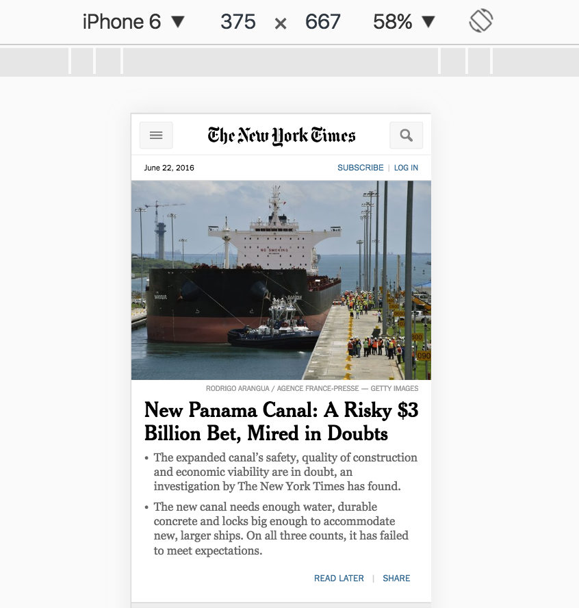
You'll have the choice between many possible devices on which you can simulate what a web page would look like. I personally have an iPhone 6, so let's look at our test HTML page from the previous chapter on an iPhone 6 (in theory)!

This looks pretty similar to the way the test page looked on a regular desktop view, but for many websites, this will look completely different.
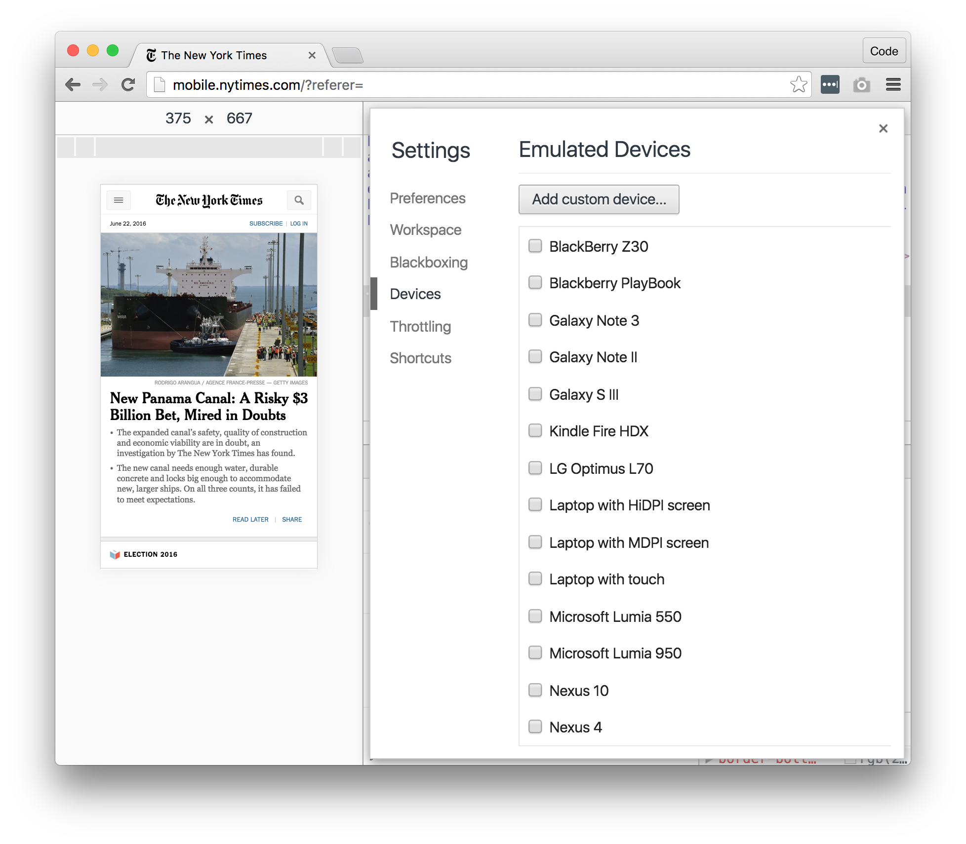
If you don't like the dropdown list presented at the top of the preview, you can even check off additional devices from the menu by clicking Edit within the dropdown list.