Examine Typography as a Tool for Communication
Typography in the world around us
Have you ever noticed the typography you see around on any given day? Chances are you take it for granted! You can find typography on building signage, street signs, wayfinding signs, in advertisements, in print and digital words. Typography helps give us signals to what we're going to see or read. Watch this short video for an introduction to typography and what it means.
When it comes to typography, Helvetica is arguably the best known font (heck, it even has its own documentary!). Some may argue that ComicSans is better known, but for the sake of getting a job after this path, please avoid ComicSans at all costs ;) (translation: your work won't be taken seriously if typed in this childish looking font).
Trailer from the Helvetica documentary by Gary Hustwit. [1:35 min]
The anatomy of typography
There are a few different categories for typography, which are easy to identify when you take a closer look at letter forms. The most common typographic classifications are serif, sans serif, slab serif, script, and display fonts. Within each category there are further divisions, but for now the basics are what are more important.
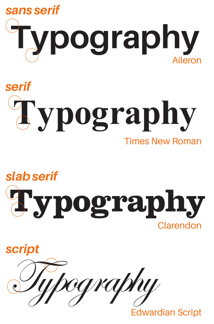
Serif fonts tend to be more traditional and formal, while san serifs are seen as more modern. Font choices can also convey a mood. For instance, script fonts may be used on a wedding invitation, but would be ridiculous for a tech company.

❌ The script typeface doesn't give the right vibe for the mission and spirit of OpenClassrooms.
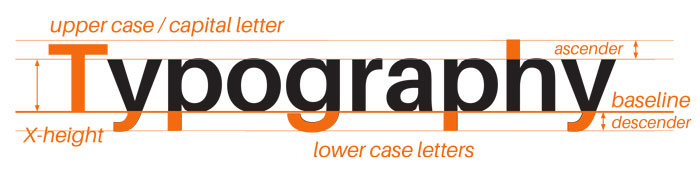
Type sits on what is referred to as a baseline. X-height refers to the height of the main body of a lowercase letter. Ascenders extend above the cap height. Descenders extend below the baseline. Start to notice the form of letters – some are symmetrical, while others may be on an axis, or have unique forms.
Many terms in typography terms date back to how it was originally used. For instance “upper case” refers to the fact that capital letters were stored in the top (upper) case for letterpress. "Lower case" letters, meanwhile, were located in the lower cases. There is another variation of capital letters referred to as "small caps". Don't be fooled these fonts aren't just capital letters made small, but fonts designed with a specific intention.
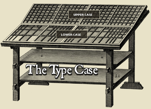 Historic rendering of a type case used by printers for letterpress via Print House.
"Leading" refers to the space between lines. In typical word processing software leading is usually denoted as 1, 1.5, 2, but in letterpress it referenced the number of lines of lead between each line of type. In a document, you may want to consider increasing or decreasing the space as a way to help group information and make it easier to read. Just be sure to be consistent in your type treatments.
Type is sized in points. You may want to create a "cheat sheet" for yourself of what the type looks like at different sizes by setting a paragraph in different sized type, and play with the leading (space between each line).
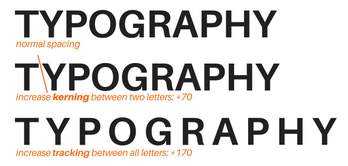
Tracking refers to the space between letters.
Kerning is the space between two particular letters, as opposed to the standard spacing between all letters. This is more likely to have to be adjusted when using display fonts at a large size and there is an awkward spacing between two letters. (It’s also something that the average person never needs to think about ;) ). To practice kerning, check out the Kerning Game!
Fonts in use
System fonts are the default typefaces that come with your computer. Other fonts are licensed (sometimes for a fee). For fonts you download from the internet, you will need to install them on your computer [Mac or PC] and activate them in order to use them.
Here are some standard fonts:
Thousands of fonts are available online, and using fonts other than system fonts can be a way to make your work stand out. Often designers will invest in one or two high quality fonts for their own personal branding system. Even if you don't invest in fonts, they're still fun to look at for inspiration, and as examples of good design:
MyFonts.com is a great font resource because you can see great examples of how fonts look in context before you purchase them. They also have a fun newsletter about fonts.
FontsinUse.com is also handy, because as you can guess from the name you can see how fonts may be used, and get ideas for design layouts.
Fonts by Hoefler & Co tend to be higher end fonts (and loved by designers). Their discover page has lots of examples of their fonts in context.
Where can I find free fonts?
Free fonts are fun (check dafont.com and fontsquirrel.com), but there is a reason you don’t see them used often by professional designers – they often lack refinement, have limited weights and variations, and at times can look amateur.
The other benefit of paying for fonts is that fewer websites will look the same (but at that level, hopefully the client is paying you!). Of course, for the creation of your projects you're not expected to pay for any fonts.
Aileron is the primary font used in the examples in the video. It has lots of variations, and is a free font!
Type on the web
Designing for print and web is different. Typically what reads well on screen is awkward and unnecessarily big when printed. There’s also a reason that eBooks are designed with larger type, so it’s easier to read on a screen.
For web fonts, check out:
Google Fonts are a great place to explore web fonts.
TypeKit are paid web fonts.
Jason Santamaria is a graphic designer who has written a book on web typography.
Mixing type
When combining or mixing typefaces you want to go for high contrast, which means that you don’t want to choose two typefaces which are really similar. There are a few different approaches you can take to mixing fonts:
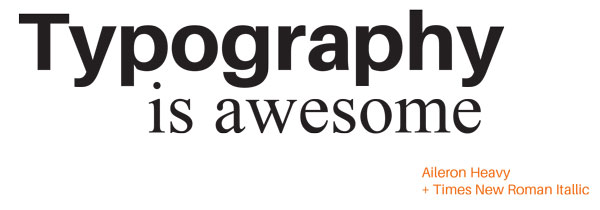
For maximum contrast mix a serif and san serif font. Consider using one for headline text, and the other for body copy (paragraph text).
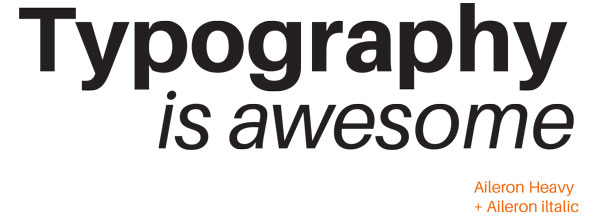
Use variations within a single font family. Try to avoid using both "heavy" and "bold" next to each other (they're too similar), but instead try "bold" and "light" which have more contrast.
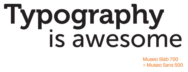
Some fonts come in different classifications, such as Museo Sans and Museo Slab. (A few of the weights are even available as free fonts, but for more variety there are paid versions).
The book The Elements of Typographic Style by Robert Bringhurst is often a reference book for those studying advanced typography.
