Table of contents
- Part 1
Identify the Benefits of Digital Marketing
- Part 2
Create a Digital Marketing Plan to Reach Your Goals
- Part 3
Monitor the Performance of a Marketing Campaign
Table of contents
- Part 1
Identify the Benefits of Digital Marketing
- Part 2
Create a Digital Marketing Plan to Reach Your Goals
- Part 3
Monitor the Performance of a Marketing Campaign
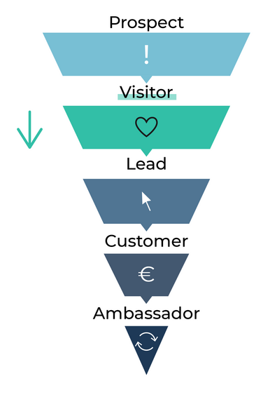
Turn Visitors Into Leads
Once you have captured a target's attention and interest to the point of making them a visitor, the next step will be to turn them into a lead. Remember, a lead is someone who is beginning the purchase decision process. And for someone to consider whether they're going to buy a product, they have to want it.

You can't force someone to buy something, or otherwise, we're no longer talking about marketing but rather about extortion. 😅
But what you can do in a completely ethical and legal manner is to stimulate the visitor's desire for your offer. If visitors explore your site, it's because they're trying to meet one of their needs or resolve one of their problems, whether they're aware of it or not.
Stimulate the Desire to Buy With Your Landing Page
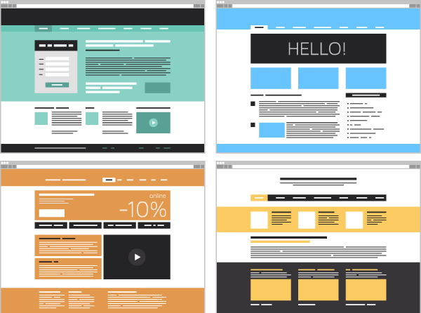
So it's up to you to explain how your offer solves the needs or problems that brought them to your site. And to accomplish this, there's no better place than your site's landing page.

Having an "optimized for conversion" landing page is a crucial marketing issue. Imagine that you use significant resources (for example, €5,000) to attract as many visitors as possible to your site (let's say, 50,000 visitors). If only 20% of them understand your offer well enough to think about buying, you will only have converted 10,000 of the visitors into leads (not even into customers). You will have wasted 80% of your efforts to attract these visitors.
By contrast, if you have a useful landing page that converts 80% of your visitors into leads, you might end up with 40,000 leads for the same budget.
Now you understand why it's essential to clearly and attractively present your offer and align with your visitors' needs or problems.
Select Your Words Carefully With Copywriting
You will have to choose your words precisely and with empathy, which is an art. Marketers who specialize in this type of writing are called copywriters.
Some offers are more effective than others. The main principle of copywriting is to say as much as possible in as few words. When you write marketing text, be as concise as possible.
You might be tempted to title your product as "the best."
Examples:
The best online course.
The best computer.
While this approach may seem appealing and concise, it doesn't explain why it's the best. Instead, identify and highlight your product's strengths:
A free, exciting and comprehensive online course.
A computer as light as it is powerful.
Prioritize and select the most appealing strengths that will get a visitor to consider making the purchase. The user can discover the other strengths as they navigate your site.
Communicate Visually to Create Desire
Make sure your landing page has plenty of images so the visitor can visualize what you offer.
If you're selling physical products, show them at their best.
If you're selling digital products, you can show screenshots of the app or a video explaining how it works.
If you're selling services, find a representative image or make a presentation video.
Marketing videos are incredibly powerful because they bring your offer to life. They allow you to humanize the customer relationship and demonstrate your offer's benefits.
Make Sure to Keep a Low Bounce Rate on Your Site
How do I measure the effectiveness of my landing page?
You don't know what your visitors are thinking, but they are on your site and inside your conversion funnel. With each action (a click, scroll, etc.), they give you a clue on your efforts' effectiveness.
An 80% bounce rate would mean that 4 out of 5 visitors leave your site, viewing only one page (the landing page). If they don't explore your site beyond that page, that's a sign that:
It isn't catchy enough.
You've attracted the wrong visitor in the first place.
To avoid breaking bounce rate records, make sure that the message that attracted them first and the one they see on the site are coherent and consistent.
Bounce rates can be interpreted differently from one site to another:
As a general rule, a bounce rate:
Above 80% is catastrophic.
Between 60% - 80% is pretty bad.
Between 40% - 60% is average.
Between 20% and 40% is pretty good.
Below 20% is excellent.
Measure the Conversion Rate of Visitors Into Leads
How can I measure the conversion of my visitors into leads?
You can see what phase a visitor is in on the customer lifecycle by examining their behavior on your site. Specific actions make them leads:
A request for additional information or an appointment.
A first contact.
A click on a product page.
A liked item or putting it in a shopping cart.
By collecting this information, you'll be able to calculate your lead conversion rate :
Conversion rate into leads = (number of leads ÷ number of visitors) × 100
If Mimine has 80,000 visitors per month, of which 16,000 are leads, then:
The conversion rate into leads = (16,000 ÷ 80,000) × 100 = 20%
Let's Recap!
You've learned that once a visitor arrives on your site, there's still a lot of work to do!
How do you move leads toward the sale?
By creating a landing page that is optimized for conversion and adapted to the interests of your visitors.
By measuring the bounce rate to ensure that it remains low and that visitors are navigating to other pages of the site for information.
By measuring the conversion rate from visitors into leads to verify that the implemented actions are effective.
In the next chapter, I'll give you some techniques to move your leads towards action and turn them into customers.
Ever considered an OpenClassrooms diploma?
- Up to 100% of your training program funded
- Flexible start date
- Career-focused projects
- Individual mentoring
Find the training program and funding option that suits you best
