Table des matières
- Partie 1
Identify key design elements through wireframes
- Partie 2
Apply the design process to create your own rapid prototype
Table des matières
- Partie 1
Identify key design elements through wireframes
- Partie 2
Apply the design process to create your own rapid prototype
Consider your next steps
Each round of designs and testing is going to help inform your next steps. After a few rounds of sketching and testing your initial wireframes, you can go on to more high fidelity digital prototypes, which means you'll be creating prototypes that start to resemble what the final app may look like.
Going digital
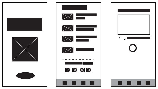
Before you start to focus too much to the visual design, consider starting with basic frames in black and white. As soon as you start adding color and UI elements, the conversation with clients is going to change. They’re going focus on the visuals and graphics more than what the app is doing.

Along with keeping simple shapes, ignoring color can be a useful way to focus on the actual user experience. Just as you tested your sketches, you can also sketch out digital designs that are simplified versions of their end product. The goal is that is to design in such a way that the end product still functions as planned.
Even after you move to the computer, that doesn't mean you have to stop sketching wireframes. The simple act of drawing one screen a day adds up, and you'll learn a lot in the process. Another tool you may want to consider is Wirify, which deconstructs any website into its basic wireframe structure. Similarly, there are extensions for Chrome browser that you can try. These tools can be useful for quickly understanding how content relates to form and for seeing the big picture.
Thinking digital
Online Tools
Now that you have a solid understanding of the basics of wireframing, it's time to discover some of the other tools available online which include:
In addition to being helpful tools, many of these tools also have highly informative blogs and newletters on the subject of UX. I recommend checking them all out to see what you can learn about different processes and approaches as you develop your own preferred working style.
Design and Pattern Libraries
Design and pattern libraries are also going to be helpful tools to refer to as you get into digital tools. There's no need to reinvent the wheel for everything you design. Here are just a few. (We'll discover many more pattern libraries and "UI kits" when we look closer at user interfaces).
With these libraries you don't need waste time drawing things like digital keyboards – these key elements are all ready for you to copy and paste. Instead, make sure you focus on your screens. Look for details like what you click to make a keyboard appear on your screen, or what happens when a cursor is visible. Think back to state changes and interaction design. All the tools in your toolkit will end up coming in handy as you're now a more observant designer.
You’ll build more skills to refine your app and take it to the next level in the courses to come, including learning the basics of Sketch! In meantime, stay curious and keep iterating!
Et si vous obteniez un diplôme OpenClassrooms ?
- Formations jusqu’à 100 % financées
- Date de début flexible
- Projets professionnalisants
- Mentorat individuel
Trouvez la formation et le financement faits pour vous
