Design for the device
There is not a universal experience across all devices. The experience is affected by the device itself, its dimensions, its purpose, and its functionalities. Not only must designers design for different devices, they must also increasingly consider how devices are linked to systems.
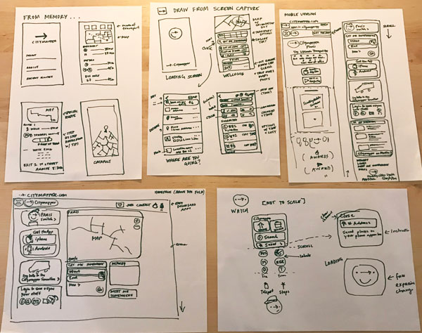
Wireframe for different devices
Wireframes can be used to sketch out all sorts of digital experiences including:
video games
computer software
websites
mobile versions of websites
apps (don't forget Apple vs. Android have different sizes across versions)
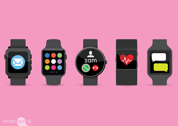
smart watches (some are square, others round)
smart refrigerators (yes, these are real!)
car navigation
This isn't even an exhaustive list of the different devices you may find yourself designing for. There's a good chance that in the future you'll be designing for products that haven't even been invented yet!
For each device or platform, now think about the dimensions, shape, and context and how each aspect has an impact on the user experience. The size of the device limits the amount of information that can physically fit on the screen (app vs. watch), and the context changes things, too (in a car you don't want to distract the driver from the road). As phones have developed over time, physical buttons have disappeared. This changes both the tactile experience, but also the spatial experience; there is now more screen space for additional information, including a digital keyboard.

Let's examine how websites work from a UX perspective. Computer screens are horizontal. They're usually at least 11" wide, and can be much larger as well. Website windows open horizontally, but can be adjusted by the users. Pages with a lot of content have a scroll function. Additionally, there is a set of navigation to help you move around the content of the website. You can fit A LOT of information onto the page of a website, and across the website itself.
Now, think of the mobile experience of when you look at the website on a smartphone. Some websites are "responsive" which means they adapt according to the device in which the content is viewed. For some sites the navigation is different, while some mobile versions of websites have less information than the main website. Some decisions are conscious decisions by designers and developers. Other times, it's the default mode.
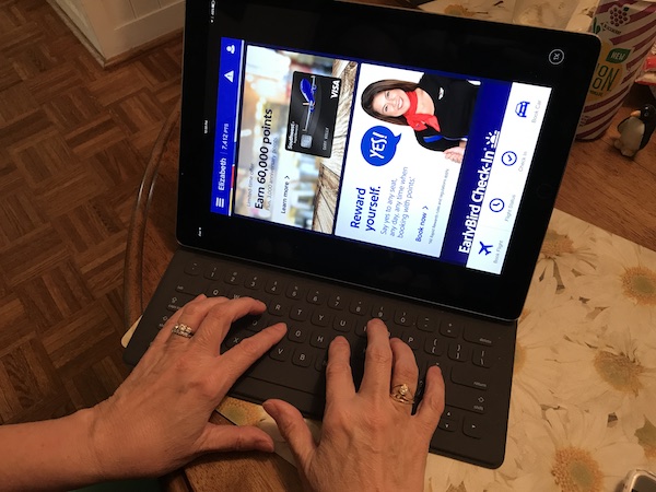
A device like a tablet was designed to have an integrated keyboard and be handheld. Although it wasn't conceived of in the initial design, users may use external keyboards, so it's important to consider how this may affect the experience. The orientation of the device – vertical or horizontal – as well as how the content adapts it is something to consider.
Next consider a mobile app. This is often different from the mobile experience (opening a website in a browser on your phone) because it's designed with specific actions or activities in mind. Apps don't need to adapt across devices, however, they may need to be developed for different platforms (Apple and Android) in order to reach a wider audience.
Each device has an impact on design and layout. The size of buttons change. The amount of information is adapted. The experience changes. Observe these changes through your wireframes.
Integration across devices
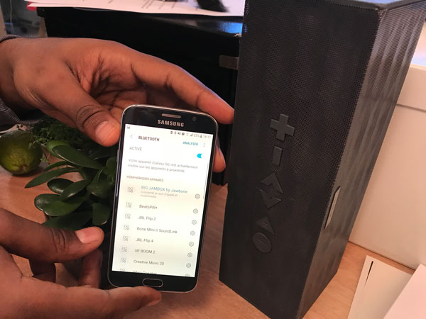
We live in a connected world. Increasingly, devices need to be able to "talk to" each other in order to enhance the user experience.

A lot of new technology, products and devices have entered the marketplace in recent years. They offer new user experiences, and integrations with connected devices. Let's examine a few examples.
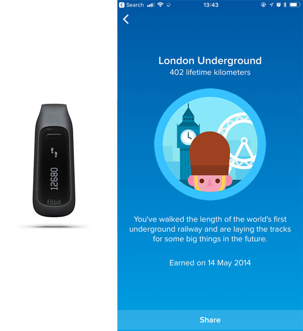
One of my favorite experiences is when my exercise wristband sends me alerts on my phone telling me I've walked my 10,000 steps for the day. I particularly love the "gamification" aspect where I receive badges that I don't even know I'm working towards (but there's an element of delight when they arrive). The feedback that my exercise app gives me makes me more competitive and pushes me to get more steps. Also, I have the option to "share" the badges, which is free PR for the brand 😉.
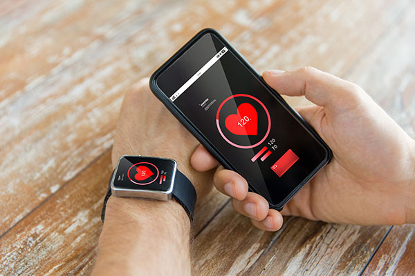
Similarly, a smart watch can "talk to" an app (where settings can be changed), or desktop platform. The person wearing the watch may feel a "haptic" (sensory) signal, while the app vibrates, and the desktop version has an audible "ding". It's all part of a large system and designing for each part involves different design considerations.
Look for these integrations in the most basic sense (boxes!) as you document existing products through wireframes, keeping the devices in mind. How is messaging adapted across platforms? What are the conventions for alerts? How big are buttons? Small design decisions can make a big impact; see what you can uncover by sketching wireframes.
As a designer you do not need to be able to design for all kinds of devices and platforms, but you should have a deep understanding of how what you're designing for functions, how it used, and how devices may work together for a more cohesive and integrated system. You also may consider eventually specializing in one kind of device, such as mobile. Either way it's important to keep up with technology and look for new innovations. There's a good chance that in five years you will be designing for a device that doesn't exist today!
Mini challenge
Pick a digital product that has a website AND an app. You’re going to wireframe for different devices:
First, draw the homepage of the website as it appears on your computer.
Then open the website in the browser of a smartphone and sketch the mobile version to see how it has been adapted for the different format. Pay close attention to the navigation in the mobile version. If applicable, include sketches of when the navigation is condensed and when it is expanded.
Finally, make wireframes of the app of the same product. How does the design connect across devices?
If you want to take it a step further, sketch the smartwatch version. If you don't have one, see if anyone you know has one you can see in action. Otherwise, work from photos or even look at the screens that are displayed in the app store!