Consider mobile design and responsive web
Designing these days no longer means designing for a single end product that is used in one way. Instead, when designing digital products and experiences, it's important to consider how to design in a way that will look good across all devices.
Mobile first
More people in the world have phones than have computers, so it's important to consider what experiences are like on mobile. Over time, we've all become more dependent on the technology we hold in our hands, so it cannot be considered an afterthought.
Luke Wroblewski, a product director at Google, was one of the first proponents of "mobile first." He was early to point out that mobile forces you to focus. The smaller screen size means less available real-estate to clutter the screen. Therefore, as a designer, it challenges us to think about what information is the most important to include and how to organize the information. The designer's focus should be on what is truly important to the product or service.
It's much easier to start by designing small and scaling up for a larger screen than to start with desktop and trying to make all the information fit in the palm of a hand. Designing small means starting with the smallest of the spectrum of smartphone screen sizes.
Designing with a mobile-first mentality is ideal for forcing us to think critically about content early in the design process. In addition, mobile has had such explosive growth that it is crucial to consider the growth opportunities for your product or business that can happen on the smaller scale.
Responsive web design
If you had to design a user experience for an iPhone or Android phone (mobile friendly and a separate app for each), tablet (mini and pro sided), laptop, desktop, and super-sized monitor, by the time you finished everything, there'd be a good chance that the technology would have already changed or someone high up wanted a change and you had to go back and fix it everywhere. While it's important to keep designing for different devices in mind, it's not always practical to have to execute it in reality. It's far more effective to think responsively - to think about how a site will adapt across different platforms.
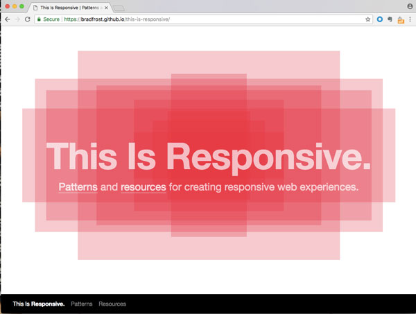
The image above is not responsive because it's just a screenshot, but if you visit Brad Frost's website This is Responsive, you can see how the site adapts when you resize the browser; there are also helpful resources for designing responsively on the site.
Responsive web design provides a more sustainable solution. The term was coined by Ethan Marcotte to explain the ever-changing web and was first published in this article on A List Apart (a great resource for all things web!). Responsive web design refers to how an interface scales and adapts across screen sizes and environments. This is achieved through fluid grids, flexible media, and CSS media inquiries. (See, understanding a bit of code is helpful! 😉)
It's not imperative to understand every detail as a UX designer, but what you do need to know is that breakpoints are assigned in the code. These values communicate which style should be applied depending on the configuration of the site. A desktop version of a site will likely look how you expect it. If you click and hold the bottom right corner to change the size of your browser, watch what happens. If content starts to become "hidden under" the page, this is NOT a responsive site. If it is responsive, you'll see that as the horizontal values get smaller, the content will reconfigure itself according to the assigned breakpoints. The best part is, no matter the size of the browser, the content still looks good! 😎
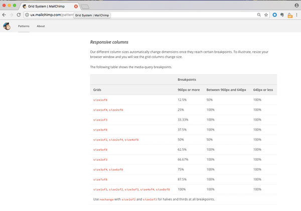
Screenshot from MailChimp's Pattern Library which defines the breakpoints for responsive columns.
Another way to think about responsive design is if you have a website with three image cards across. If you kept three across on mobile, everything would be minuscule, and not highly effective at communicating the desired information. Instead, in responsive web design, the layout adapts. For this layout, it'd make sense for the three images with text to be stacked one on top of each other. The user may have to scroll, but all the information is there and clear. It always depends on what you're designing, so along with the developer you can determine where those breakpoints should be assigned.
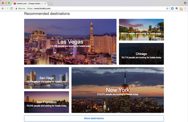
A screenshot of Hotels.com shows a photo grid with images of different sizes to recommend various destinations when the website is displayed on a typical browser window.

When the browser window is made smaller, the grid changes to feature all of the images at the same size. Interestingly enough, with this particular site, if you make the browser too small (or view the website on mobile), instead of going down to one image.
Multi-screen UX
Another way of considering what you're designing for is what Wolfram Nagel calls "multi-screen UX." He argues that there needs to be a holistic strategy, as experiences need to work across devices.
Some things to consider:
Many users have multiple screens and devices. It's a new reality that people are regularly shifting between devices. Are you ever guilty of working on your computer and picking up your phone at the same time? I know I am! 🙋🏻
Understand the devices and their capabilities. (You can't do as much on a smartwatch as a smart phone.)
The context in which the user is using the device may affect how they use it (or what other distractions they're competing with).
Know your users and their needs.
Experiences can go beyond just the times when we're on a website or app. They may involve notifications, alerts, emails, or communication on other social channels. As designers we have to think about how these experiences are integrated across screens.
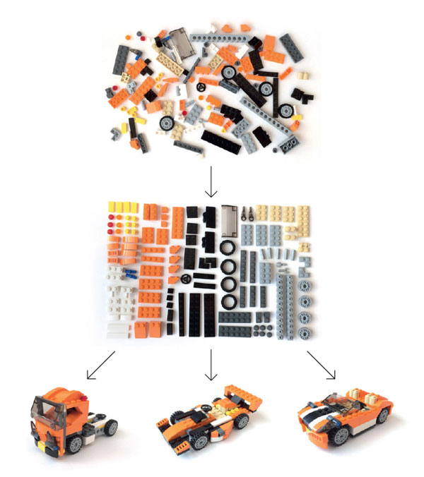
In his article "Content Design and UI Mapping," Wolfram Nagel uses Lego bricks to demonstrate the benefit of organizing different elements (creating a design system). These elements can be recombined in different ways in a more systematic and structured approach than working on arbitrary parts of a project. Designing with a system in mind makes it easier to adapt across platforms.
Let's Recap!
Mobile first design helps us consider which information is most important to include in a product.
More people have mobile devices than use computers.
Responsive web design explains the way in which websites can adapt across different screen sizes.
Multi-screen design is a helpful way of thinking about the context and environments in which users use digital products.
