Design with color
Color is very important in UI design. It's one of the ways users get a first impression of your product. You need to think like an art or creative director considering how photos and illustrations impact the design as well. Color is a tool to create worlds, reflect brand values, and appeal to users. Color is a key way we are able to identify brands we know well and get a sense of what they have to offer if we're discovering them for the first time.
In this chapter we'll look at the big picture of color and different aspects to consider when selecting and implementing color.
Color theory
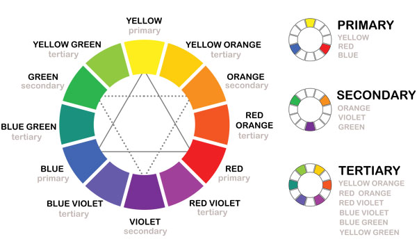
The primary colors are red, blue, and yellow and form a triangle on the color wheel. The secondary colors are green, orange, and purple. Tertiary colors occur when primary and secondary colors are mixed. Complementary colors are pairs of colors that appear opposite each other, for instance, blue and orange or red and green, while analogous colors are pairs of colors that appear next to each other like violet and red violet.
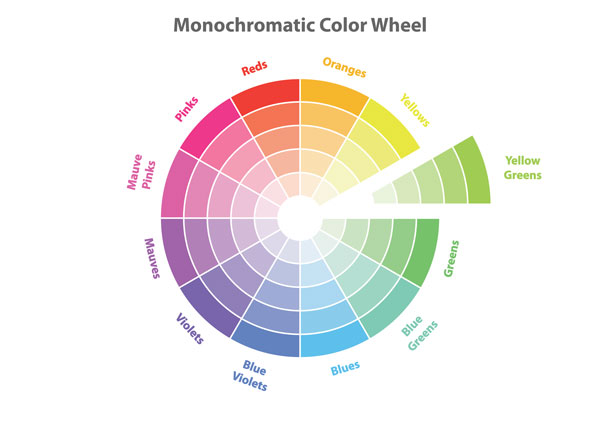
Monochromatic design involves using different tints, tones, and shades of a single color in order to achieve harmony. Analogous color schemes draw inspiration from colors next to each other on the color wheel. Complementary schemes use colors that are directly across from each other. Observe the brands around you to see which schemes they're using.
You also can think of colors in terms of temperature where warm colors are reds, oranges, and yellows, and cool colors are blues, greens, and purples. Color temperature is used in heat maps to communicate where users are spending most of their time on a website (we'll explore this more in the course Apply Metrics to Design Decisions).
Neutral colors tend to be black, white, grey, and brown. Color temperature can be used to help communicate emotion. (We explored some of the challenges of trying to assign color meaning from a cultural perspective in the course Apply Psychology to Design.)
When designing, keep saturation in mind, which refers to the intensity of an image. When you select a color, you are looking at its full saturation level of 100%. By changing the percentage, you can view a lighter shade of the color.
Black can be a challenging color to design with. It can be overpowering and hard on the eyes. Using a percentage like 80% greyscale will not only be easier for the viewer to read, it also tends to add an element of sophistication to your design.
The RGB system of color is popular on the web, where red, green and blue serve as the primary colors. It uses an additive method for achieving other colors, whereas CYMK (in print) uses a subtractive method.
Typically, color in web design is selected using six digit #HEX codes, as hexadecimal color is supported across browsers. Black is written as #000000 while white is #FFFFFF. Other colors tend to have a mix of color and numbers in the HEX code. Color for various components should always be defined in the style guide or design system.
The strongest UI often sticks to a concise color palette, working creatively within a particular color scheme.
Color in action
When deciding on a color palette for a project limit yourself to 2-3 colors. You can get more variations out of the color palette by using different saturation and opacity levels.
There are several tools available to help you select colors:
Adobe Color Wheel (including popular color schemes)
Material Design also has tools for color systems including color usage and palettes, color theme creation, and tools for picking colors. Material Design's approach to color stresses the importance of consistency (color should be applied consistently throughout), distinction (there is contrast between elements), and intentionality (the way color is used has a purpose or relationship). Once you have a color scheme, think how and when color will be applied.
Color and accessibility
Whenever you're designing, you want to keep accessibility guidelines in mind. The same applies when selecting colors. Just because something looks good to you doesn't mean everyone will be able to see it. A significant part of the population is color blind or has low vision.
In addition to color choice, you also want to be sure that there is enough contrast between the colors you are using. There are tools on the web that let you test this before diving too deep into your designs. Colorsafe.co and WebAIM are resources based on the WCAG Guidelines for accessibility.
The W3C Web Accessibility initiative encourages accessibility as something that is "Essential for some, useful for all." [1:04 min]
Trends in color
Every year there are new trends in design. Some you may want to embrace while others you may want to avoid for fear of designing a product that looks like everything else on the market.
Flat design became popular for it's clean simplicity. Flat design often does not use shadows to give dimension and can lack contrast and depth. Flat design is most common in the design of icons and app buttons for the home screen of your phone.
However, despite being trendy the Nielsen Norman Group reminds us to test on users. Their research shows that flat UI elements lack clickability cues and can cause confusion for users. (Note: they also clearly state the limitations of their research as well.) Clickability issues and lack of signifiers or affordances (clue to tell you it's something you can click) can be particularly problematic if it makes a difference in making a sale or not.
Nielsen Norman Group: Flat UI Elements Lack Clickability Clues and Cause Confusion. [5:09min]
Nielsen Norman Group on making flat design usable. [2:47 min]
Don't be dissuaded from using flat design. Just be aware of some of the pros and cons. It's worthwhile to check out the Nielsen Norman Group's best practices for flat design.
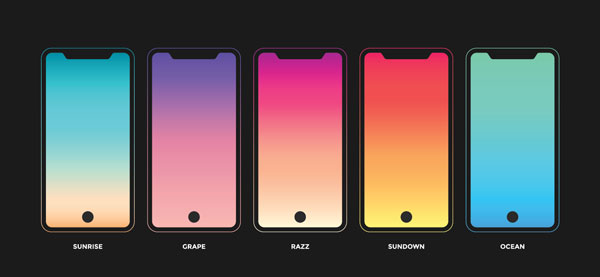
Gradients are another trend. A gradient is an effect created by one color transitioning into another color, where the two colors become blended in the middle. This has become popular because it adds more depth and achieves a sense of there being a source of light. This became appealing after the trend in flat design.
There's a debate over whether or not following trends like this is more likely to make a project look fresh or run the risk of looking dated someday. This is where things like picking colors to reflect your brand values make sense and help you justify decisions. Think critically about the selections you make.
As always, keep your eyes open for what's next! 👀
Mini exercise
Do an audit of existing brands or sites that have distinct color schemes. Start to take note of how the details play into the color scheme. Where is color added, and where is color avoided? What imagery is used and how does it reflect the look and feel of the product, as well as brand values?
Do a color audit of your favorite apps or sites to better understand which color schemes are most effective from your perspective. It's a way to discover what works and what doesn't when it comes to color.
Let's Recap!
You can look to the color wheel to inspire different types of color schemes.
When designing, limit your color palette to 2-3 colors to start.
Use color to give your product a certain look and feel.
Consider user accessibility when selecting colors.
