Design with details
If responsible for UI design, you will, of course, be designing homepages and onboarding screens, but there are a lot of other screens that you may not have thought of at first. Also, of course, each client will have different needs and requirements. Below is just a beginning of the kind of screens you may find yourself designing:
Profile pages
Forms
Messanging systems
Confirmation screens
Chatbox displays
User or admin dashboard
Help, FAQ, or TOS [terms of service] pages
Contact forms
Maps
All of these screens can affect the user experience and should be considered in terms of how they can most benefit the user.
Designing the imperfect path
The goal is for users to have seamless, perfect experiences where the design clearly helps communicate what to do next or anticipate what happens next. However, one of the most important things to keep in mind as a UX designer is that not all experiences are good experiences. You also need to design for when things go wrong.
This could be anything from what happens when someone forgets their password to an error in a purchase order on an e-commerce site, or communicating when a site is overloaded by too many users. Both the UX and UI designer need to be aware of the different sides of experiences and consider the user perspective while designing them.
Integrate icons to guide the way
Icons are a useful communication tool in design that can be used to help guide the user journey. They also can help reflect the brand personality and style.
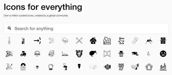 Screenshot from the Noun Project.
Two great places you can turn to for icons are the Noun Project and Streamline icons. You'll also find a lot of icons integrated into UI kits. Designing your own icons is possible, but it can also be quite time consuming. As a UI designer you'll need to figure out what to prioritize for each project. There are also additional steps you may not have considered that can take a bit of time as well (we'll explore those in the next chapter).
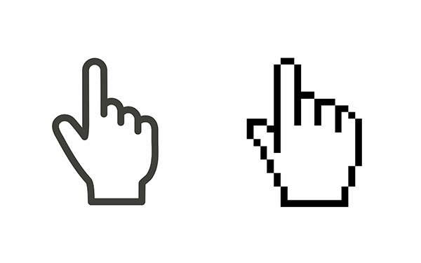
The important thing about icons in UI is that they should be vector based. Vector graphics are made of a series of points which allows you to change size, without losing quality, unlike a bitmap graphic that will become pixelated as it is enlarged.
SVG or Scalable Vector Graphics are a filetype common in UI design because it easily can be adapted to different sizes and devices. They are also supported across all browsers and devices, therefore they are an ideal file type for responsive web.
You can draw your own icons and graphics using the vector pen tool in Sketch or Adobe Illustrator.
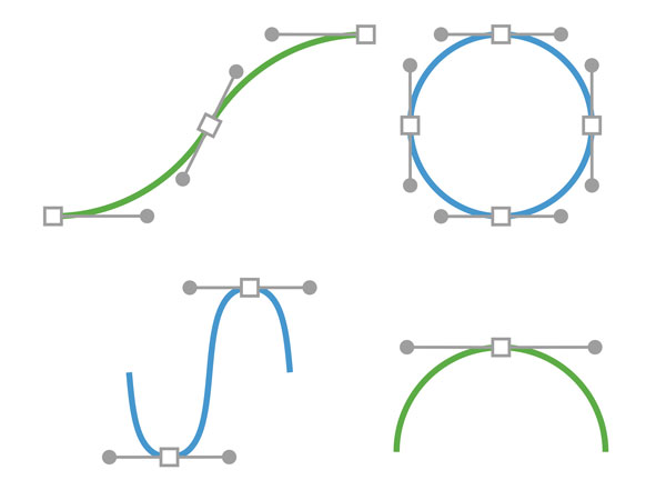
The Bezier curve can be manipulated using the anchor points and handles to adjust the shape.
If you do make your own icons, remember to keep in mind they should all have a consistent look and feel. Using the same weight for all of your lines can be a good way to achieve consistency. The other thing to keep in mind is that icons are typically used at a small scale, so make sure you view them in context before making too many.
Lines are a simple but effective design tool. They can be great as dividers separating information. Pay attention to the thickness of lines in the products you use. Often, a very thin hairline is most common as it is not distracting.
Copywork
Recreating the work of masters is one of the techniques artists have been doing for centuries in order to build skills by learning from the best. The same can be valuable when building your design skills. Self-taught UI designer Erik Kennedy believes this technique of "copywork" is one of the best ways to get better as a designer, pixel by pixel.
Copywork can be done by recreating any existing work. (Don't feel like you have to start with the most complicated layout; learning to design clean, simple layouts is one of the best skills you can have as a designer). This exercise is meant to be a learning experience, not something you put in your portfolio and claim as your own.
Another helpful technique for learning how to refine your designs is through downloading existing UI kits. Many design systems also have downloadable Sketch files. In addition to trying to recreate the files, look at how layers are organized and labeled.
Practice makes perfect. Speed is important in the world of UX/UI, so any shortcuts you can find to speed up your workflow are crucial. Keep working, and don't forget to revisit the tutorials in chapter one. Watching different designers work can be one of the easiest ways to pick up different tips and tricks. Thankfully platforms like YouTube and Vimeo make it easier than ever to do this from the comforts of your home.
Let's Recap!
UI designers will also have to design the less visible sides of experiences including dashboards and forms.
Icons are useful tools for communication. Using existing icons will save you time.
SVG (Scalable Vector Graphics) are a common file type in UI because you can be certain that it adapts to different sizes seamlessly.
Copywork is a technique you can use to get better designing for UI by recreating existing designs.
