Consider layout constraints and information organization
Now that you have a sense of the "big picture" factors that influence UI design, we'll explore in part two of the course a few specific aspects of visual experiences.
Considering how responsive web design works is helpful in approaching any layout design and how it may adapt. Using an underlying grid system can help provide a guide for how to organize different elements on a screen or page. Grids also ensure that elements are aligned, which has the practical benefit of making information easier to read and digest, but it will also give your layout a more polished and professional look.
Wireframes
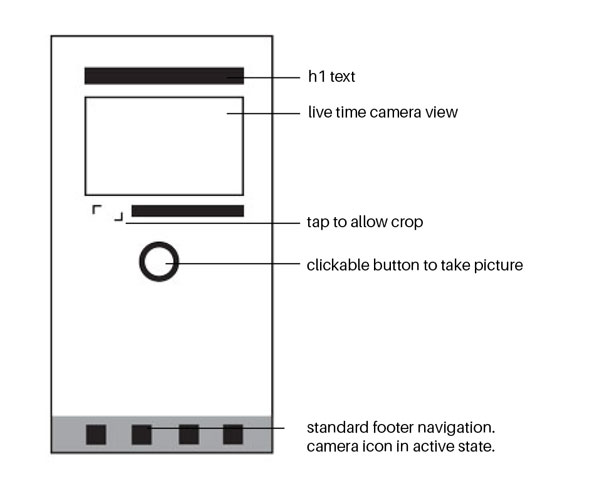
As with any project, it's always a good idea to start with wireframes. These could be simple sketches or digital drawings with black and white boxes.
As you work through iterations of wireframes, you want to consider how they will look on different devices. A good rule of thumb is to draw wireframes for the smallest device and a typical desktop layout. When wireframing for mobile, this should be the smallest screen for smartphones, not the newest; while people in tech often will have the latest versions of cool tech, most of the world is fine with the standard version. Desktop displays may be 960px or ~1200px wide. The company or project should have a standard and stick to it.
The key here is to understand how the layout will adapt to different environments, which is also important for developers to know. Therefore, you'll want to include annotated notes regarding state changes, animations, or unique functionalities. While these drawings are designed to be simple and straightforward, sometimes they need a little extra explanation for those not as close to the project as you. Also, as you work on multiple projects at the same time, these annotations will also benefit you by helping you keep each project separate and clear.
Grids
Grids date back to early print design and become more important as you take wireframes digital. Grids help establish the flow of information, providing guides where content can be placed.
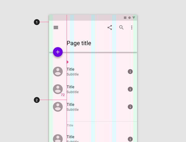
Grids are a series of columns or invisible guides that can be turned on and off in the background of a file as you work. Images and text can span multiple columns depending on the prominence of the information.
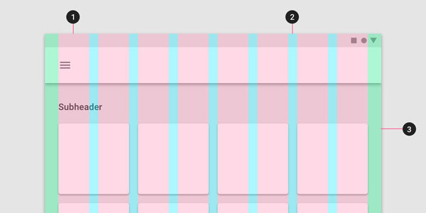
The Material Design layout grid is made up of columns (pink), gutter (blue space between columns), and margins (green). In the background, a few boxes are visible that could represent images or cards that span the width of two columns.
The grid a particular company or project uses is typically defined by the UI designer. Grids can vary by project, but a 12-column grid is common as it can lead to a range of various layout options for displays. The gutter is the space between each column grid, which helps ensure that content is aligned and that elements aren't flush on top of each other.
One way to think about grids is to imagine the images and text as puzzle pieces that "snap" into the framework of the grid. However, for this puzzle, there is not just one solution but many ways the information can be arranged. It's up to the designer to figure out what is most effective for each case, keeping in mind responsive web and what happens when it is viewed at different sizes.
Typically a "hero image" or main key image on a landing page may span all columns, whereas thumbnail images may span 2-3 columns with text blocks under the image which are the same width. Where images and text are placed on the layout also can help highlight which information is most important. (The course Integrate UX Writing and Content Strategy will help ensure that you're making these decisions with users in mind.)
For mobile devices, a 4-column grid is more common. There is no need for more than 12-columns because you want to ensure that content is large enough to be visible for users. Grids should be used to simplify and streamline layouts, not complicate them.
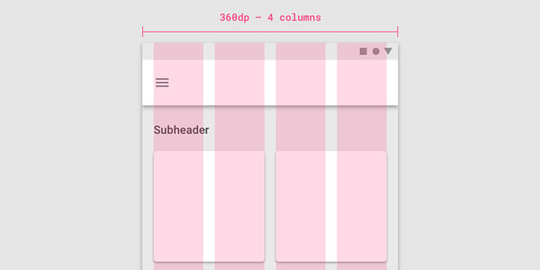
Material Design mobile view shows the breakpoint is 360, with a grid of 4 columns. See it on the website here.
Whether or not you decide to use Material Design as the basis for a project, it's worth spending time gaining an understanding of the approach. There is a thorough explanation of designing with responsive layout grids.
Another approach to grids for those familiar with code is Bootstrap, which is a popular framework based on grids. It is a responsive system that uses a series of containers, rows, and columns to layout and aligns content.
Spacing
In digital design, even a few pixels can make a difference. At a more granular level this is referred to as spacing (the space between two elements). Sometimes consistent spacing is important in order to visually show that a particular type of content is related or part of a larger set. Other times you may want to add more space between elements in order to differentiate what you're trying to communicate.
Material Design highlights the alignment of objects using keylines to break the grid and maintain consistent spacing. Read more here.
When talking about spacing, it is more common to talk about the gutter between columns or padding, which is the space around an object. A common way you'll see padding expressed is with logo guidelines to ensure no one puts text too close to the logo. Logos need room to breathe in order to have impact!
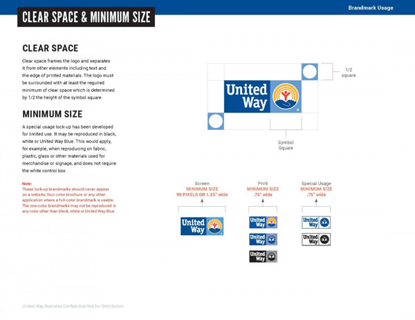
A page from the United Way style guide shows logo usage guidelines. Rather than defining spacing by pixels, they note that there should be a(n) (imaginary) square that is half the size as the logo to determine how much space goes around the logo.
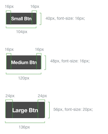
Trello's design system 'Nachos' shows how padding should be used for various button sizes on their products. Visit the website here.
For digital design, you may see padding written as px (pixels) or dp, which refers to scale independent pixels (it's the unit that Material Design uses). Particularly when designing for mobile, it's good to use something like a 4pd, 8pd, or 10pd grid system to ensure there is consistent spacing or padding throughout your layout. All that means is that your spacing is incremental and divisible by these numbers. This may be the space between an image and text or the space between two paragraphs. Of course some parts of the layout will need more space, but it's good to have a rule of thumb to work from.
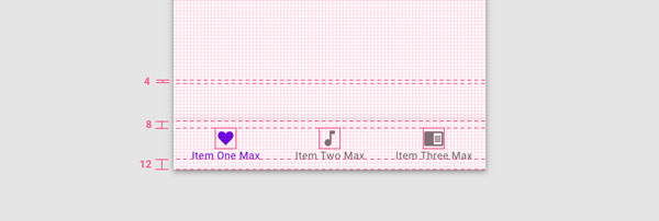
Material Design layout using a 4dp grid. The space between the elements on the bottom toolbar are divisible by 4 in order to be consistent.
Let's Recap!
Annotated wireframes are an effective tool to help UX designers, UI designers, and developers collaborate.
Grids are the underlying structure of any layout. They ensure that elements stay aligned and there is consistency across the product.
Considering the spacing or padding between elements is essential for designing effective layouts. White space is just as valuable as the content on the page.
