Analyze the Results
In the previous chapter we took the World University Rankings data and performed a Principal Component Analysis on it. In this chapter we will dig into the model produced to understand what it is telling us.
Start with the code from the previous chapter in Jupyter and follow through below. The full code can be found on the course Github repository.
Let's first take a look at an important metric within the PCA model, the explained variance ratio.
Explained Variance Ratio
This is an array of the variance of the data explained by each of the 10 principal components, starting with PC1, the principal component that explains most of the variance.
pca.explained_variance_ratio_array([3.21371891e-01, 2.37089839e-01, 1.55600315e-01, 1.05351043e-01, 6.92858779e-02, 5.47049848e-02, 3.52056608e-02, 1.45935070e-02, 6.79688170e-03, 4.05252471e-33])
If we sum up the values in this array they will equal 1, indicating that the 10 principal components together explain 100% of the variance of the data.
More usefully we can express the explained variance ratio as a cumulative sum:
pca.explained_variance_ratio_.cumsum() array([0.32137189, 0.55846173, 0.71406204, 0.81941309, 0.88869897, 0.94340395, 0.97860961, 0.99320312, 1. , 1. ])
This now more clearly shows the amount of variance explained as we add principal components. PC1 explains 32%, PC1 and PC2 explain 55%, PC1, PC2 and PC3 explain 71%, etc all the way up to 100% explained by all 10 principal components.
Scree Plot
The explained variance ratio is an important set of numbers to understand in PCA, and the easiest way to understand them is to plot them on something called a scree plot.
display_scree_plot(pca) 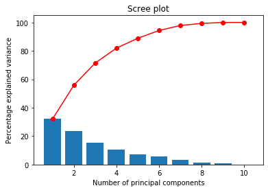
The blue bars show the percentage variance explained by each principal component (this comes from pca.explained_variance_ratio_). The red line shows the cumulative sum (this comes from pca.explained_variance_ratio_.cumsum()).
From the scree plot we can read off the percentage of the variance in the data explained as we add principal components. So the first principal component explains 32% of the variance of the data set. The first 2 principal components explain 56%, the first 3 explain 71%, and so on.
In this way, scree plots can be used to visualise and determine how many of the principal components we would like to retain when you move on to perform further analysis of the data.
How many variables to retain
But how many variables should you retain? It's hard to provide a definitive answer as a lot depends on what you plan to do next. In the above example, I may decide that I want to preserve 85% of the variance in my modeling, so I would keep the first five principal components, explaining 89% of the variance, and discard the other 5 principal components.
Remember that the point of PCA is to reduce dimensions, so we don't want to keep all 10 PCs. We can just read off the number of principal components we need to achieve the desired level of variance.
Component Scores
From the pca object generated, we can also get the components, which is defined in the Sklearn documentation as "Principal axes in feature space, representing the directions of maximum variance in the data":
pc1 = pca.components_[0]
pc2 = pca.components_[1]
pc3 = pca.components_[2]
# etc
Each array, pc1, pc2, etc has one value or 'score' for each variable. The score shows how much the variable influences the principal component. Let's remind ourselves of what columns we have in the data:
X.columnsIndex(['teaching', 'international', 'research', 'citations', 'income', 'num_students', 'student_staff_ratio', 'international_students', 'female%', 'male%'], dtype='object')
And now let's look at the components:
pc1array([ 0.44602246, 0.41763286, 0.47918623, 0.4372045 , 0.17746079, -0.06111775, -0.0565289 , 0.39562507, 0.07394972, -0.07394972])
pc2array([-0.17388542, 0.17493695, -0.14625 , 0.0530956 , -0.28297188, 0.2070367 , 0.21899687, 0.09335706, 0.60635809, -0.60635809])
So in the above the first variable is teaching. For PC1 teaching scores 0.44, for PC2 teaching scores -0.17. Clearly teaching is more influential on PC1 than PC2.
Correlation Circle
We can plot these component scores on a correlation circle (sometimes called a variables factor map) chart to make them easier to digest. Each plot is drawn on a factorial plane, that is the vector space made up of the intersection of two of the principal components. First, we plot the component scores of PC1 against PC2:
# Generate a correlation circle
pcs = pca.components_
display_circles(pcs, num_components, pca, [(0,1)], labels = np.array(X.columns),)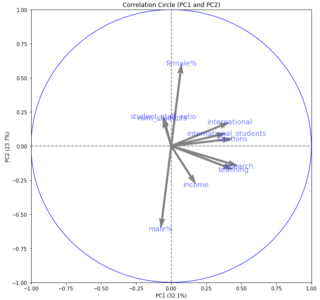
We have a circle of radius 1. The horizontal axis represents principal component 1. The vertical axis represents principal component 2. Inside the circle, we have arrows pointing in particular directions. Some of the arrows are longer than others.
The length of the arrows represents how much that variable explains the variance of the data on the factorial plane. Sometimes we call this the quality of representation of that variable on the plane.
The angle between variables provides an indication of how well the variables are correlated on the factorial plane.
A small angle indicates that the representation of the two variables on the factorial plane are positively correlated. Above we see that teaching and research are positively correlated on this factorial plane.
An angle of 90 degrees indicates no correlation. Above we can see that international and num_students have little correlation on this factorial plane.
An angle of 180 degrees indicates a negative correlation. So male% and female% are strongly negatively correlated on this factorial plane.
We can also plot other factorial planes. Here is PC2 against PC3:
# Generate a correlation circle
pcs = pca.components_
display_circles(pcs, num_components, pca, [(1,2)], labels = np.array(X.columns),) 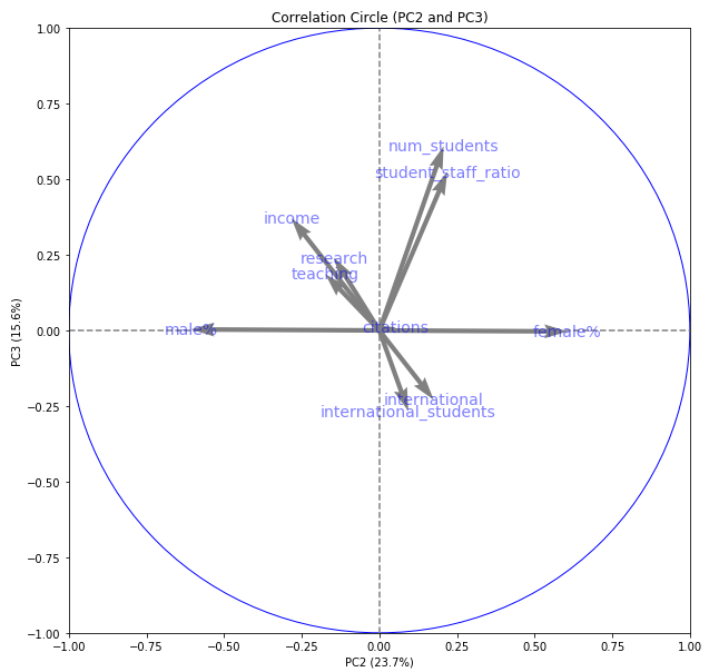
Individuals Factor Map
We can also plot our samples on a scatter plot in the new factorial planes. We will do this to show that the principal components found with this unsupervised approach have value as representative components of the original data.
# Transform the original scaled data to the new vector space
X_projected = pca.transform(X_scaled)

# Display a scatter plot of the data points in this new vector space
display_factorial_planes(X_projected, num_components, pca, [(0,1)])
plt.show()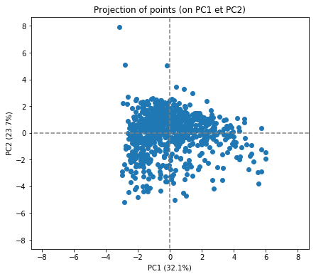
In itself, this doesn't tell us too much. What would be interesting would be to see if the PCA transformation has retained the good information about the university rankings. Let's first band the data into the top 10, top 100 and top 1000 universities:
# Take a copy of the data an add a new column for the banding
classed_data = original_data.copy()
append_class(classed_data, 'rank_band','world_rank',[0,11,101,1000],['10','100','1000'])

# Get a list of the new bandings that we can pass to the plot
classed_data = classed_data.reset_index()
rank_band = [classed_data.loc[uni_id, "rank_band"] for uni_id in range(0,len(X_scaled))]
Now let's plot the samples again, this time showing the bands as separate colours:
# Transform the original scaled data to the new vector space and display data points
X_projected = pca.transform(X_scaled)
display_factorial_planes(X_projected, num_components, pca, [(0,1)], illustrative_var = rank_band, alpha = 0.5)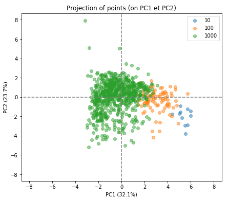
We can see that PCA has done a good job. Remember that PCA carried this out with an unsupervised approach. It knew nothing about the rankings beforehand but has found the optimal plane through the data which happens to separate out the top universities quite nicely.
We can also look at the individual factor maps for other factorial planes:
X_projected = pca.transform(X_scaled)
display_factorial_planes(X_projected, num_components, pca, [(1,2),(2,3),(3,4)], illustrative_var = rank_band, alpha = 0.5)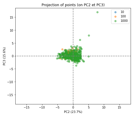
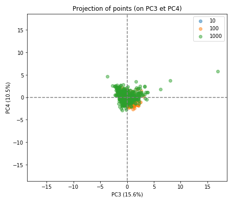
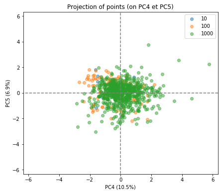
As you can see the separation of the indivduals in the three groups is much less clear in the subsequent factorial planes, indicating how well the first factorial plane has captured the essence of the data.
Using the results of PCA
Once you have selected how many principal components to use, these are new variables, PC1, PC2, etc, can be in further data science tasks. For example, you could now use these for building a classification or regression model.
Recap
The explained variance ratio is an array of the variance of the data explained by each of the principal components in your data. It can be expressed as a cumulative sum.
Scree plots is a visual way to determine how many of the principal components you would like to retain in your analysis.
Correlation scores show how much each variable influences the principal component.They can be plotted on a correlation circle.
An individual factors map is used to check your work and to determine if the PCA transformation accurately represents the original data.
