Analyze the Results of a K-means Clustering
In the previous chapter, we used scikit-learn to carry out a k-means clustering on the World University Rankings data. In this chapter, we will analyse the results.
Start with the code from the previous chapter in Jupyter and follow through below. The full code can be found on the course Github repository.
Visualize the Clusters
Because we have 10 dimensions it is hard to visualise the result (10D space is hard to visualise!) But we have a nice technique from before... called PCA. ;) This can reduce our 10 dimensions to 2 dimensions. We can then plot the clusters in a 2D scatter plot.
First, perform the PCA, asking for 2 principal components:
from sklearn.decomposition import PCA

# Create a PCA model to reduce our data to 2 dimensions for visualisation
pca = PCA(n_components=2)
pca.fit(X_scaled)

# Transfor the scaled data to the new PCA space
X_reduced = pca.transform(X_scaled)
We now have all our universities and the 10 variables mapped onto a 2D vector space. We can quickly confirm this, showing the PCs and clusters against the universities:
# Convert to a data frame
X_reduceddf = pd.DataFrame(X_reduced, index=X.index, columns=['PC1','PC2'])
X_reduceddf['cluster'] = clusters
X_reduceddf.head()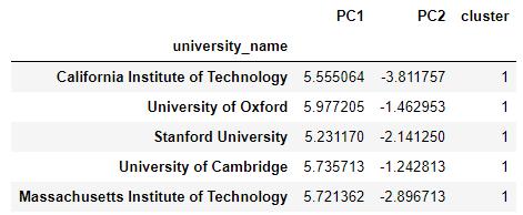
It would also be nice to show the cluster centres, but we need to apply the same PCA transformation that we gave to the actual data points, so that they can appear in the new 2 dimensional PCA space:
centres_reduced = pca.transform(kmeans.cluster_centers_)Now we can display the data points and centroids (as black crosses):
display_factorial_planes(X_reduced, 2, pca, [(0,1)], illustrative_var = clusters, alpha = 0.8)
plt.scatter(centres_reduced[:, 0], centres_reduced[:, 1],
            marker='x', s=169, linewidths=3,
color='r', zorder=10) 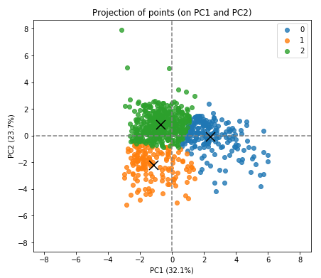
The 3 clusters and their centroids are clearly identified.
So there we have it. We have grouped our list of universities into 3 groups using the unsupervised k-means algorithm.
Interpreting the Meaning of the Clusters
But what do these clusters actually represent? The clustering algorithm has not given any indication as to what these 3 groups are. Unfortunately, there is no magic approach here. We need to examine the clusters and determine a sensible way to interpret them. This boils down to summarizing the samples within each cluster, or characterizing the clusters. Fortunately, we can use some tools to help us.
Parallel Coordinates Plot
We can use a parallel coordinates plot to see how individual data points sit across all our variables. In the following chart, each color represents a different cluster. By looking at how the values for the variables compare across the clusters we can get a feel for what the clusters actually represent.
# Add the cluster number to the original scaled data
X_clustered = pd.DataFrame(X_scaled, index=X.index, columns=X.columns)
X_clustered["cluster"] = clusters

# Display parallel coordinates plots, one for each cluster
display_parallel_coordinates(X_clustered, 3) 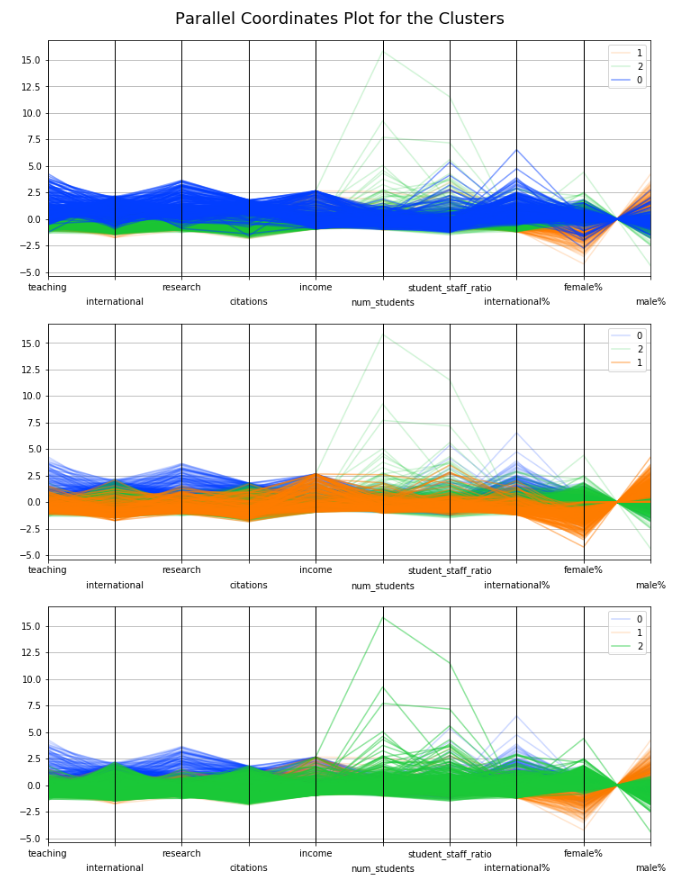
We can identify some groupings here:
Blue samples (cluster 0) with high ranking for teaching and research and a high number of international students.
Orange samples (cluster 1) with a high proportion of males and high income.
Green samples (cluster 2), some of which have a high number of students and high student to staff ratio, but the income seems to be low.
But we also have another useful piece of information coming out of the k-means clustering: the centroids. Let's plot these:
# Create a data frame containing our centroids
centroids = pd.DataFrame(kmeans.cluster_centers_, columns=X.columns)
centroids['cluster'] = centroids.index

display_parallel_coordinates_centroids(centroids, 10) 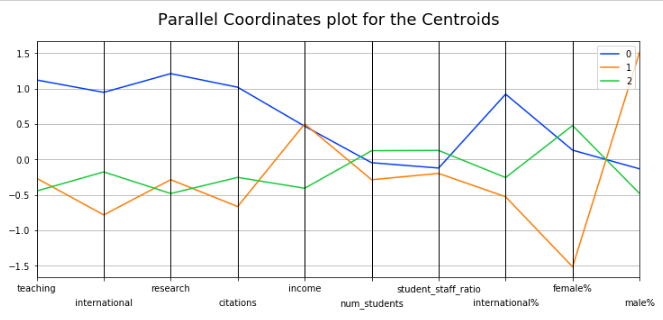
We can now more clearly see the variation across the variables for each of the clusters found by the k-means algorithm.
Recap
Interpreting the meaning of k-means clusters boils down to characterizing the clusters.
A Parallel Coordinates Plot allows us to see how individual data points sit across all variables. By looking at how the values for each variable compare across clusters, we can get a sense of what each cluster represents.
