Table of contents
- Part 1
Create user-centered content
- Part 2
Examine the content ecosystem
Table of contents
- Part 1
Create user-centered content
- Part 2
Examine the content ecosystem
Put the user first
When we talk about users, we're also talking about customers, constituents, and target audience. UX design always takes a user-first approach, where it's key to remember "YOU are not the user." It's easy to make assumptions about people based on our own experiences, but when we take the time to talk to and observe users, we're often surprised to learn things about them that we may have taken for granted (for example, not everyone has a cell phone or a smartphone).
Words on a screen are often written from a marketing perspective. Marketers and copywriters tend to write with the company or organization in mind, rather than putting the user first. Marketing and communication teams like to spread their messages, so user- and content-first approaches may be a departure from traditional approaches.
There is often a lot of overlap between organizational goals and user goals, but it's essential to think "user-first" to truly get inside users' heads. They are the people using your product after all, so why wouldn't you want to think from their perspective?
What does the user want?

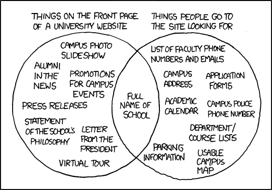
The Venn diagram on university websites by XKDC illustrates the disparity between what universities put on the front page of their websites vs. what people visiting those websites are actually looking for. The joke is that the only overlap is the full name of the school. When writing content for the web, it's important to think of the user perspective. Don't just tell users what you want to tell them. Work to appeal to their needs and motivations.
Keep in mind that context changes, and so can the content. In the university example, you have current students, their parents, prospective students (and their parents), and faculty and staff. If you had access to metrics, you could look at which pages are most visited to get an idea of what content your users really want to see, which may contrast with the content you're likely to share.
For a mini-challenge, consider a restaurant website and the information they present vs. the information you really want to see when you visit the site. Draw your own Venn diagram to communicate the two different perspectives of the restaurant and the client who wants to eat there. Visit some restaurant websites in a city—or country—you've never been to before if you need to help to spark some ideas.
Right information, at the right time
Typically, content is an afterthought and the last thing to happen for many projects. In Content Strategy for the Web, the authors talk about the difference between content development and copywriting through the analogy of baking a cake. In baking a cake teams approach design and content as something that happens step by step: gather ingredients, make the batter, bake the cake, and decorate it. Words and content are typically saved for the "decoration phase." However, that approach ignores exploring other possibilities along the way that will truly benefit the user and enhance the experience. Also, a lot can go wrong if you wait until the end to think about content. Rather than making the content fit into an existing design, you need to consider how content can help inform your design choices.
The fields of content strategy and content design put more emphasis on content first, and content throughout the process. In addition to thinking about what the content says, the ultimate goal is also to get the right information to users at the right time.
One of the best ways to think strategically about content is to look to an existing app. Start to notice what information is included, and how much information you are presented with on each screen. Keep in mind how long the product has been on the market. Chances are they didn't get it perfect on the first try, and that it has evolved over time due to additional feedback and observation of users. The examples below looks specifically at notifications, but the same considerations should be taken into account for all aspects of the user experience.
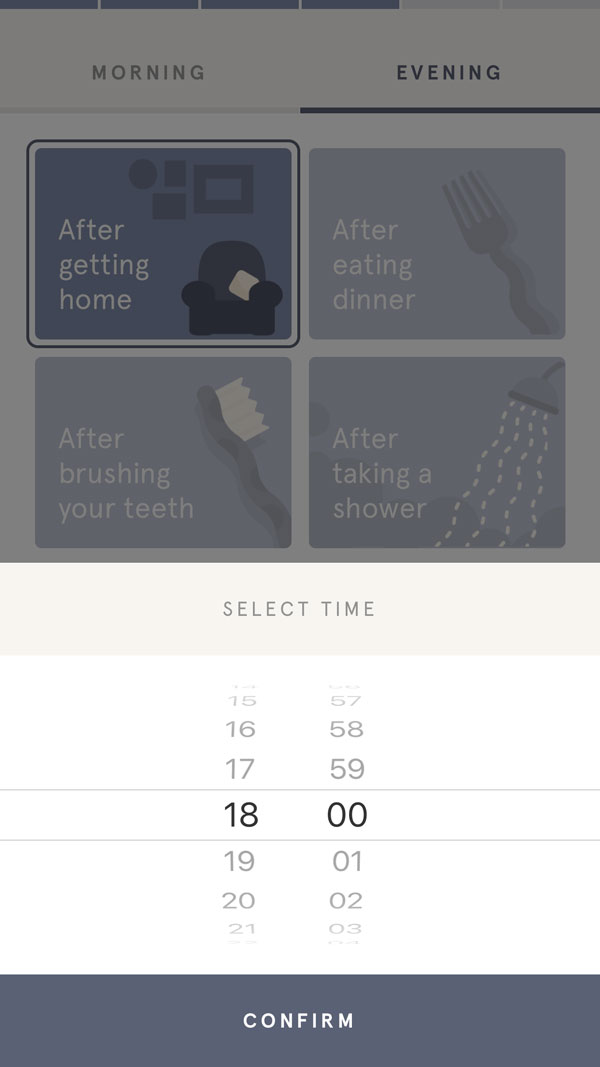
As we observed in the previous chapter, in the onboarding screens, the app Headspace tries to anchor reminders based on existing habits. The user can choose when they'd like to be reminded, from a general event to a specific time. One of the interesting things in this example is the user helps determine when they'd like to receive reminders. (That's not to say the app won't send you notifications at other times as well.)

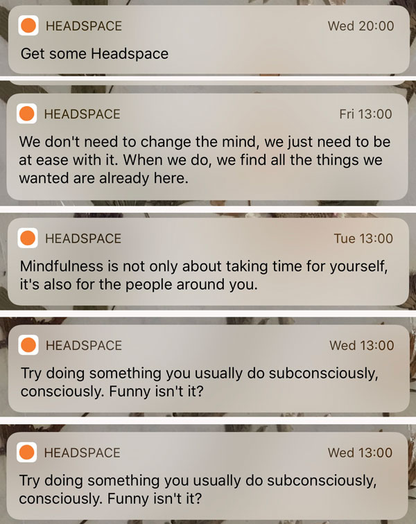
Some notifications will be more practical, like reminders and alerts, while others, will work to motivate the user. The language in these alerts is intentional and keeps the audience in mind. Headspace understands that many new customers will also be new to meditation. Much of their messaging is around educating users about meditation and helping reframe pre-conceived notions users may have. The fact that Headspace's initial onboarding asks how much experience you have with meditation is directly connected to the type of messages and notifications you may receive.

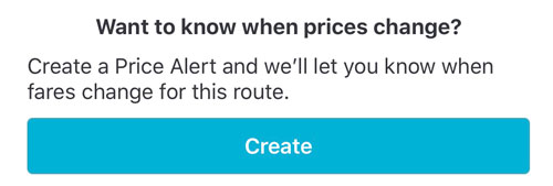
Notifications are an excellent example of the need for clear messaging, but it must also be well-timed to provide value to the user. "The right time" to send notifications or messages is dependent on context and will mean something different for every product. What works for a meditation app like Headspace wouldn't necessarily work for a dating app or travel app. For an app like Skyscanner, which is known for travel deals, it makes more sense for the user to receive the alert as soon as the deal is available. If they waited to send the user alert at a specific time every day, the deal may already be over. Timing must take context into account.

Jared Spool gives the example of a traveler at the airport. All the user wants is their boarding pass, but the airline keeps putting irrelevant information in front of them like how to earn extra miles or how to get a credit card. In the mindset of the user, all they want to do at this stage is to get what they need and get through security. With a long line of travelers behind them, the airline could also benefit from focusing on making the process as efficient as possible. The good feeling at that stage will likely make all those other upsells and airline perks to be more appealing when the user encounters them again.
To provide the right content at the right time, it's crucial to have a deep understanding of users. Recognizing how they feel along the journey helps ensure you're designing for the right experiences, at the right times, in appropriate contexts. In addition to the literal journey, users also have an emotional one that accompanies them.
Use language that everyone can understand
When you hear the terms write in "plain English" or "plain language" the goal is to use language that everyone can understand. The Nielsen Norman Group addresses the common myth that using plain language dumbs down the content. Their studies have shown that no one complains when text is easy to understand and that "highly educated online readers crave succinct information that is easy to scan."
Plain language for everyone, even experts from the Nielsen Norman Group [2:39 min]
According to the Nielsen Norman Group, plain language:
Takes less effort to decipher
Benefits everyone (particularly international audiences)
Performs better in search results
Jargon is specific terminology used by an industry or group that can be difficult for others to understand. In most cases, avoid using jargon and instead focus on terms that are more universal, making them clear to a wider audience. Jargon risks being alienating or sounding pretentious, so instead opt for plain and clear.
Let's recap!
Consider the information the user wants and needs at each step of a user flow.
The best content is communicated effectively, and comes at the right time.
User desires don't always match the information that companies and organizations present on websites.
Consider the user journey and how they feel at each step in order to create content that is useful for them.
Use language that can easily be understood by everyone, and avoid using jargon.
Ever considered an OpenClassrooms diploma?
- Up to 100% of your training program funded
- Flexible start date
- Career-focused projects
- Individual mentoring
Find the training program and funding option that suits you best
