Learn about users from heat maps and scroll maps
Heat maps and scroll maps allow you to understand user behavior by examining how and where visitors are spending their time on a site. You can use information collected through analytics or usability testing to help determine which pages to start with. Heat maps are only accessible through external services such as Crazy Egg or Hot Jar.
Interpreting heat maps
Heat maps visually represent clicks, taps, and scrolling behavior through patches of color so you can see where users are spending their time on the page. It's a way to better understand what users care about, what they want, and what they expect to interact with on your site.
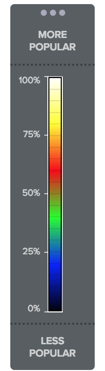
Typically on heat maps warmer colors (reds, oranges) mean that more people are focused on a particular area, while cooler colors (blues, greens) mean that the area is less active.
Similar to how you look at temperatures on a weather map, a heat map shows which areas are the most active. You can get a better understanding of when users are clicking on things they are not supposed to click on. Say you have an icon or colored shape that resembles a button integrated into your design. When you were designing the layout, you may never have considered that it's something the user would try to click, but after looking at your heat map of that page, now you know you may want to adjust your design.
Heat maps can also validate that users are clicking where you want them to. You should look to heat maps to know both where things are working and where actions are not converting.
Crazy Egg presents the benefits of a heat map, and why it's more powerful than looking at analytics alone. {2:38 min] You may want to check out the Crazy Egg YouTube channel for more tutorials and features.
Hotjar in 60 seconds—a tool that let's you help prioritize content that needs attention. [1:04 min]

Vimeo stats use their own version of a heat map with a graph overlay on the video that lets you know the points of drop-off throughout the video. In the screenshot above, you can see that we start with 100% of viewers watching, but with each passing second, more people drop off, meaning they've stopped the video or left the website. The red on the left of the graph is the "hottest" with the most viewers. To the right it is blue. The "coolest" area reflects the largest drop off in users. Simultaneously, there is a line graph of sorts with different points. You can examine what happens during each segment of the video and look for any signals in the content that may have caused the viewer to stop watching. In an ideal world, the graph would stay in warm tones and a steady bar graph without any dips, meaning very few people drop off because they're so interested and engaged with the content.
Use this information to help determine your approach to video content moving forward (which is particularly useful for a company like OpenClassrooms, where courses are centered around video content). Consider everything from the presentation of content (Do you see the person or is it voice over?) to how you will use titles and graphics.
Interpreting scroll maps
Scroll maps show how far users scroll down the page by using bands of color that signal which parts of the page are more active than others. Scroll maps show what's happening when you're not sitting next to users and can give you information about a larger group of visitors to your site. You can also get a better idea of which content users are most interested in and where they drop off or get stuck.
Scroll maps can be something you look at based on your observations, or a usability test may inspire you to look at what's happening in the scroll map. Data can be approached from many directions and is strengthened and validated by looking at it from multiple perspectives.
Crazy Egg presents scroll maps . [2:51 min]
As a general rule of thumb, long pages are not ideal if you want to be sure you're engaging users. (Listen to this episode of the UX Podcast with guest Lina Hansson who is a conversion specialist at Google. While the conversation is about mobile behaviors, many of the same concepts apply to web when it comes to having a lot of content.)
If you discover that users are not scrolling down the page, take another look at where your call to action buttons are placed to help encourage users to take action. If users have to scroll down the page for a minute before they can do something, you'll likely have a high drop off rate.
Look at pages from a content perspective as well (we'll look at this more in the content strategy course, Think like an editor). The most important information should not be hidden where users can't find it. Based on the results of your scroll map, you'll be able to make more informed decisions regarding how you can adapt the page (Which you can continue to monitor and test!). You may decide to break the content into multiple pages or work with a strategist to cut it down to what users really want. Make sure that the content and language you use resonate with users ensuring that it's relevant and something they'll want to read. Consider what information users want, and when they need it. Tell them what they want to hear, not what you want to tell them. (Again, we'll explore this more in the content strategy course.)
There are times when longer pages are necessary, such as a page with instructions, or a recipe, where it is best to put all the information on one page rather than break up the user flow. In both situations, consider whether the text is clear, succinct, and easy to understand. When text is too long, or too complicated, users may drop off.
Eye tracking
Eye tracking is another tool that can help better understand user behavior; specifically to see where visitors are looking on the page. The Nielsen Norman Group used eye tracking to better follow trends in scrolling and attention. The results found that "people scroll vertically more than they used to, but new eyetracking data shows that they will still look more above the page fold than below it."
Research by the Nielsen Norman Group using eye tracking also found that most people don't click on anything that looks like an advertisement. These users demonstrate what the researchers call "banner blindness." When designing, it's important to consider the container and positioning of your content, as many users know where ads will appear and will intentionally ignore those areas.
Banner Blindness: Ad-Like Elements Divert Attention. [3:56 min]
It's also important to consider the way that people visit websites based on patterns they are already familiar with.
Eyetracking Shows How Task Scenarios Influence Where People Look .[2:19 min]
The proof is in the data
You may want to make some changes to a page but the key decision makers "don't get it" and think the current page is fine as is. Heat maps and scroll maps can be great to share with stakeholders when you're trying to justify the need to make certain changes. Once you show them (not just tell them) where you're losing visitors, you can use the data to make design adjustments.
Rather than assuming all the changes you make to a page are perfect the first time, conduct usability tests, or A/B tests (which we'll explore in the next chapter) to ensure everything is in working order and performing well.
Let's recap!
Heat maps and scroll maps can give you a lot of information about the behavior of users by showing where they click and scroll.
Heat maps and scroll maps are beneficial for illustrating what is not working, but they can also show you what is working.
Heat maps and scroll maps can be useful for convincing other team members or stakeholders that you may need to address the content or design of the page in order make sure it is seen by users.
