Plot Charts Using Matplotlib

Discover Matplotlib
At this point, we’ve gathered a lot of information about our customers, which we could slice and dice and represent using different charts.
For example, rather than having the information in tabular form, it could be interesting to show total revenue by branch. We can also look at the debt-to-income ratio of our customers, to see if there’s a pattern.
So, we need a library to create these different charts using Python. There are lots to choose from, and it’s sometimes tricky to know which one would best serve our purpose. That’s why I suggest you take a detailed look at the Matplotlib library, which is used primarily to create visualizations. We’re actually going to use pyplot, which is included in Matplotlib.
Here’s how to import it:
import matplotlib.pyplot as pltEach graphical representation has a corresponding function within Matplotlib:
Scatter plots:
scatter()Line or curve diagrams:
plot()Bar charts:
bar()Histograms:
hist()Pie charts:
pie()
So, shall we see how to apply these functions in practice? Let’s go!
Draw Your First Charts
The scatter plot
Let’s try to plot one of the graphs we talked about above, to show the debt-to-income ratio. As we saw in a previous exercise, the debt-to-income ratio can be calculated like this:
loans['debt_to_income'] = loans['repayment'] * 100 / loans['income']These two variables are numeric and they don’t change over time, so we can create a scatter plot using the scatter function. This function requires you to provide x and y arguments, which are the values to be placed on the x-axis and y-axis:
plt.scatter(loans['income'], loans['debt_to_income'])which gives us:
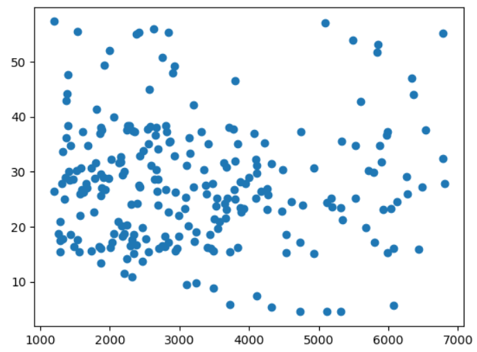
There are many options for customizing a scatter plot. For example, we can change the following:
Dot color, using the
colororcargumentDot size, using the
sizeorsargumentDot marker type, using the
markerargumentDot transparency, using the
alphaargument
Let’s take the same chart, but use red crosses with a modified size and with 50% transparency:
plt.scatter(loans['income'], loans['debt_to_income'],
    s=60, alpha=0.5, c='red', marker='P')
which gives us the following visualization:
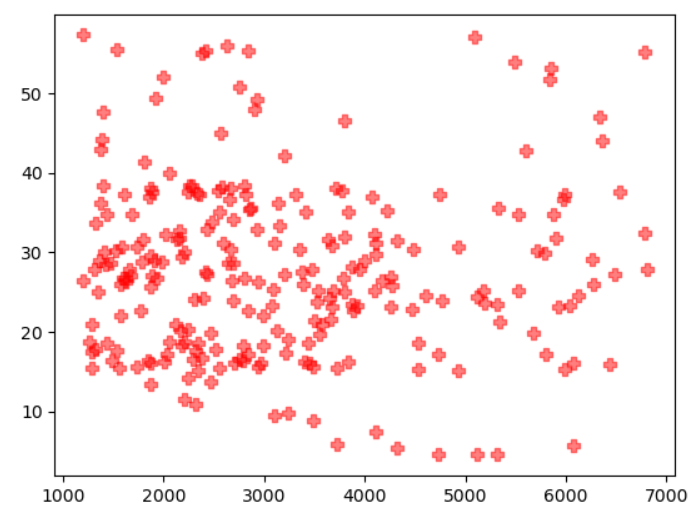
This list is only a small subset of what you can change. You can find the full list of arguments on the official documentation for the function.
We now want to show the total revenue by branch. As we’ve seen before, the two options we have here are a bar chart or a pie chart. We’re going to do both of these visualizations.
Pie Chart
A pie chart is reminiscent of a circular pie or tart that we cut into several portions. The pie chart function is simply called pie .
It’s used in a similar way to scatter . There are two arguments you need to provide: labels , i.e., the non-numeric variable names used to aggregate the data, and x, the corresponding aggregated values.
So, our first step is to aggregate the data:
data = loans.groupby('city')['repayment'].sum()
data = data.reset_index()Let’s now create our pie chart from this aggregated data:
plt.pie(x=data['repayment'], labels=data['city'])which will give us the following result:
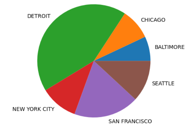
This chart could also be improved by displaying the percentage associated with each “slice.” To do this, we need to specify a number format using the autopct argument. For example:
plt.pie(x=data['repayment'], labels=data['city'], autopct='%.2f%%')Let’s quickly explain this number format. It displays the percentage share of the total revenue for each branch to two decimal places, followed by the % character.
Bar chart
The alternative to a pie chart is a bar chart. You can display exactly the same information, but from a different perspective.
To use the bar function within Matplotlib, you need to provide two arguments:
x: the different values of the non-numeric variable, equivalent to thelabelswe used inpieheight: the aggregated values, equivalent to thexargument in thepiefunction
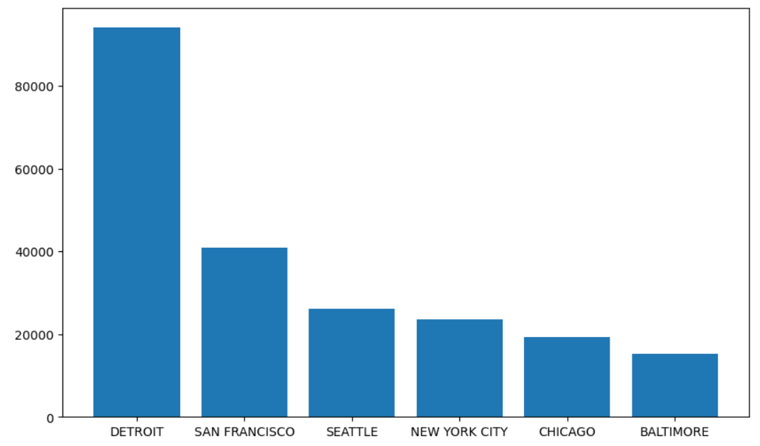
Let’s now illustrate the same data—total revenue by branch—using a bar chart:
plt.bar(height=data['repayment'], x=data['city'])... which gives us the following result:
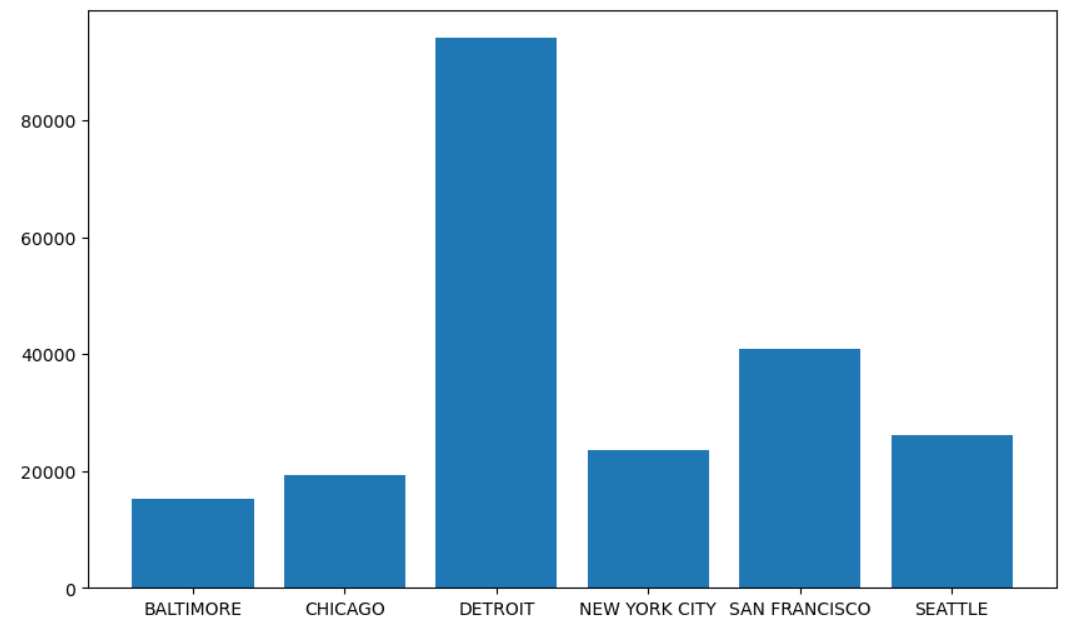
data_sorted = data.sort_values('repayment', ascending=False)
plt.bar(height=data_sorted['repayment'], x=data_sorted['city'])
It looks a bit better like that, doesn’t it?
Histogram
The histogram is particularly useful when we want to have an idea of a variable’s distribution, so it’s highly appropriate in this situation. The corresponding Matplotlib function is hist . Simply pass the numeric variable, whose distribution you’re interested in, as a parameter:
plt.hist(loans['income'])This gives us the following:
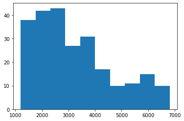
At a glance, we can see from the histogram that the majority of our clients have a fairly modest income.
Curves
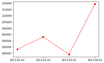
We would like to track our revenue over the first four months, to see how it changes over time and potentially plan for the future.
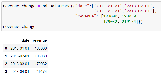
We have data available for the bank’s revenue from loans from January to April 2013:
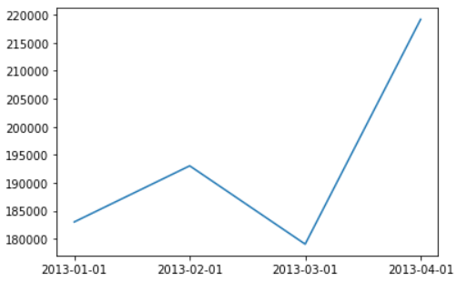
Because we are displaying data changing over time, the most appropriate option would be to plot a curve.
We’re going to use plot from Matplotlib to do this. This function requires two input arguments: the information to plot on the x-axis and the information to plot on the y-axis. So, this is how we’re going to track our revenue:
plt.plot(revenue_change['date'], revenue_change["revenue"])We had an overall increase in revenue in the first four months of 2013:
For example, here’s the same chart with dotted red lines and a point added to each date:
plt.plot(revenue_change['date'], revenue_change["revenue"],
marker='o', linestyle='--', color='red')
It displays our chart in a different style:
These various charts are all well and good, but they don’t really follow the good practices we mentioned before.
That’s a very good point! There’s actually quite a lot of information missing on all of these charts. But don’t worry, this isn’t an oversight on my part, we’ll see how to correct all this in the next chapter.
Creating Multiple Charts in a Single Window
We have six different agencies with several dozen customers per branch. The national manager would like a single chart showing how each branch has applied its rate based on income.
Showing income based on rate can be done quite simply, using a scatter plot. But how can the branch information be displayed?
By adding additional information to our chart, such as dot color!
However, there is no default option within Matplotlib to change dot color. We’ll have to create several charts—one per branch—and superimpose them on a single chart window.
Let me show you how to do this in this video:
Now that you know how to plot many charts in a single window, let’s put everything we've learned in this chapter into practice!
Over to You!

Background
You’re in the process of preparing a monthly report to present to your manager at the end of each month. The presentation will need to include some key charts, so you’ll have to use your data visualization skills to produce the different illustrations your manager requires.
Guidelines
The charts you need to produce are as follows:
Percentage of loans of each type
Monthly profit based on customer income for real estate loans
Profit distribution
Total monthly profit for the branch
Head over to the exercise and have a go.
Check Your Work
Well done! Here’s the solution.
Let’s Recap
Matplotlib provides a function for each type of chart you want to use:
plot: for curvesbar: for bar chartspie: for pie chartshist: for histogramsscatter: for scatter plots
Customize your charts using the different options available for each function.
Plot several charts in a single window to add further dimensions to your charts.
Let’s explore some of Matplotlib’s chart customization options in more detail.
