Establish a Boundary Between Influence and Manipulation
Not long ago I received a reminder to renew one of my favorite web apps. I read the email quickly and decided to renew right away for fear I'd forget later. Hmm, I thought to myself, that's more expensive than I remember, but I was in a rush, so I paid. Later I checked, and indeed, what I had paid for was not at all what I wanted. It was, in fact, an "up-sell" email to get me to sign up for their premium service. The language was vague and the landing page had no alternative payment options. I realized I'd been suckered.
I was really disappointed. I did want to pay for the service, but I didn't want – or need – the premium level account. The customer service experience wasn't great either. What a headache! This did not enhance my trust or loyalty to the service.
Every step of this experience could have been better designed in order to minimize the chances of error and improve my experience as a user. There is a lot that designers can learn from this type of interaction. (If they don't, an opportunity will be missed!)
The art of manipulation
When designing experiences around behaviors and habits, you always have to be conscious of what you're putting into the world. Psychology can easily be used to manipulate. As a designer, it is your responsibility to use your moral compass and consider any ways your product may be used other than intended.
Dark patterns is a term used to describe the dark, devious, or manipulative side of design. Rather than trying to help the user complete a task, you're tricking them into doing something they don't want to do.
Here are a few scenarios you may encounter:
Sneaking into the basket: unwanted Items get added to your cart. (This is similar to low budget airlines trying to automatically add insurance and other up-sells.)
Forced continuity: In order to benefit from the free month of a service, you have to enter your credit card information. This often happens with learning and music platforms.
Bait & switch: the buttons all look the same to mislead the user (including purchase buttons), or the opt out button is nearly impossible to find on the page.
Each of these scenarios can vary in terms of degree of "darkness" depending on the company and its approach. Some dark patterns are downright devious. Other companies do their best to maintain communications with users. For instance, after you have to use a credit card to sign up for a free trial, it can improve the experience for users if they receive a reminder email that their account will be charged soon if they want to continue service. Even if this kind of communication is handled by the marketing team, it's another reason that collaboration is crucial, to ensure that key steps along the user journey are not ignored.
As a designer, you should be aware of when and how dark patterns can occur. Think beyond the immediate product you designed, to the larger ecosystem, which may include an alert system or reminder emails. Look at the content of messages to make sure that while you're selling your service, the text is clear and not misleading. In the case of a free trial, make sure there is a system in place to notify the user that their trial is coming to an end. In this respect, you don't want to make it impossible for customers to cancel a subscription or service (otherwise, prepare for the wrath of Twitter complaints!). For anything involving purchases, you can always include a confirmation step.
Harry Brignull has made it his job to collect and highlight dark patterns through the website darkpatterns.org.
Harry Brignull presents examples of dark patterns to watch out for. [5:27 min] (There's a long version of the talk as well).
The ethics of persuasion
It's one thing to gently push, persuade, and encourage users to do something, but when you go too dark, you're also possibly dancing with the law. Being a UX designer involves finding a balance between user and business needs. Keep zooming in and out to focus on what you're designing at both a micro and macro level.
Don't forget your biases
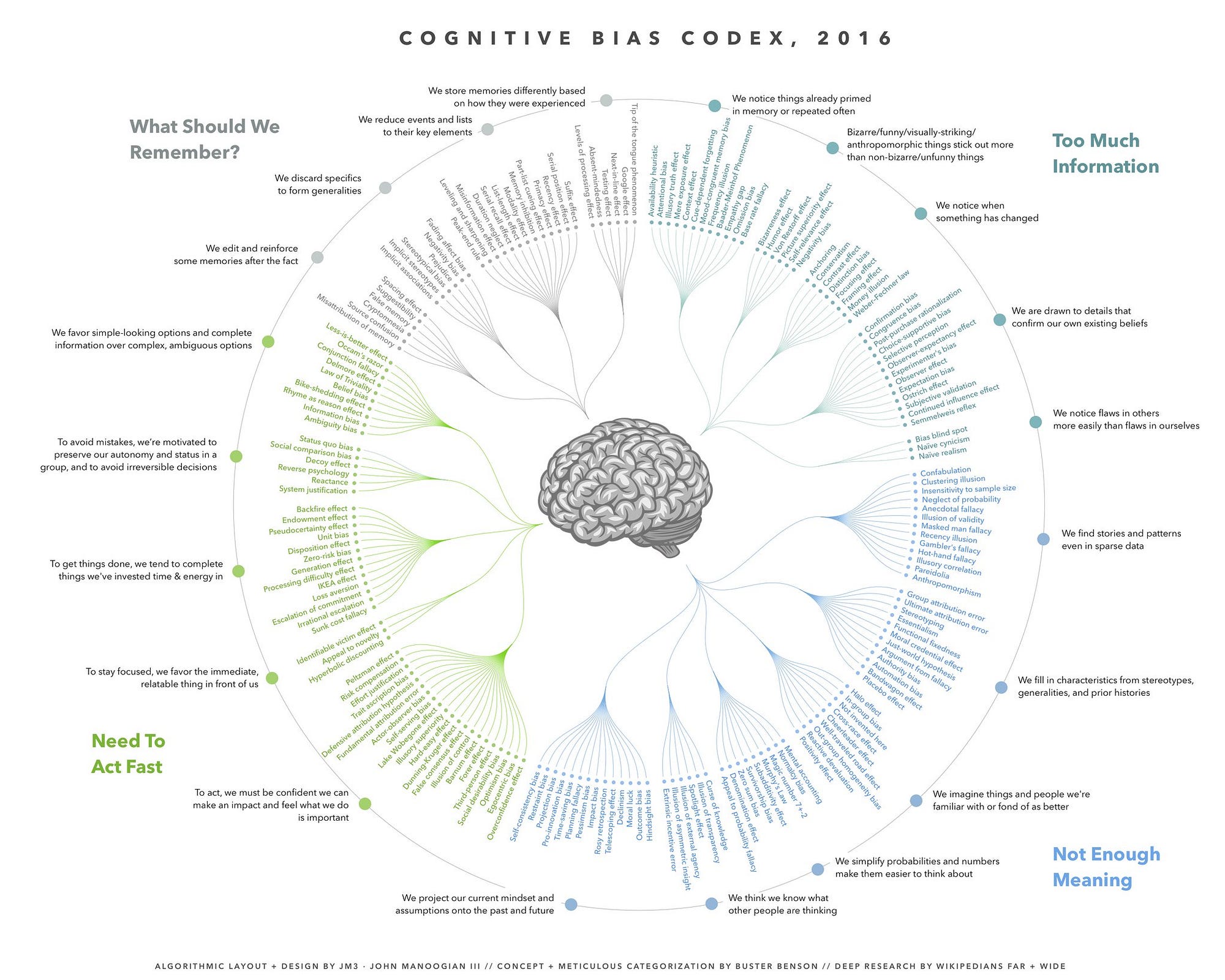
Biases are the tendencies, inclinations, feelings, or opinions we have that tend to be based on preconceived notions. Being aware of cognitive biases helps us discover flaws in our own thinking.
Buster Benson created a cheatsheet of cognitive bias to help identify flaws in his own thinking. While Wikipedia has a list of 175 different kinds of biases, Buster Benson was able to break them down into four main problems, pointing to the fact it's more important to be aware of the larger themes than each individual bias. The four themes that emerged were:
Too much information.
Not enough meaning.
Need to act fast.
What should we remember?
In response to the post, John Manoogian III diagrammed the codex of cognitive bias, which can be viewed full size in this post.
Working collaboratively is one of the best ways to minimize bias in order to bring in different perspectives and keep each other "in check." During usability tests, it's helpful to have a second person present to serve as a notetaker which allows the interviewer to focus on the job of asking questions. When it comes time to interpret the results, working together will help minimize the bias in the patterns you uncover. This is particularly important when your user base comes from different backgrounds. You can make hypotheses that you can validate, but you don't want to rely on assumptions while you're designing.
Let's recap!
Dark patterns are the devious or manipulative side of design. Some patterns are "darker" than others. They're not something you want your product or company to be known for!
Be aware of what you're putting into the world and how it may be used in unintended ways.
We bring our own experience and ways of thinking to a project. This can be reflected as cognitive biases that we need to be aware of when approaching the work we do.
