Design to be Memorable
The market is full of products. There's loads of competition. The question is, how will you stand out from the competition? You'll want to design to be memorable.
Being memorable does not have to mean having the biggest budget, latest technology, or fanciest logo. It's more about standing out in a way that works for the product or brand.
Design with stories in mind
Short-term memory is limited, so you want to make sure your product stays front of mind. Formatting information into a story is one of the best ways to make the information stick because it becomes connected to people and context.
Consider how you can tell stories in terms of what users want to hear, not just the history of the company. How can you make the information relatable? How can you appeal to the user? How can you help solve a problem for them? Think about how you can shape the story to make the user the hero.
Storytelling can include tension with twists and turns to sustain attention and appeal to emotions. A narrative doesn't necessarily have to be linear as long as it engages the audience. Stories help make content more exciting; whether you're presenting a customer testimonial or a product. How can you weave together the brand story with that of users?
Design to capture attention
Visiting a website for the first time can sometimes be overwhelming. If the site is slow to load, visitors may disappear before ever giving your brand a chance. Once the content loads, you still may not be sure what product or service is being offered. Think about how the design of a site can draw people in. Tunneling is one technique for guiding visitors through a certain path where they only receive the information that is relevant to the phase they're in. Another term for this is progressive disclosure, which the Nielsen Norman Group defines as deferring advanced or rarely used features to a secondary screen, making applications easier to learn and less error-prone. This is common in mobile experiences where there is less real estate on the screen. Rather than cluttering the screen with everything you could possibly know about the product, the user is introduced to it each step of the way where it is relevant.
"Chunking" involves organizing information into digestible groups of information. This can be as simple as presenting a phone number with spaces or punctuation or giving headers to lists of different information. The use of icons and color can also be useful for the division of information.

With the "isolation effect," designers can draw attention to certain items to bring them into focus for the user. That way the user knows where to start. This could be anything from a featured item for sale, an artist or author that you'd like to highlight, or a specific deal you want to showcase in a pricing comparison (for example, offering a free trial is a common way for platforms to create a low barrier of entry in order to get people using their product).
Design for memory
In his book Designing for Emotion, Aarron Walter says, "When you start your next design project, keep this principle in mind: people will forgive shortcomings, follow your lead, and sing your praises if you reward them with positive emotion."
Users won't remember every moment along their product journey. The "rosy effect" says that memory is more important than the reality of an experience. Even if something goes wrong, the way you handle and respond to the issue can change user reactions. Better experiences can replace the frustrating ones. The peak-end rule states that people judge experiences by how it was at the peak-either high or low. You don't remember every experience you have in life but the good and bad ones tend to stick out.
Design for forgiveness
Despite best efforts from designers, developers, and product managers, things will undoubtedly go wrong. How your company responds can turn this frustrating experience into an opportunity. Designing for forgiveness in response to something that goes wrong can have a big impact on the user's experience. Nothing is worse than a company that completely ignores user experience issues.
Consider the nature of your brand personality in terms of everything from when a user lands on an error page to when you have to send a message about a service outage. These often unexpected and unfortunate situations can provide an opportunity for companies to become memorable and build trust through their approach to resolving the issue.
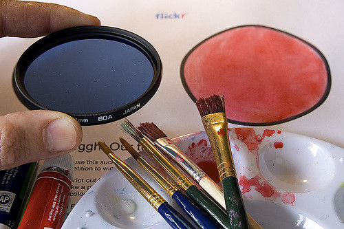
Years ago when the photo sharing site Flickr had a storage failure, they quickly put up a coloring competition for users to get creative with their logo. They redirected the focus to an opportunity to win a free year of service. The real joy came from the excitement and creativity of the user responses to the challenge. Communication is key to connecting with users.
When designing, think about how you want your users to feel and how they will talk about your brand. Don’t forget to consider ways they wouldn’t expect!
Let's recap!
Stories are a great way to make a product or brand memorable for the user.
Consider how you will capture the user's attention when they first encounter the product. Consider things like only presenting the information they need to see when users need to know it, or "chunking" information into different groups so it's easier to absorb.
Design to be memorable. Users won't remember every moment along their journey with the product, but they will often remember high or low points.
Recognize that things will go wrong in the world of technology, so prepare for that—and don't be afraid to be creative!
Consider how you want users to feel throughout the time they interact with your app, website, product, or service.
