Design with Choice and Scarcity in Mind
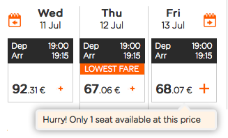
Have you ever browsed for train or plane tickets when you weren't quite ready to finalize your plans? Suddenly, you noticed a pop-up or text signaling that there are only a few seats left! You probably had a sense of urgency - also referred to as "scarcity." You bought that ticket, didn't you? It's not all bad. You accomplished your goal of booking a trip, and the company made a sale. Without this sense of urgency, you may never get out of town!
The design of decision making
The more you start to look at the websites and apps you use regularly with a critical eye, the more you'll start seeing the nuance of how they're framed and presented to appeal and entice you—the user!
The principle of scarcity
The principle of scarcity can occur in UX in different ways, from limited availability of seats/space, to a limited duration of time a deal will be offered. The idea is to get users to ACT NOW!!!!!! Limited time offer! If you snooze 😴, you lose.
The UX designer should look for ways to help entice and persuade users to do something. The product owner or manager will often decide whether or not to implement a feature such as limited availability. This will often rely on the possibilities of the platform. The UI designer will be in charge of how the button will look.
The Goldilocks Effect
It's common to see three pricing options available in coffee shops ☕️, but also for many web services. Collaboration is important because while the marketing or business development team may establish prices, the designer visualizes the offerings.
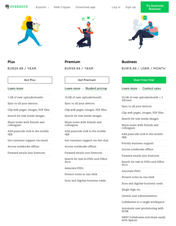
In the example above, Evernote presents three different pricing models: Plus, Premium, and Business. The chart highlights the three plans. Features are listed under each offer, with the idea that certain features in the column to the right are highly appealing. Ironically (but intentionally), the free "Basic" plan is not presented here. The way information is arranged is often designed to help make a sale. There is not one correct way to display this information, so starting with sketches and wireframes is always a good idea.
The Goldilocks Effect uses psychology to explain that most people will be drawn to the middle option. Just like the tale of Goldilocks 👧 and the three bears 🐻🐻🐻, when faced with three choices, the one in the middle feels "just right." In this respect, businesses are intentionally building plans around the the one they hope users will find most appealing (the one in the middle). When you select the middle option, you get more than the bare minimum, but not too many unnecessary features. Users are sometimes averse to extremes, so the middle option is just right.
The dilemma of choice
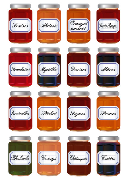
There's a famous study from Dr. Sheena Iyengar and Dr. Mark Lepper that looks at jam displays at a supermarket. One table had six jars, and the other had 24. When they asked shoppers about their preferences, they would say they wanted more choice, however, reality proved that when faced with more choice, shoppers wouldn't make a purchase - they got overwhelmed and froze. Although more people would stop at the table with more jars, when it came to buying, shoppers were much more likely to make a purchase when they were only presented with six jars of jam.
Hick's Law also examines choice. It states that the time it takes to make a decision increases with the number and complexity of choices. Therefore, when designing, it is important not to overwhelm users with too many options. (If an online newspaper presents you with 10 different subscription models, you may give up; if there are three, it's much easier to make a choice.) Focus on giving the most important information and a reason to act. You can always conduct usability testing if you need to convince colleagues or stakeholders that they should consider a different approach with fewer options.
Overview of key principles
Psychologist Susan Weinschenk (from part one of this course) has examined seven principles that make websites more engaging:
If people have too many choices, they won't choose at all.
Social validation is when we look to others to help make decisions.
Scarcity, or when something has limited availability, triggers action.
Our minds are attracted to food, sex, or danger.
Our brains are predisposed to pay attention to faces and photos of faces.
The brain processes information best in the form of stories.
Small commitments over time will build loyalty.
7 principles that make websites more engaging from Human Factors International. (Download the poster.) [5:11 min]
The work of designer/developer Anders Toxboe is highly valuable for exploring how psychological principles are applied to actual websites and layouts. He is the author of UI Patterns, an excellent resource for considering different conventions that apply psychological principles to layouts, with different examples of actual websites implementing them. His article on "Beyond Usability: Designing with Persuasive Patterns," is a useful read for keeping in mind everything we've covered in the chapters so far.
Let's recap!
The principle of scarcity is when a user is inspired to act knowing that there is a limited quantity of something or that it's only available for a limited time.
The Goldilocks Effect explains why the middle offering is usually the most popular option and the one that businesses are hoping to drive users to. The layout and design is important to making this information clear to users.
Users and customers can easily get overwhelmed by having too much choice. As a designer, you have to go beyond what users say they want and examine which factors result in sales.
Susan Weinschenk's seven principles for engaging websites are an indispensable application of psychology to design.
UI Patterns consider psychological principles in effective layout designs.
