Make Your Dashboard Interactive
Great job on creating your first draft of the dashboard! Now let’s take that draft from static to dynamic.
Understand the Dashboard Actions
One way to make your visuals interactive in Tableau is to use a series of actions.
In this chapter, we will focus on using the Filter action item. But first, let’s spend some time discussing the differences between Highlights and Filters in Tableau.
Highlights
This dashboard action enables one sheet to highlight specific data points in others. When you add a highlight action to your dashboard sheet, you provide the end-user the ability to select data points or dimensions in one visual and have the related data points or dimensions highlighted in another. The non-selected dimensions will become grayed out (or dimmed). Highlighting in Tableau works best when granularity matters. For example, if you are looking at a scatterplot, and want to focus on the data points that are for a specific dimension without filtering out the other data points, then you want to use a highlight action item.
Filters
This dashboard action enables one sheet to filter specific data points in others. When you add a filter action to your dashboard sheet, you provide the end-user the ability to select data points or dimensions in one visual and have the non-related data points or dimensions filtered out in another.
Let’s add filter actions to our dashboard!
Add Filter Actions to the Dashboard
There are two main ways to add filter actions to your dashboard. Let’s focus on the quickest method.
Select the Gender Treemap object in the dashboard sheet, and click on the funnel icon in the menu that appears when the object is selected, as shown below.
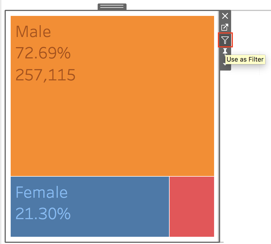
You should see that the funnel icon has now been filled in, as shown below.
Now, let’s see this filter in action! Click on any of the segments in the Gender Treemap visual (i.e., Unknown, Female, or Male) and see how selecting one impacts the data in the other visuals in your dashboard. Amazing!
Now add filter actions for the histogram, pie chart, line graph, and heat table.
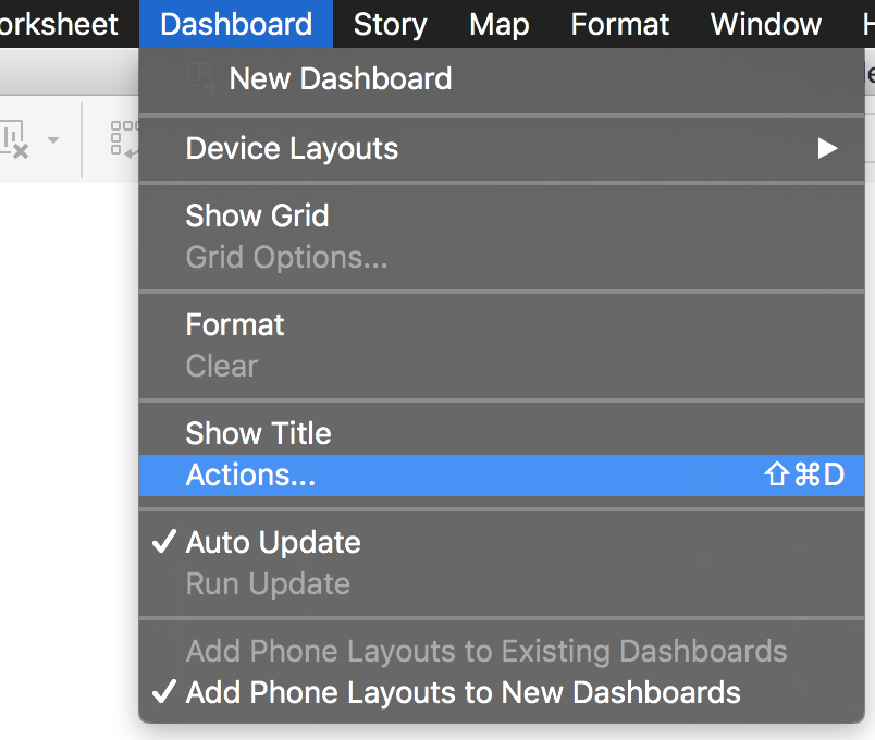
The other way to add action items to your dashboard is to use the Actions dialogue window. Navigate to the Dashboard menu at the top of your screen. Then select the Actions... option.
You should see the Actions dialogue window open up. If you check the Show actions for all sheets in this workbook checkbox, you will see all the action items (in our case, filters) that have already been added to the dashboard.
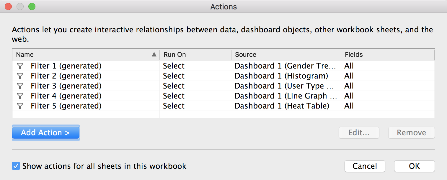
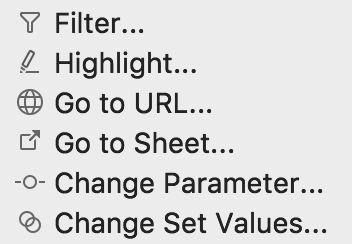
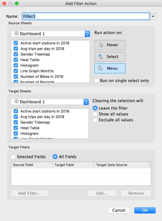
If you select the Add Action > button, a menu of dashboard action items will be displayed. Select the Filter option, and you will be taken to the Add Filter Action dialogue window. Here you can fine-tune the details of your filter action items.
Add Context Filters
When you create a numerical or top N filter (like the top 10 filter from a previous chapter), you may want to include only the data of interest determined by dimension filters. For example, if you click on the Unknown portion of the Gender Treemap object in the dashboard, you should see that the data in the other visuals are filtered and updated accordingly.
That is because the top 10 filter is applied before the dimension filters, meaning it is including more than the data of interest. You need to apply the dashboard filter actions as Context Filters. By doing this, you will make sure that the top 10 filter processes only the data that passes through the context filters.
So let's do that!
After you have added the 5 action filters to your dashboard sheet (as described in the previous section), navigate to the Top Stations Map worksheet where you should see that Tableau has added the action filters to the Filters card. Nice!
For all the action filters in the Filters card (they are the ones named Action and in italic font), click on the drop-down arrow and select the Add to Context option. You should see the filter change from blue to gray.
Now, you have ensured that the top N filter for the map object in the dashboard calculates the top 10 stations using only the data of interest. Phew!
Test it out!
Once you have set all the action filters as context filters, navigate to the dashboard sheet and select the Unknown' portion of the Gender Treemap object. If you take a look at the map, you should see that the Liberty Light Rail Station is popular among users who have unknown gender labels.
Now, go back to the Top Station Map worksheet, and remove the Action (Gender Label) filter from the context. To do that, click on the drop-down arrow for the action filter, and select Remove from Context.
If you look at the map in the dashboard (with the Unknown portion of the Gender Treemap object selected), you will no longer see the Liberty Light Rail Station as a top station for this user segment!
Our dashboard deliverable is shaping up very nicely! Now, are you ready to add the cherry on top!?
In a previous chapter, we created a filter for the top 10 start stations based on the Start Station ID field. But now, we want to give the dashboard end-users the ability to select either 20, 10, 5, or 1 for the top N filter. Let’s have the user input the N value for the filter using a parameter!
Include a Top N Filter Parameter for User Input
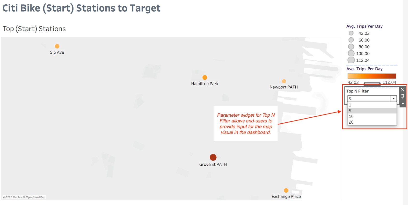
To create the parameter widget for the top N filter shown above, watch the video below and follow along to complete the steps.
Summary
You learned about dashboard actions and how to create a filter action item.
You learned about the difference between filters and context filters, and applied the action filters in the map visual to the context.
You learned how to create a parameter in Tableau and how to add the parameter widget to your dashboard to enable end-users to provide input.
You did it! Give yourself a pat on the back! You just made a professional and engaging dashboard that meets project requirements for Marketing Firm, Inc. Your client is going to be very pleased. ;) Thank you so much for spending your time and energy with me!
