Design Accessible User Interactions

Make Your Content Accessible With a Keyboard
If your elements are not operable with a keyboard, both alternative navigation and assistive technology users will not be able to interact with your content. If you’re sticking with HTML controls like input and link elements, they will be keyboard accessible by default, unless you intentionally override their usual behavior. However, if you’re using custom components, you’ll need to put in some extra effort to make them operable by adding tabindex attributes and controlling their behavior with JavaScript.
The focus order should generally move left to right, from the top of the page to the bottom. If the code order matches the visual order of content, and you’re not intentionally disrupting the focus order, this will happen by default. However, there are a few cases to be mindful of.
When sections of content are expanded to reveal additional information, such as expandable FAQ sections, the focus should move into the expanded content as the next focusable element, before moving onto the next collapsible toggle.
If information is added to the page dynamically, like when answering a particular question in a form, it presents an additional follow-up question. The content may appear next visually but be added to the end in the code order. It is best to add it to the code order in the same spot where it appears visually. If that’s not possible, you should redirect the focus order manually into the section.
If a dialog window opens, the focus should shift into the modal and remain there until the user dismisses the dialog. When this technique isn’t applied, the focus will remain on the background content, which may not be visible, and users will need to continue tabbing through all of the interactive elements in the background before reaching the dialog.
One last key thing to keep in mind is showing users which element is in focus. Browsers have their own indicator. As long as the focus indicator is not disabled in your CSS, they will highlight the focus elements. If you disable the default for aesthetic reasons, replace it with a custom indicator that is more in line with your visual design. A custom indicator is also beneficial because some browser defaults, like the one used by Chrome, don’t meet contrast requirements and may be difficult to see for some users.
Provide Alternatives to Visual Interaction Cues
The idea of providing alternatives to visual content like images and videos is pretty intuitive. But you might not realize how much more information you gather based on visual presentation. For example, let’s take a list of items and draw a single line through it.
What do you see in this image? Specifically, what are the words Muffins, Cookies, Cakes, and Scones doing on the page?
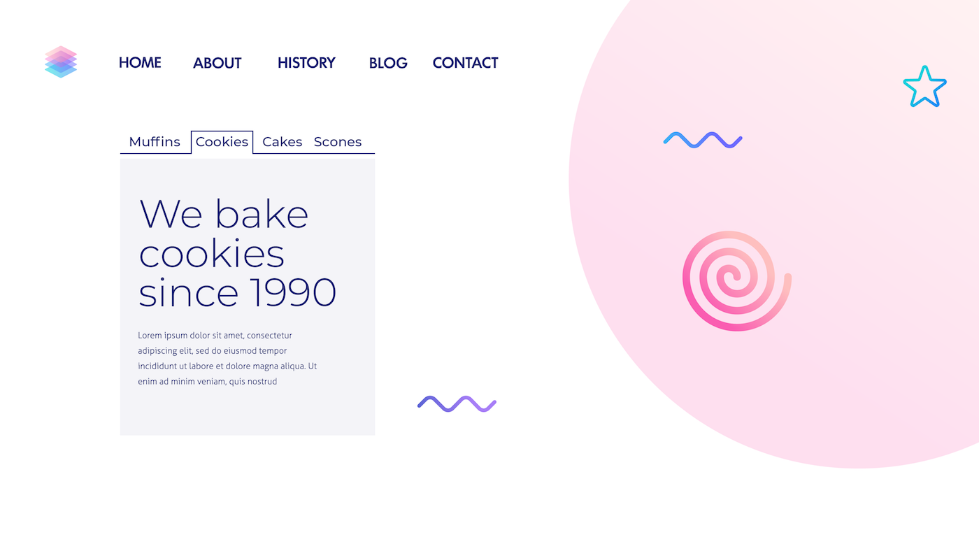
Most likely, you identified these as a list of tabs. You know that each item on the list has some content associated with it below and that if you click on another item, it will bring information about that item to the front and send other information to the back. You constructed this mental model based on just a few visual cues. But this is only an abstract representation. Those relationships need to be communicated semantically to someone who can’t see the visual cues to understand the same relationships between the content elements. In many cases, you can do this by using proper semantic HTML, but in other cases, you will need to rely on ARIA.
Understand the Capabilities and Importance of ARIA
In the early days of HTML, the functionality of all content was clear from the elements. Headings were identified using <h> tags, tables with table elements, buttons through input elements, and so on. Both the role and the behavior of HTML elements are baked into the markup, and assistive technologies like screen readers can pick up on this information and communicate it to users.
For example, let’s say you have an HTML download button. The screen reader can identify the name of the control, the <input> tag, and the button type, and communicate it to non-visual users. It would read something like “download button.”
As technology evolved, and functionality became more complex, many sites and desktop applications began to use tags that have no inherent meaning like <div> and <span> elements, styling them with CSS, and controlling their behavior through JavaScript. It allows for more flexibility in how elements look and behave, but they do not have a specific meaning or functionality.
Going back to the download button example, if instead of an HTML input element, we create a custom button using a div tag, assistive technologies don’t have any meaningful information to pick up on and communicate to the user. All it would readout is “download.” And this is where ARIA comes to the rescue.
ARIA allows you to create custom components that look and behave how you like and then identify their function and state.
But ARIA has a few more tricks up its sleeve! Some components and interactions don’t have corresponding semantic HTML elements. Text input tabs like the ones you saw in the example above; show/hide toggles, pop-up elements, and comboboxes, give users a list of suggestions to choose from, and other interactions. ARIA has special roles, states, and properties that allow assistive technologies to communicate the interaction in an accessible way. Without ARIA, this wouldn’t be possible.
ARIA can also identify regions of a page. Now we have HTML tags like <nav>, <main> and <footer>, but these actually originated as ARIA markup and were then adopted into HTML5. We will look at these landmark regions in more detail in the next chapter.
Keep Your Interfaces Consistent
In previous chapters, we talked about how predictability is an important contributing factor to understandability, and consistency is key for creating predictable interactions. At a bare minimum, this means having navigational elements that are in the same relative order on all pages and consistently named when they perform the same function. So if you have a back button, don’t call it “back” in one instance and “previous” in another.
I encourage you to take consistency a little further than the very basic requirements in WCAG because any inconsistencies in navigation or element behavior could be detrimental. Even if elements are named the same, any patterns or behaviors that are not applied reliably could confuse users. If navigation appears in the same order, but some functionality is not consistently available on all site pages, it could confuse users.
For example, if you have several instances of tab content, even if they are different visually, they should function the same when it comes to keyboard interaction. If you’re able to move between some tabs using the tab key and others by using the arrow keys, it could go against the expectations users have for interacting with these elements.
If your navigation contains certain functionality on some pages but not on others (i.e., a profile menu or a logo that takes users to the homepage), it could be disorienting even if the items are presented in the same relative order.
Exercise: Design a Homepage Mock-up
Taking into account what you learned in this chapter, create a mock-up of a homepage. You’ll be working with it in the next chapter. It doesn’t have to be high-fidelity. You can even sketch out a rough wireframe with a pencil and paper. Alternatively, you can also use a tool like Figma to create something more polished.
First, go back to the style guide from Chapter 1 of Part 3 and add hover and focus styles to your design. If you include other elements like buttons, remember to communicate states and other information without relying only on color.
If you have complex interactions, like drop-down menus, tabs, or collapsable regions, make a note of those for now. We’ll come back to them in the next chapter.
Let’s Recap!
Ensure content supports keyboard interaction by making all elements operable with a keyboard, indicating the focus and following a logical focus order.
Remember that much information can communicate visually and supports visual interaction cues programmatically through semantic HTML and ARIA.
Keep your site navigation and elements consistent, in terms of naming and behavior and presentation.
Ready to put it all together? In the final chapter of the course, you’ll learn how to annotate your mock-ups with information that developers can use to build accessible web content from your visual designs.
