Set up a basic grid
In order to create layouts using CSS Grid, you only need to add one line of code to the element where you want to create a grid!
A grid display type is usually added to container elements, meaning an element that contains other elements. This could be a section or div, for example. Let's imagine that we have a div with a class of "container":
.container {
    display: grid;
}
In the following chapters, we'll use this same example to explore CSS Grid's power. Let's say that our div, with a class of container, contains eight other divs, each of which contains a number:
HTML
<div class="container">
<div>1</div>
<div>2</div>
<div>3</div>
<div>4</div>
<div>5</div>
<div>6</div>
<div>7</div>
<div>8</div>
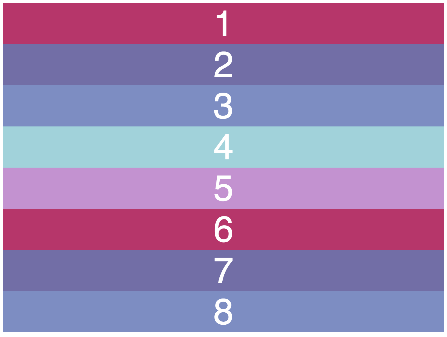
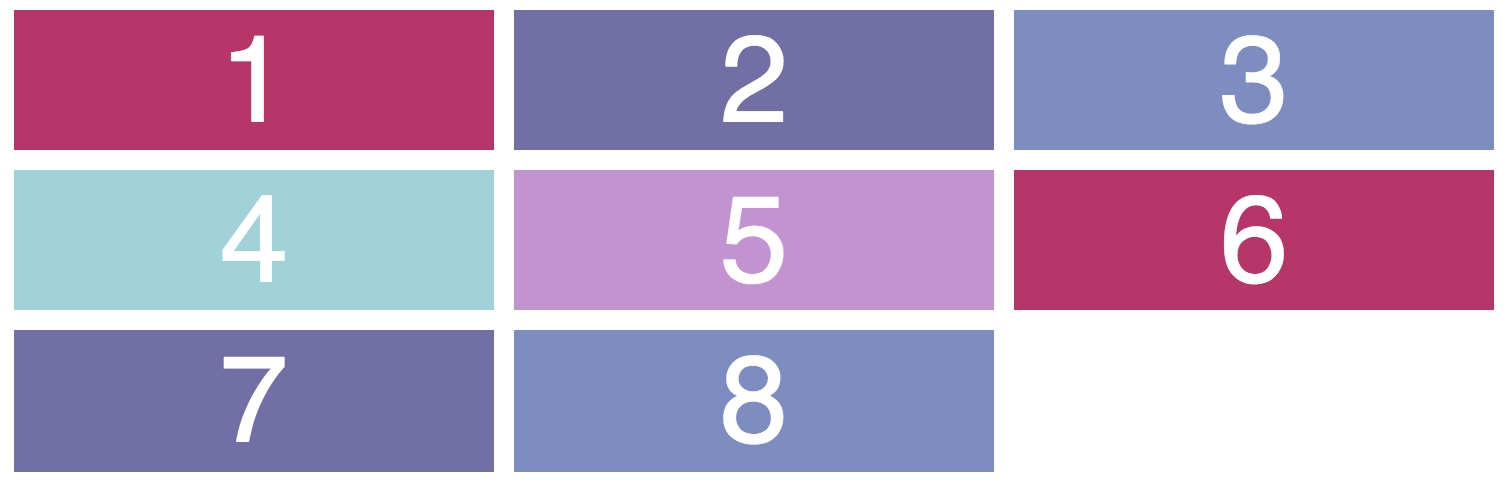
</div>We have a div called "container", then made 8 nested divs. Now, let's put a different background color for each nested div.
CSS
* {
    font-family: Helvetica;
    font-size: 1.4em;
    color: white;
    text-align: center;
}

.container div:nth-child(1), div:nth-child(6) {
    background-color: #B8336A;
}

.container div:nth-child(2), div:nth-child(7) {
    background-color: #726DA8;
}

.container div:nth-child(3), div:nth-child(8) {
    background-color: #7D8CC4;
}

.container div:nth-child(4) {
    background-color: #A0D2DB;
}

.container div:nth-child(5) {
    background-color: #C490D1;
}The result is a group of blocks that make it easy to see the structure created by different grid configurations:
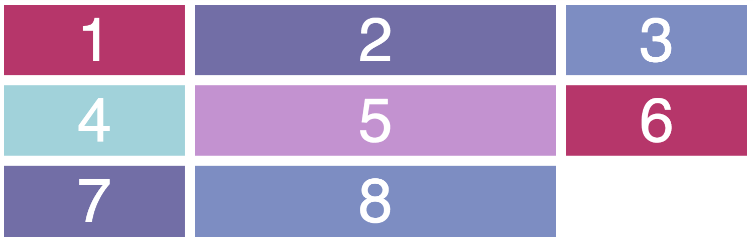
HTML
<div class="container">
    <div>1</div>
    <div>2</div>
    <div>3</div>
    <div>4</div>
    <div>5</div>
    <div>6</div>
    <div>7</div>
    <div>8</div>
</div>
CSS
* {
    font-family: Helvetica;
    font-size: 1.4em;
    color: white;
    text-align: center;
}

.container div:nth-child(1), div:nth-child(6) {
    background-color: #B8336A;
}

.container div:nth-child(2), div:nth-child(7) {
    background-color: #726DA8;
}

.container div:nth-child(3), div:nth-child(8) {
    background-color: #7D8CC4;
}

.container div:nth-child(4) {
    background-color: #A0D2DB;
}

.container div:nth-child(5) {
    background-color: #C490D1;
}
Setting up a basic grid
The first step for using CSS Grid is to set the display property of a container element to grid:
.container {
    display: grid;
}
There will be no immediate changes with this line of code. No magic grids appear! It's now time to actually set a custom grid ourselves.
Set the columns and rows of your grid using two properties:
grid-template-columnslets you set the number of columns and each of their widths.grid-template-rowslets you set the number of rows and each of their widths.
Let's start with columns.
Setting columns
Let's set 3 columns using the grid-template-columns property. Each column is 20% wide. The 20% is relative to the width of the containing element: in this case, the container div.
.container {
    display: grid;
    grid-template-columns: 20% 20% 20%;
}
Notice that we don't explicitly say "I want 3 columns!" The number of columns is set depending on how many widths you specified. If you specify 3 column widths, you'll get 3 columns. If you specify 10 column widths, you'll get 10 columns.
Setting rows
Now let's add rows using the grid-template-rows property:
.container {
    display: grid;
    grid-template-columns: 20% 20% 20%;
    grid-template-rows: 3em 1.6em 1.6em;
}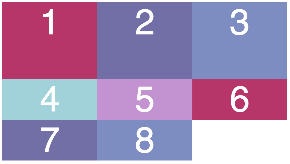
We now have 3 rows: the first is 3em tall, the second is 1.6em tall, and the third is 1.6em tall.
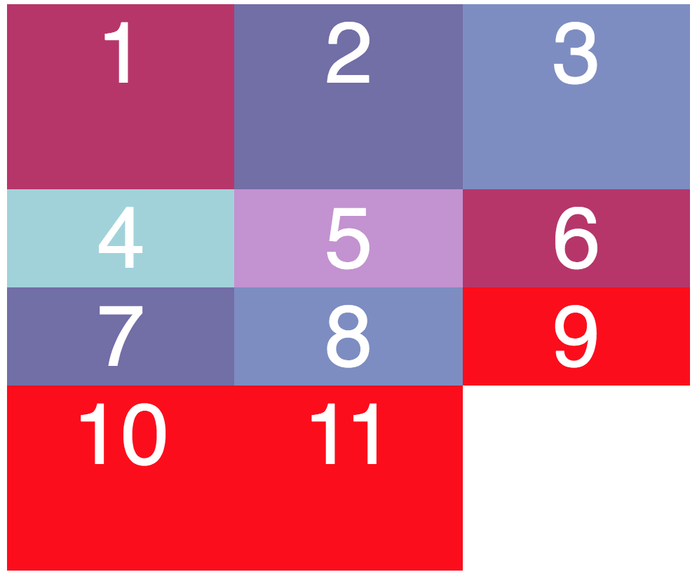
What if we add more blocks?
A fourth row would be created, and you'd have to modify your CSS code to add a height for that new row! Sometimes it's hard to know how many rows you'll have in advance. Setting row-by-row values is very limiting and inflexible.
That's why you can set a default row value that will apply for row numbers you haven't specified. This property is called grid-auto-rows .
Now, when I add 3 additional blocks (in bright red to help you see the difference), notice the fourth row that gets created has a default height of 3em. Even if I added enough content to fill 20 new rows, each new row would have a height of 3em! The other rows still keep their specified heights (1.6em) though.
.container {
    display: grid;
    grid-template-columns: 20% 20% 20%;
    grid-template-rows: 3em 1.6em 1.6em;
    grid-auto-rows: 3em;
}
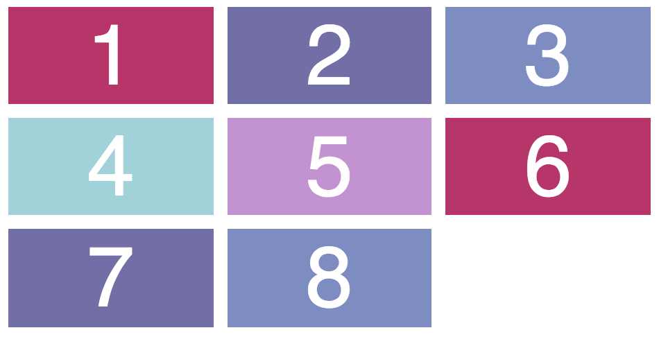
Grid gaps
In order to set gaps between your grid elements, use a simple property called grid-gap. Set one value if you want the gap to be the same between rows and columns. Otherwise, set two values (the first for the gap between rows, the second for the gap between columns).
.container {
    display: grid;
    grid-template-columns: 20% 20% 20%;
    grid-auto-rows: 1.6em;
    grid-gap: 10px;
}
Column and row measurements
You can set column and row values using the same units you've seen so far in this course like em/rem, percentages, and pixels.
However, there's another great unit will help you set grid measurements. It's called "Fraction unit", or fr for short. It's similar to percentages but more flexible.
Percentages can get complicated when combined with grid gaps. If you have 2 columns, each with a 50% width, you'd expect this to take up 100% of the viewport. However, adding any grid gap will make your container extend beyond the viewport. The percentages don't recalculate to factor the gap in.
This can be avoided by using fraction units instead of percentages.
Let's use a column example. The width of a "1fr" column will depend on the width of the containing element, similar to percentages. You don't need to do much math, though! If you set 1fr, 3 times, you'll have 3 equally wide columns:
.container {
    display: grid;
    grid-template-columns: 1fr 1fr 1fr;
    grid-template-rows: 3em 1.6em 1.6em;
    grid-auto-rows: 3em;
}
You could even set different measurements for each column. Say you wanted the middle column to be doubly as wide as the other two. Let fraction units handle the math for you!
.container {
    display: grid;
    grid-template-columns: 1fr 2fr 1fr;
    grid-template-rows: 3em 1.6em 1.6em;
    grid-auto-rows: 3em;
}
Your Turn
Columns and rows are the basis of any grid. Now that you know how to set their widths and heights, do a quick practice exercise, and then join me in the next chapter to learn a shortcut for setting grid measurements!
In style.css , find the rule set for.container (you'll see a code comment saying "Add grid rules here").
Set a display: grid; on the container element.
Set the following properties with values of your choice:
grid-template-columns(use the "fr" unit!)grid-template-rowsgrid-auto-rowsgrid-gap
And observe the results!
Recap
To use CSS grid, add the display property to your container element and set it to grid.
Set the columns and rows of your grid using
grid-template-columnsandgrid-template-rows.Set a default row value for all future rows via
grid-auto-rows.Use Fraction units or "fr" to size columns and rows to proportionate or equal values.
