Manually adjust elements' positions
In the past two course parts, you saw how to create layouts using new, powerful tools like CSS Grid and Flexbox. These tools didn't always exist, though. They're recent from the past few years.
Let's recap how an element's position is usually determined. An element will have a default display property whose value is either block , inline-block , or inline .
block-levelelements start on new lines and take up the full width available to theminlineelements take up only as much space as they need and do not start on new linesinline-blockelements can display side-by-side but still can have width and height properties, which regular inline elements cannot
Since these properties determine elements' positions, bear them in mind as we go further with layout properties.
Positioning
Even without using Flexbox or CSS Grid, you can adjust where an element appears on a page by using a property called position .
The position property's default value is static . This just means the element appears where it normally would in the flow of your HTML document. Additional possible positioning properties we'll explore include relative , absolute , and fixed positioning.
Relative positioning
The first alternative position property we will explore is relative positioning. Setting a position to relative means you can position it relative to where it would normally be.
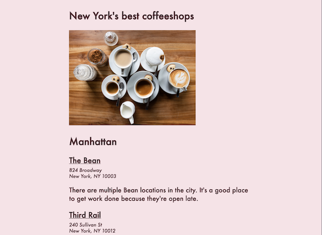
Let's explore positioning through the following example: the beginning of an article on New York's coffeeshops. The HTML and CSS behind this starter page are below the image:
HTML
<article>
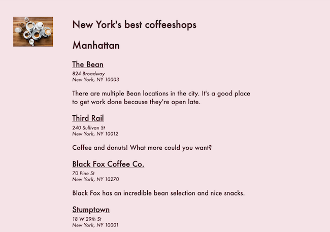
<h1>New York's best coffeeshops</h1>
<img src="https://images.unsplash.com/photo-1492158244976-29b84ba93025?ixlib=rb-0.3.5&q=85&fm=jpg&crop=entropy&cs=srgb&ixid=eyJhcHBfaWQiOjE0NTg5fQ&s=01425b0c3fb3f3b6bc9edbd38447ec72">
<h2>Manhattan</h2>
<h3>The Bean</h3>
<p class="address">
824 Broadway<br>
New York, NY 10003
</p>
<p>There are multiple Bean locations in the city. It's a good place to get work done because they're open late.</p>
<h3>Third Rail</h3>
<p class="address">
240 Sullivan St<br>
New York, NY 10012
</p>
<p>Coffee and donuts! What more could you want?</p>CSS
body {
  background-color: #F5E3E7;
  color: #4A262F;
  font-family: Futura;
  padding: 20px;
}

h3 {
  text-decoration: underline;
}

article {
  width: 60%;
  margin: 0px auto;
}

img {
  width: 70%;
}

.address {
  font-style: italic;
  font-size: 12px;
  margin-top: -15px;
}
We'll focus on the image element in particular. There are no custom position values on it right now, so by default, its value is static.
Setting a position value of relative doesn't change anything right away:
img {
    position: relative;
}
You must also supply the exact relative positioning values you want using top, bottom, right, and left in order to see a change. Setting top: 40px; and left: 30px will move the element 40px from the top of where it'd normally be and 30px from the left of where it'd normally be:
img {
    position: relative;
    top: 40px;
    left: 30px;
}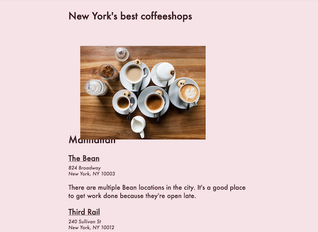
Notice that now the image overlaps with the "Manhattan" heading. Setting custom positioning values like this can be a little risky because your other elements don't automatically readjust themselves accordingly! That's why CSS Grid and Flexbox are so powerful: other elements usually adjust accordingly to the positions of the elements around them.
Absolute positioning
The second custom positioning value we'll explore is absolute positioning.
Absolutely positioned elements are set relative to their nearest explicitly positioned ancestor. If you haven't explicitly set any positioning values on previous elements, the absolutely positioned element will appear relative to the edges of the document. Define offset values for absolutely positioned elements the same way you would for relatively positioned elements: by defining top, bottom, left, or right values.
Let's change our coffee image to have an absolute position, offset by 10px from the top and 30px from the left:
img {
    position: absolute;
    top: 10px;
    left: 30px;
}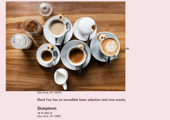
Notice that the image appears to have been visually removed from where it was before and is floating up in its own little world as if it weren't even in the article anymore! Its position is determined by the edges of the document since there are no other explicitly defined position values on preceding elements.
If you scroll down the page, the image stays exactly where it is. It does not scroll with the page. That's important to remember as we check out one last custom positioning value.
Fixed positioning
The last positioning value we'll see here is fixed positioning. This is similar to absolute and relative positioning in that you have to set top, bottom, left, and right values. However, an element with a fixed position will scroll with the page and will often be positioned relative to the entire viewport, except in a very specific subset of cases. It will always stay exactly where it is, visually, as the rest of the page scrolls normally. This can look goofy sometimes but can, in fact, be useful for elements you want to have displayed permanently on the side of a page, no matter whether the user is at the top or bottom of the page (like a digital assistant or chatbot option).
Let's reduce the size of the coffee image, move it to the top right of the page, and change its positioning to fixed:
img {
    width: 100px;
    position: fixed;
    top: 45px;
    left: 35px;
}
Now, if you were to scroll up and down this page, the coffee element would never move!
Recap
While setting positions using relative, absolute, or fixed values may seem like a straightforward idea, you'll sometimes find these solutions to be outdated. They are also easily broken. They don't respond to different screen sizes, meaning you need to hardcode the values you want in different media queries for different screen sizes. You'll rarely want the same positioning for an element on a desktop and on a mobile device.
Nonetheless, you'll see this kind of code in older code bases or in situations where there was no other option for positioning an element in a linear, grid-oriented way.
