Add breakpoints for responsive layouts
Right now, everything looks right as rain when you view our page in a desktop browser:
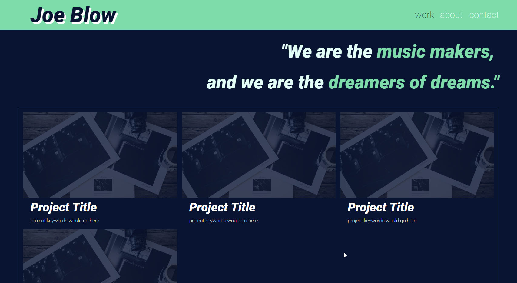
But it looks bad when you view it on a mobile device!
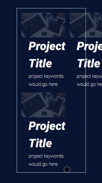
Ooof...😬 It looks awful on mobile devices because our page isn’t yet responsive; the layout stays the same no matter the screen resolution. To make our site display properly on different devices, we need to implement what are called media queries.
Media queries tell the browser to use an alternative ruleset if certain circumstances are true, such as whether the medium is a screen or for print, or if the browser resolution is that of a large monitor or tiny cell phone. To execute a media query, you deploy the CSS @media rule, followed by the query list and a set of curly braces to contain the alternative rulesets:
@media (max-width: 599px) {

}
With this media query, the browser will apply whatever rulesets you place within the curly braces if the browser width is less than 600 pixels.
The resolutions that you use for media queries are referred to as breakpoints; they’re the limits for screen resolution-specific rulesets to be applied. In this case, we’ve created a media query with a breakpoint that will apply rulesets specifically tailored to mobile screens.
The standard CSS syntax for for media queries is to place a selector and its ruleset within the queries curly braces. When the screen resolution matches the breakpoint, it's ruleset will override the default's:
@media (max-width: 599px) {
.proj-grid {
grid-template-columns: 1fr;
}
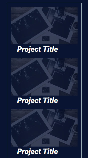
}We've used the breakpoint to change the layout of the project preview grid on our work page to look better on mobile. On the desktop version, it's three columns wide, no matter the resolution of the window. But for mobile, we've put all of the project previews to be in a single column. Now that section of our site is much easier to read on a mobile screen:
We’re on our way to making our site mobile-friendly! And I have a hunch that this whole smartphone thing might be more than just a trend, so that’s a good thing. 😉 But having to place the selectors within the media query means that they won’t be part of their nested BEM blocks. This makes things harder to find, maintain, and more work to write.
Luckily, Sass, as always, is there to make your life easier. It’s getting hard to imagine writing CSS with a preprocessor, right?
Breakpoints done sassily
Where standard CSS media queries require you to place the selectors within the query, Sass lets you put media queries within selectors:
.proj-grid {
    display: grid;
    grid-template-columns: repeat(3, 1fr);
    @media (max-width: 599px) {
        grid-template-columns: 1fr;
    }
}
Rather than having to split things up, the media query and its rules are neatly nested in its BEM block, making it easier to find and therefore read and update. When Sass compiles media queries, it looks to see which selector it’s nested within, and renders a standard media query with the selector nested inside:
.proj-grid {
  display: grid;
  grid-template-columns: repeat(3, 1fr);
}

@media (max-width: 599px) {
  .proj-grid {
    grid-template-columns: 1fr;
  }
}
While Sass helps with media queries right out of the box, you can leverage the Sass tools we’ve already covered to to make it more maintainable and easier to write.
Try it out for yourself!
Let’s take a look at a wireframe mockup of a page, where we have an image block, summary block, and text block. The image and summary blocks share a row, where the image take up 60% of the width and the summary occupies the remaining space via the flex-grow property. Below those blocks sits the the text, which occupies 100% of the width.
It looks fine on a large monitor. But if we take the browser window and scale it down to a more mobile-size width, things start looking a bit funky. The summary wraps to its own line, which is what we want, but the image still only occupies 60% of the width, which isn’t what we want. To fix the layout for mobile, let’s use a media query to change the image width to 100% when the browser is less than 600px wide in this interactive exercise:
Create a media query within the
.article__imageselector via the@mediakeyword.Set the query to be the
max-widthproperty with a value of599pxAfter the query list place a set of curly brackets:
{ }Inside of the curly brackets, place the properties that we want applied when the width of the browser window is
599pxor less, which is to set thewidthto100%
Review the rendered page. Resize it and ensure that the image changes relative width when the browser is less than 600px wide. Check the solution on this CodePen.
Even Sassier breakpoints
To make things a bit more maintainable, let’s create a $breakpoints map to store our breakpoints in. Let’s add our mobile breakpoint value while we’re at it:
$breakpoints: (
    mobile: 599px
);
Writing out@media screen and (max-width: map-get($breakpoints, mobile) each time you need to use a media query strikes me as a bit long-winded. Let’s use a Sass mixin to abstract away all of that verbose syntax, and create something more semantic:
@mixin mobile-only {
    @media screen and (max-width: map-get($breakpoints, mobile)){
        grid-template-columns: 1fr;
    }
}
By naming the mixin mobile-only, you know at a glance that the rules it contains will only be applied to mobile resolutions, and it’s easier to remember and type out as well. Within the mixin, we've moved the mobile version of the project preview grid-template-columns rule.
So let's plug our mobile-only mixin into the.proj-prev block:
@mixin mobile-only {
    @media screen and (max-width: map-get($breakpoints, mobile)){
        grid-template-columns: 1fr;
    }
}

.proj-grid {
    display: grid;
    grid-template-columns: repeat(3, 1fr);
    @include mobile-only;
}
That's a lot cleaner to look at! And when you check out the compiled CSS, you see a media query for resolutions under 600px with a ruleset for the .proj-prev block, just like before:
.proj-grid {
  display: grid;
  grid-template-columns: repeat(3, 1fr);
}
@media screen and (max-width: 599px) {
  .proj-grid {
    grid-template-columns: 1fr;
  }
}
Perfect!
Except that we can only really use the mixin this one time. It’s pretty useless for just about any other situation; its ruleset is specific to the layout of the .proj-prev block’s grid, and is hard coded into the mixin. That means we’ll have to write a whole new mixin for each of our media queries. And that seems like far more trouble than it’s worth. Maybe Sass isn’t so great after all!
😎 Of course, Sass has a better way to do it. It’s Sass after all!
The @content directive
Rather than having to hard code the content of a mixin, Sass gives the option of deploying the@content directive instead.
@mixin mobile-only {
    @media screen and (max-width: map-get($breakpoints, mobile)){
        @content;
    }
}
When Sass compiles instances of the mixin, it will replace @content with whatever code you place inside of the instance of the mixin.
And just how do we add content to an instance of a mixin? 🤔
When using the @content directive, you can add a set of curly braces to instances of the mixin to contain the content:
@mixin mobile-only {
    @media screen and (max-width: map-get($breakpoints, mobile)){
        @content;
    }
}

.proj-grid {
    display: grid;
    grid-template-columns: repeat(3, 1fr);
    @include mobile-only{
        grid-template-columns: 1fr;
    }
}
Now Sass will replace @content with grid-template-columns: 1fr when it compiles:
.proj-grid {
  display: grid;
  grid-template-columns: repeat(3, 1fr);
}
@media screen and (max-width: 599px) {
  .proj-grid {
    grid-template-columns: 1fr;
  }
}
In essence,@content is a placeholder for code that will be swapped in at compile time on an instance by instance basis. By implementing it, we’ve created a highly flexible but succinct mixin for our media queries.
We can now use our mobile-only mixin throughout the site to style it for mobile devices. Let's use it to adjust thefont-size of the .quote block while we're at it:
| |
Sass has given us the tools to create responsive and graphically consistent websites with clean, maintainable CSS, all while reducing the amount of tedious and repetitive code that we need to write.
Try it out for yourself!
We’ve fixed the image width of our articles using a breakpoint, but there’s more that we can do to fix the responsiveness of our article wireframe. The article itself is a good place to start. On the desktop, it has a width of 75%, but, just like the image, we’d like it to occupy the full width of the container on a mobile screen. And let’s make the summary font size a bit bigger while we’re at it.
We could create another media query, but a DRY-er way of doing things would be to port the media query we made for the image width into a mixin, using Sass’ @content directive to make it more versatile and reusable. In this interactive exercise:
Create a mixin named
mobile-onlyCut the media query from the
.article__selectorand paste it inside of themobile-onlymixinReplace the
widthproperty with the Sass@contentdirectiveInclude the mobile-only mixin within the
.article__selector, using a set of curly braces to include the rules that we want placed within the mixin’s media query:width: 100%;Do the same for the
.articleselector, setting it’swidthto100%as well.Include the
mobile-onlymixin within the.article__summarymixin, setting thefont-sizeto1.5rem
Review the rendered page. When the browser is scaled down to a mobile-size width, the article block should occupy 100% of the width of the window, as should the image. The summary font size should increase 50% to 1.5rem. Check your solution with this CodePen.
Coming up next, we’ll put the cherry on top by automatically adding vendor prefixes to our compiled CSS, ensuring our site displays properly across the major browsers.
Let's recap!
Media queries allow you to adapt context to different screens by telling the browser to use an alternative ruleset if certain circumstances are true.
To execute a media query, deploy the CSS
@mediarule, followed by the query list, and a set of curly braces containing the necessary alternative rulesets.Breakpoints are the resolutions that you use for media queries.
In Sass, you can put media queries within selectors, which allows you to nest them in the appropriate BEM block.
Use
@contentas a code placeholder for specific media queries.
