Use BEM selectors with SASS
Keeping things flat
Let's apply what you've learned about nesting in Sass to BEM methodology. If you implement BEM selectors using nesting in Sass to create a block and a block__element , you might come up with something like this:
.block{
    background-color: #15DEA5;
    .block__element {
        color: #fff;
    }
}
Which yields this CSS:
.block {
    background-color: #15DEA5;
}
.block .block__element {
    color: #fff;
}
You end up with a block selector with a specificity of 0/0/1/0, and a block__element selector with a specificity of 0/0/2/0. It’s not ideal, but everything will work as you expect it, as there are no conflicting rules.
But, let’s say you then needed to create a variation of your block__element , changing its background color. This means creating a block__element--modifier selector, but since you’ve elevated the specificity of your element, you must also make sure that you are increasing your modifiers by at least as much, or they will fail to have any effect.
| |
Having inconsistencies in specificity between selectors will create bugs and unpredictable behavior. Modifiers and elements of varying degrees of specificity can be mismatched, preventing desired overrides from occurring where you intended, or causing overrides where you didn't.
So, what you need is a way to nest in Sass without messing up the principles of BEM. Remember nesting with ampersands? When you nest with an ampersand, it joins the parent and child together in the compiled CSS. But the child doesn’t have to be a selector; it can be plain old text as well!
In our nest for block__element , let’s replace the “block” part with an ampersand:
.block{
    background-color: #15DEA5;
    &__element {
        color: #fff;
    }
}
The result is a BEM element selector identical in manner to the element selectors we wrote manually in chapter three, but with the added bonus of only having to write “block” once, and having the awesome structure and grouping that Sass provides.
.block {
    background-color: #15DEA5;
}
.block__element {
    color: #fff;
}
Now we have an element selector with the flat specificity of 0/0/1/0, just like we wanted.
Have cake? 🍰 Check. ✅ Eating cake?🍴Also check. ✅
Now, let’s go back to that block__element--modifier and re-create it using the same principles that used to create the block__element :
.block{
    background-color: #15DEA5;
    &__element {
        color: #fff;
            &--modifier {
                background-color: #001534;
    }
    }
}
And we get compiled CSS that is exactly what we were hoping for:
.block {
    background-color: #15DEA5;
}

.block__element {
    color: #fff;
}
.block__element--modifier {
    background-color: #001534;
}
Try it out for yourself!
Let’s revisit the Puppy Cuteness Poll that we BEM-ized a few exercises back. Now that we’ve unleashed the raw power of Sass nesting, and learned to focus it with the ampersand, let’s refactor our poll components to fit within a Sass nest, while retaining their flat specificity. In this interactive exercise:
Nest the element and modifier selectors within the
.pollblockUpdate each selector’s name, replacing the block prefix with the ampersand symbol:
&Review the rendered HTML to make sure we didn’t break anything along the way.
When you're ready, check your answer with this CodePen!
You’ve created proper BEM selectors utilizing the clean structure of Sass, which will help you keep your code organized and simple to update. Plus, you’ve saved yourself from typing the block name over, and over, and over again.
This could save a lot of future wrist pain! 🙌 And all of your selectors have the lowest of lows for specificity: 0/0/1/0!
I know, I can see you rolling your eyes from here. 🙄 Flat specificity. Low specificity, I’m obsessed. 🤓 Maybe...
But there’s a reason for it. Just as with everything else in life, there’s a time, and a place for everything.
Save specificity for when you need it
Just because we have avoided increasing specificity until now doesn’t mean that we never will. It's not inherently bad, and there’s a time and place to use it. By keeping specificity to a minimum, it makes it much more straightforward to create a modifier that will override desired properties.
Let’s say we’ve made a button with a solid background, as well as a modified button that has a transparent background and solid border, like this:
.btn {
    display: inline-block;
    margin: 0 auto;
    background: #15DEA5;
    padding: 1rem;
    &--outline {
        background: transparent;
        border: 2px solid #15DEA5;
    }
}
To represent a disable button, you need to turn it grey, which means creating another modifier. In the case of the standard button, that would mean a grey background color, and, for the outlined button, a grey border color. Now, you could create two new modifiers, one for each button, but that means more selector names to remember, not to mention it'll clutter up your code.
You know what would make this a whole lot simpler? You guessed it: increasing our specificity!
We’ll write out two new modifiers, one for each instance of the button, but we’ll use the same name for both. To differentiate them, we’ll rely on nesting in Sass to create selectors specific to each type of button.
.btn {
    display: inline-block;
    margin: 0 auto;
    background: #15DEA5;
    padding: 1rem;
    &--disabled {
        background: grey;
    }
    &--outline {
        background: transparent;
        border: 2px solid #15DEA5;
        &.btn--disabled{
            border: 2px solid grey;
        }
    }
}
We’re using the ampersand to create two separate selectors. The first is a standard modifier, .btn--disabled, which will override the background color on .btn, turning it grey. The second is a selector with two classes, .btn--outline, and .btn--disabled, meaning that both classes must be applied to have the contained rules to take effect and change the border to grey.
.btn {
    display: inline-block;
    margin: 0 auto;
    background: #15DEA5;
    padding: 1rem;
}
.btn--disabled {
    background: grey;
}
.btn--outline {
    background: transparent;
    border: 2px solid #15DEA5;
}
.btn--outline.btn--disabled {
    border: 2px solid grey;
}
You end up with four separate selectors:
The button:
.btnThe modifier to outline the button:
.btn--outlineThe modifier to turn the button grey:
.btn-disabledThe modifier to turn the outlined button grey:
.btn--outline.btn--disabled
Technically, selector #4 has a specificity of two, but .btn--disabled also works without .btn--outline , making it a modular, reusable system, where you can add or remove the class and have the element behave as we'd expect.
Try it out for yourself!
In this interactive exercise, we have a standard button, which is styled by the .btn class, which features a mint-green background-color. We also have a modified button, with a transparent background and mint-green border and font color, created through the .btn--outline modifier.
Now we want to make a color variant on those buttons, where .btn--pink sets the background of .btn to a pink color. And when we use also want to make an alternative to .btn--outline where the the border and font color are pink, rather than the stock mint-green. But we don’t want to create an entirely separate modifier that creates both the outline aesthetic of the button, as well as the pink hue.
Instead we want to add .btn--pink to an element that already has a class of .btn--outline, and have it be both outlined AND pink:
Use nesting and the ampersand to create a
.btn--pinkmodifierChange the background color of
.btn--pinkto#EA526FWithin the
.btn--outlinebranch of the.btnblock, nest a new selector, using the ampersand to join it with.btn--pinkWithin
.btn--outline.btn--pinkchange the border color and font color to#EA526F
Review the resulting HTML. There should be one solid mint-green button, one outlined mint-green button, one solid pink button, and one outlined pink button. Check your answer with this CodePen!
Put your specific selectors into HTML
Let’s put these selectors to use by integrating them into some HTML. First, let’s create two buttons: solid and outlined:
<div class="container">
<div class="btn">Solid Button</div>
<div class="btn btn--outline">Outline Button</div>
</div>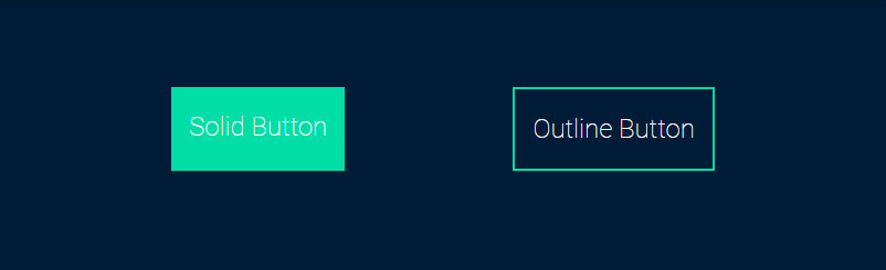
And now let’s disable both of them by applying our remaining two selectors:
<div class="container">
<div class="btn btn--disabled">Solid Button</div>
<div class="btn btn--outline btn--disabled">Outline Button</div>
</div>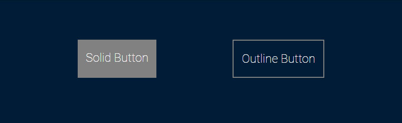
Let’s say you decide that you want your first button to be outlined like the second. All you need to do is apply the outline modifier:
<div class="container">
<div class="btn btn--disabled btn--outline">Solid Button</div>
<div class="btn btn--outline btn--disabled">Outline Button</div>
</div>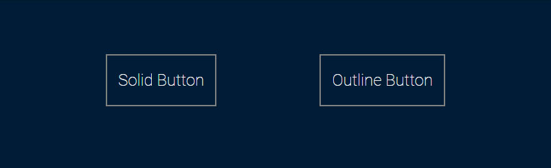
Thanks to the heightened specificity of the outlined/disabled combo, adding the same class in two situations produces two separate, but predictable results. You don't need to worry about remembering a bunch of overly specific selectors. Or worry that if you remove a modifier, another will act unpredictably.
By using heightened specificity only where appropriate, you can create a selector system that is not only clean and maintainable, but also stable and predictable.
Let's recap!
Don’t worry if your brain just melted a bit. That means that you’re learning. And not just some casual learning. We’ve plugged your brain into the matrix and you’ve downloaded the CSS equivalent of Kung fu.
Focus instead on the key takeaways:
Inconsistencies in specificity between selectors will create bugs and unpredictable behavior.
Use ampersands to nest effectively in Sass, without messing up BEM principles.
Use nesting and specificity to create a maintainable selector system in Sass.
Now, let's check everything you've learned in the end of part quiz! Once you're done reviewing, I'll meet you in the next part and we'll get a whole bunch more ninja Sass moves.
