Understand the Purpose of Bivariate Analysis
You are now capable of analyzing all of the variables sequentially, one after the other. Bravo, you are an expert at univariate analysis!
I’ve analyzed all of the variables! It’s all good! So why are there still chapters remaining in this course? :o
Sorry: it’s not over. In this Part, we are going to analyze the relationships between variables. This is known as bivariate analysis. Some chapters will require you to really put in some effort. But if you’ve made it this far, you shouldn’t have anything to worry about. And starting now, analyzing your account statements is going to get really interesting!
Why Do We Need Bivariate Analyses?
Why should we analyze the relationships between variables?
Here’s a little illustration. Say you work for an e-commerce website. You have access to the site’s customer database and browsing data. The browsing data tell you which customer consulted which page on the site, how much time he or she spent there, etc. To assist in creating a recommendation algorithm (for suggesting new products to customers), you decide to conduct a little preliminary study.
Using the browsing data, you select a sample of customers who often check out the latest folk music albums. You decide to determine how interested they might be in the latest album by a popular singer, modeling this interest using a score of 0 to 10 on a continuous scale. If a given customer has never visited the page for this new album, you assign her an intermediate score of 5. If she has often visited the page, spent a lot of time there, and even ended up buying the album, you assign her a score of 10. If, on the other hand, the customer visited the page, didn’t spend much time there, and didn’t buy the album the last time she ordered something from the website, it’s likely that this customer doesn’t like the new album. So you assign her a score of 0.
You know the age of each customer. So you gather a customer sample defined by two variables: age and level of interest.
You analyze these two variables separately, using histograms:
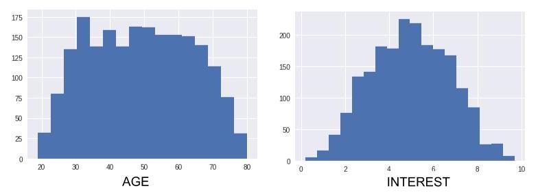
These histograms show that ages are fairly evenly distributed over the sample, which contains approximately the same number of younger people as older people. With respect interest, there are also about as many people who are interested in the new album as there are people who show no interest in it.
Okay. It’s good to know these things but, as we will soon see, we can do much better!
Now let’s plot the individuals of our sample on a two-dimensional graph. Each point on the graph represents a person. The position of each point is determined by two axes: horizontal and vertical. The values represented on the horizontal axis are numbers. If an individual’s number is high, the point will be far to the right on the graph, but if it is close to 0, it will be far to the left. The values represented on the vertical axis are also numbers: if an individual’s number is high, the point will be very high on the graph, but if it is close to 0, it will be very low.
Here, we are representing the age variable on the horizontal axis and the level of interest variable on the vertical axis. A point located on the upper right will therefore represent a somewhat older person who is very interested in the new album. A point on the lower left will represent a younger person who doesn’t like the album.
Here are two extreme examples:
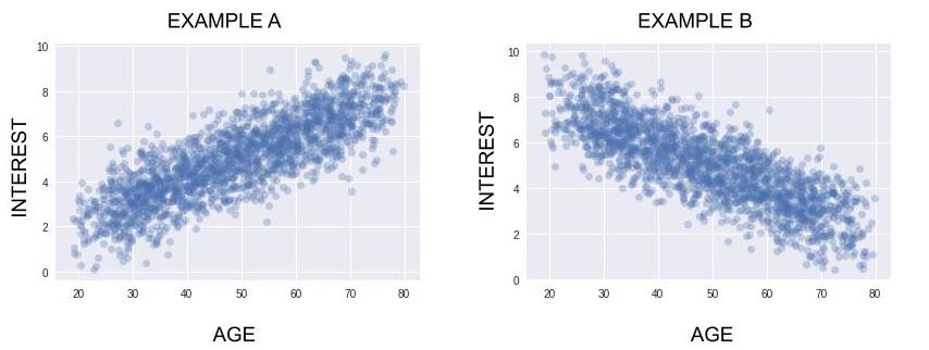
In Example A, a lot of older people like this new album, and a lot of younger people don’t like it. So your algorithm should recommend this new album to people who are somewhat older, and it should not recommend it to people who are younger (it’s better to recommend products to people who are predisposed to like them).
In Example B, the opposite is true. The album should be recommended to younger people and not to older people.
As I’m sure you’ve realized, in general we get a lot more information from analyzing the relationship between two variables than by analyzing them separately! Without this bivariate analysis, you would not know who should receive the recommendations (or not receive them) for this album!
Take It Further: Another Example
Another example: Let’s say that a famous online training website publishes courses that require students to take quizzes (sounds familiar? ;)).
To pass a quiz, students must get 70% of the questions right. So, on a quiz of 8 questions, students must answer at least 6 questions correctly in order to pass. The sample of students who have taken the quiz has 8 variables (each question is a variable). They are all binary (right answer /wrong answer).
For one of the quizzes in the course, these 8 variables are represented below:
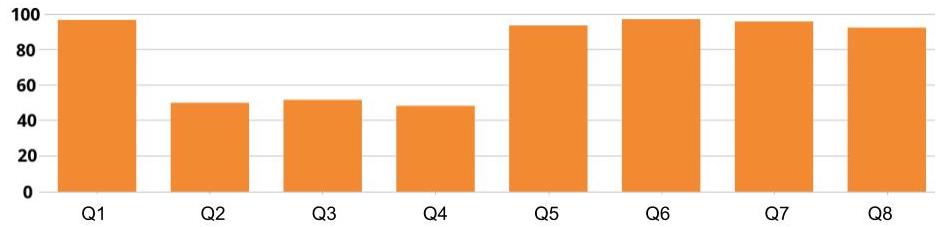
Five questions of the 8 have a success rate of close to 100%. The other three questions have a success rate of close to 50%. This graph represents eight univariate analyses. But we need to analyze the relationships between these variables.
That’s right: of the 50% of students who missed question 2, I don’t know how many got question 3 right, and that’s a problem because:
If the 50% of students who missed question 2, the 50% who missed question 3, and the 50% who missed question 4 are all the same students, it means that a total of 50% of students failed the test (each with three wrong answers). In this case, the overall pass rate for the test would be 50%, and we would need to simplify the wording of the quiz.
However, if the 50% of students who missed question 2 are among the 50% who got question 3 right, then these students probably all passed the quiz (because, no matter how they answered question 4, they will almost all have an overall score of 6/8 or 7/8). In this case, the overall pass rate for the quiz would be close to 100%, which is an excellent pass rate!
