Align items and justify content
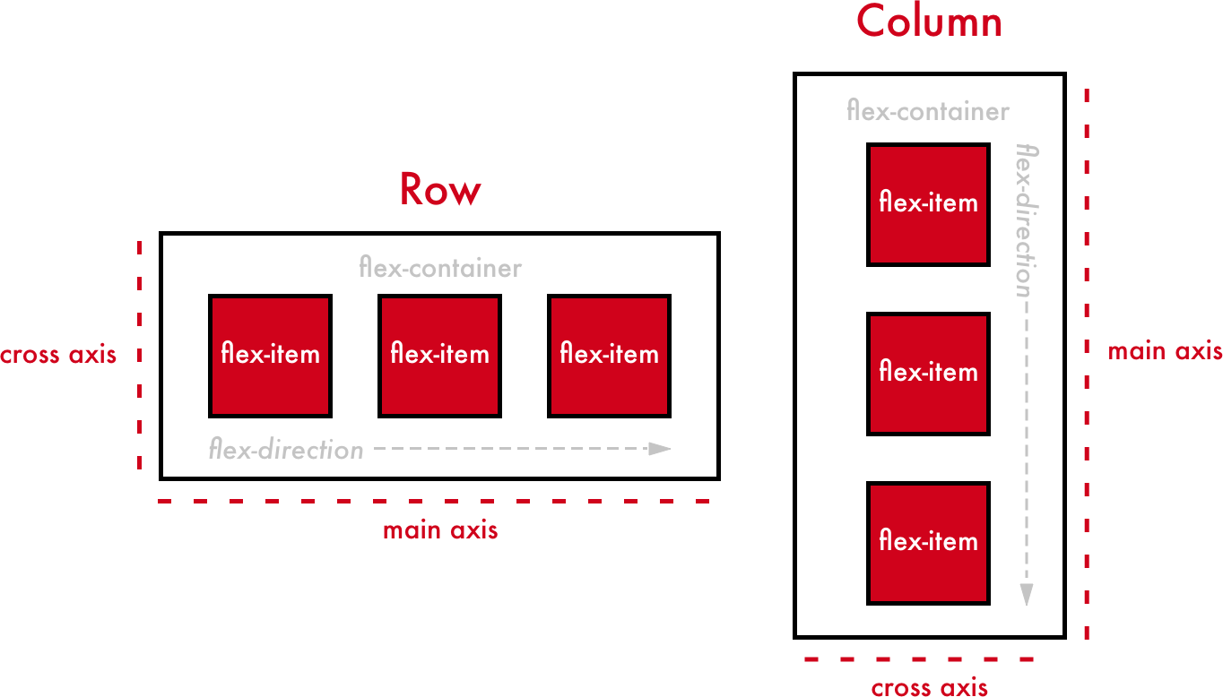
Items in Flexbox are arranged horizontally or vertically depending on whether you specify row or column for your flex-direction. This "main" direction is what we call the flex items' main axis. The perpendicular direction is therefore the cross axis.
If the elements are arranged horizontally in a row (or rows), the main axis is horizontal, and the cross axis is vertical.
If the elements are arranged vertically in a column (or columns), the main axis is vertical, and the cross axis is horizontal.

Alignment along the main axis
We'll start with elements that are aligned horizontally because that's the case by default. To change their alignment, use justify-content , which can accept the following values:
flex-start: aligned at the start of the containerflex-end: aligned at the end of the containercenter: aligned in the center of the containerspace-between: elements are spread out along the axis (there's space between each)space-around: elements are spread out along the axis, but there's also space around the edges
For example:
.container {
    display: flex;
    justify-content: space-around;
}
How about we test out each value to see what happens?
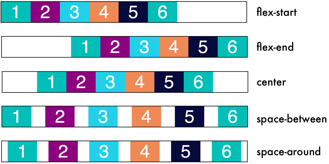
Do you see how the elements align differently depending on the value of justify-content? With one simple property, we can intelligently align elements the way we want.
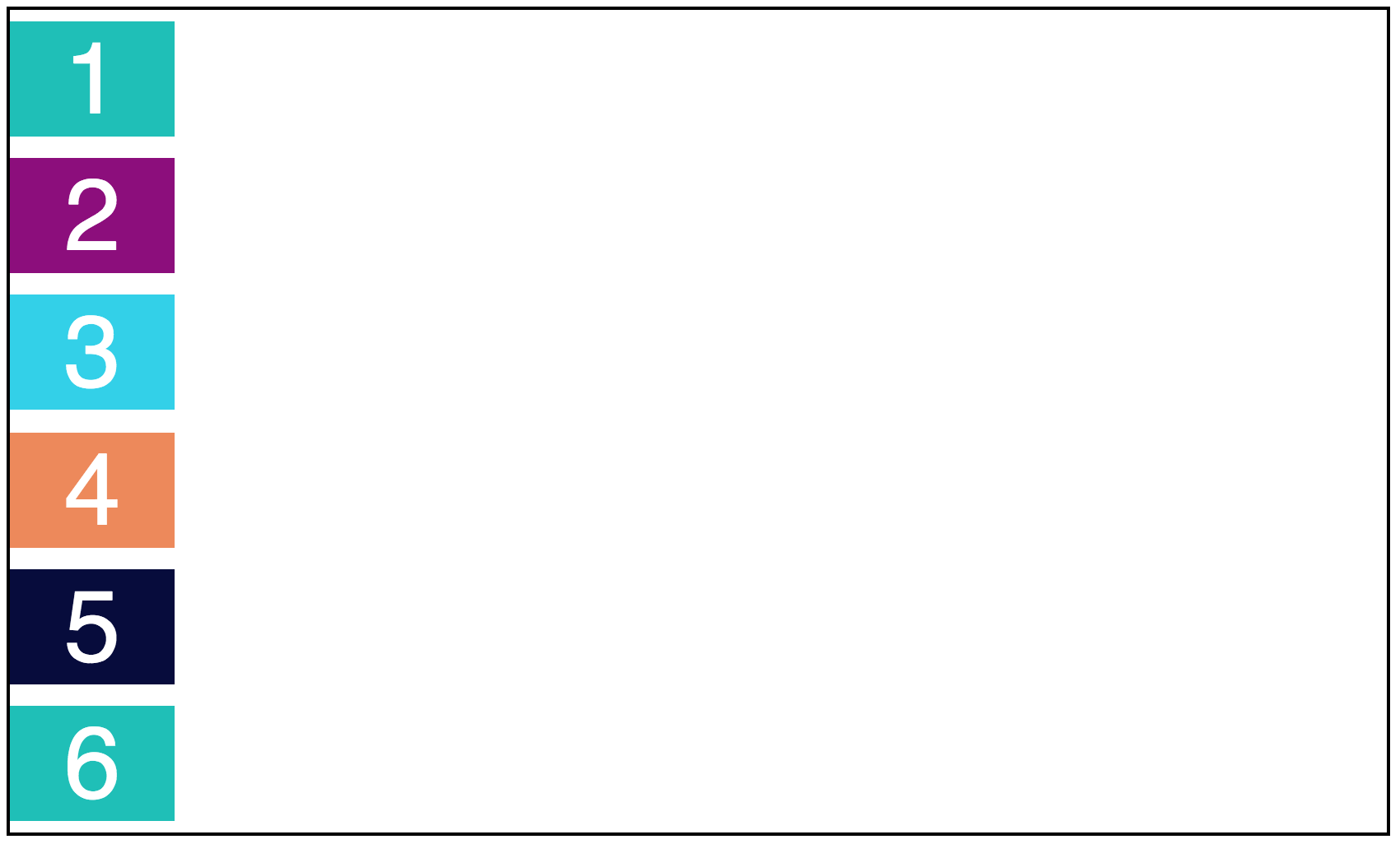
While this may seem more intuitive for rows, the same justify-content property can be applied to Flexbox columns too! For example, check out how space-around presents on a column:
.container {
    display: flex;
    justify-content: space-around;
}
Alignment along the cross axis
This is where Flexbox gets a little...trippy.
When we talk about aligning items along the cross axis, the direction that cross direction goes depends on the flex-direction. Let's check out the same illustration we saw at the beginning of the chapter:
Remember:
If the elements are arranged horizontally in a row (or rows), the main axis is horizontal, and the cross axis is vertical.
If the elements are arranged vertically in a column (or columns), the main axis is vertical, and the cross axis is horizontal.
With the align-items property, we can change element alignment along the cross axis. align-items can take the following properties:
stretch: the elements are stretched out along the whole cross axis (this is the default value)flex-start: aligned at the start of the containerflex-end: aligned at the end of the containercenter: aligned in the center of the containerbaseline: aligned along the baseline of the cross axis of containers
.container
    { display: flex;
    justify-content: center;
    align-items: center;
}
Aligning items in the center (and justifying the content in the center) means we have both horizontally AND vertically centered content! Whoa! Vertical centering is especially tough in CSS, but Flexbox gives you a way to do it easily. Here's the result:
Aligning one item
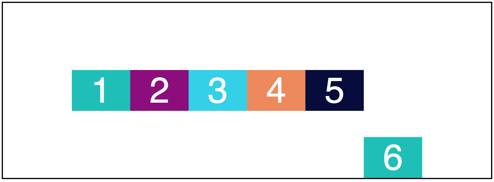
You can even align one single element instead of the whole group using the align-self property. Let's align the last item in our group to the end of the cross-axis:
.container div:nth-child(6) {
    align-self: flex-end;
}
Your turn
Take alignment and content justification for a spin yourself in this interactive exercise!
In
style.css, find thedivwith a class ofcontainer.Align items along the main axis (
justify-content) using the value of your choice. It could beflex-start,flex-end,center,space-between, orspace-around.Align items along the cross axis (
align-items) using the value of your choice. It could bestretch,flex-start,flex-end,center, orbaseline.
Recap
For horizontal arrangements (rows): the main axis is horizontal, and the cross axis is vertical.
For vertical arrangements (columns): the main axis is vertical, and the cross axis is horizontal.
Use
justify-contentto align along the main axis.Use
align-itemsto align along the cross axis.Use
align-selfto align a single element.
