Set flex direction and wrapping
In the last chapter, you learned three fundamental Flexbox properties. In this chapter, we'll put them into practice in actual code.
Here's the starter code for the example we'll be using in the following chapters.
HTML
<div class="container">
    <div class="item">1</div>
    <div class="item">2</div>
    <div class="item">3</div>
    <div class="item">4</div>
    <div class="item">5</div>
    <div class="item">6</div>
</div>
CSS
* {
font-family: Helvetica;
font-size: 1.4em;
color: white;
text-align: center;
}
.container {
border: 2px solid black;
}
.item {
width: 100px;
height: 70px;
}
.container div:nth-child(1), div:nth-child(6) {
background-color: #00BFB8;
}
.container div:nth-child(2), div:nth-child(7) {
background-color: #8E007E;
}
.container div:nth-child(3), div:nth-child(8) {
background-color: #23D0EA;
}
.container div:nth-child(4) {
background-color: #EF8956;
}
.container div:nth-child(5) {
background-color: #060A3D;
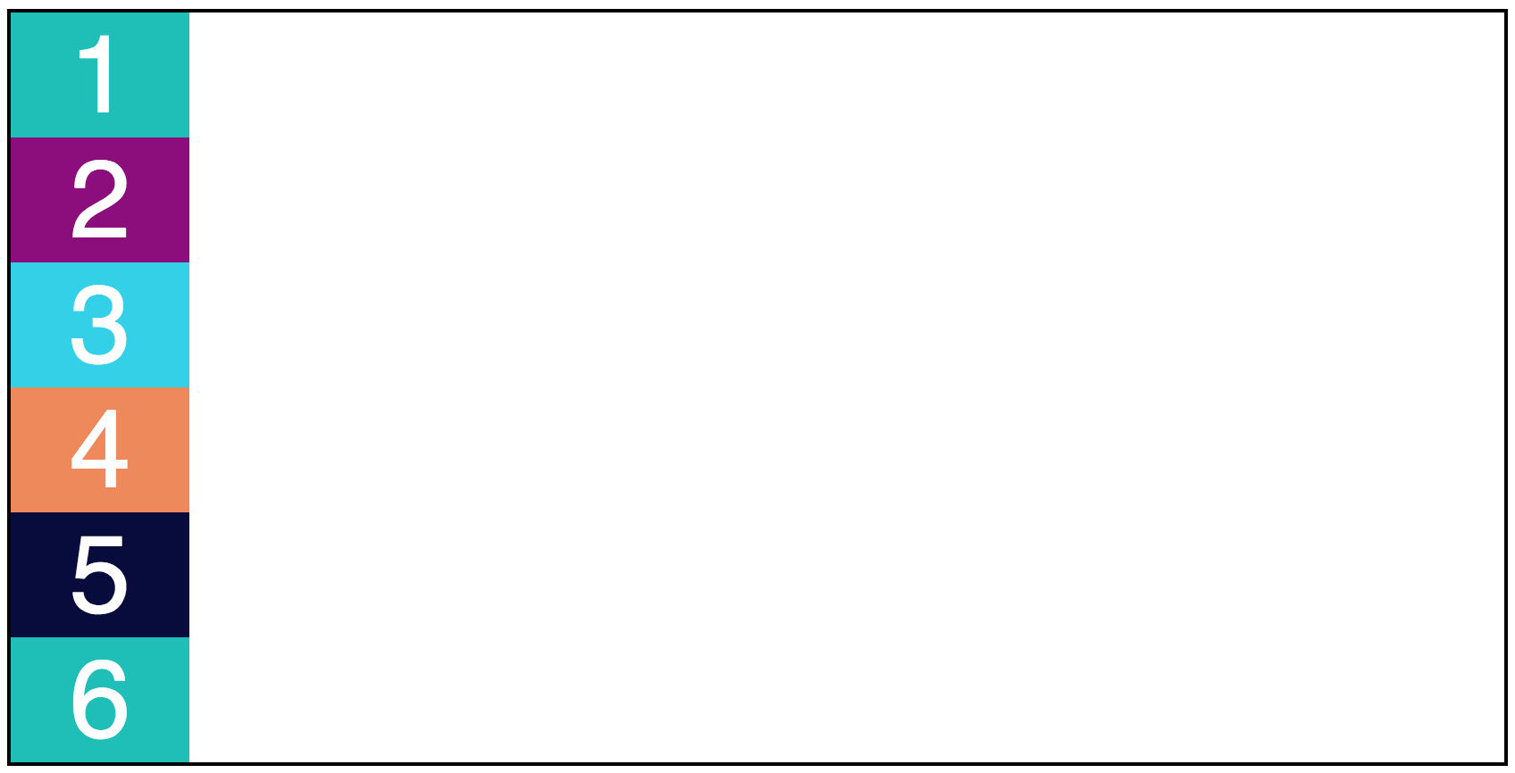
}There is a container div that contains 6 items. To be as clear as possible, each item has a class of item. Each is also 100px wide and 70px tall with a different background color.
There is also a black border around the containing div. This will help you visualize the relationship between the flex items and the flex container.
Adding Flexbox
Adding Flexbox capability to an element is easy! The one simple line of code to remember is display: flex;. This goes on your container element:
.container {
    display: flex;
}
Immediately, your elements will float up into a row inside the container!
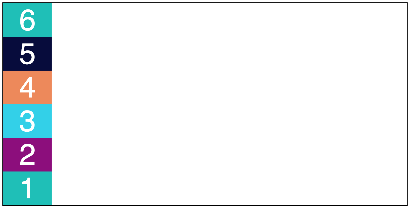
Let's jump right into the next property: flex-direction . This lets you add elements in a row or column.
flex-direction has four possible values:
row(elements from left to right)row-reverse(elements from right to left)column(elements from top to bottom)column-reverse(elements from bottom to top)
.container {
    display: flex;
    flex-direction: row;
}
.container {
    display: flex;
    flex-direction: row-reverse;
}
.container {
    display: flex;
    flex-direction: column;
}
.container {
    display: flex;
    flex-direction: column-reverse;
}
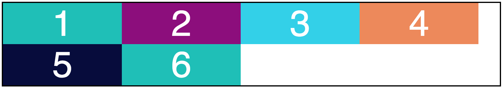
Wrapping
Sometimes, your elements will be too large for your containing element. I'll update the width of our items from 100px to 200px to make this the case:
.item {
    width: 200px;
    height: 70px;
}
However, the elements won't actually be 200px wide; they're only 139.328px wide, in reality. There's not enough space for them in the container. That's because we've defined "row" in Flexbox, which means only one row. The elements don't have the ability to wrap into multiple rows if they're too wide.
That's why the next Flexbox property to explore is flex-wrap. It can take three specified values:
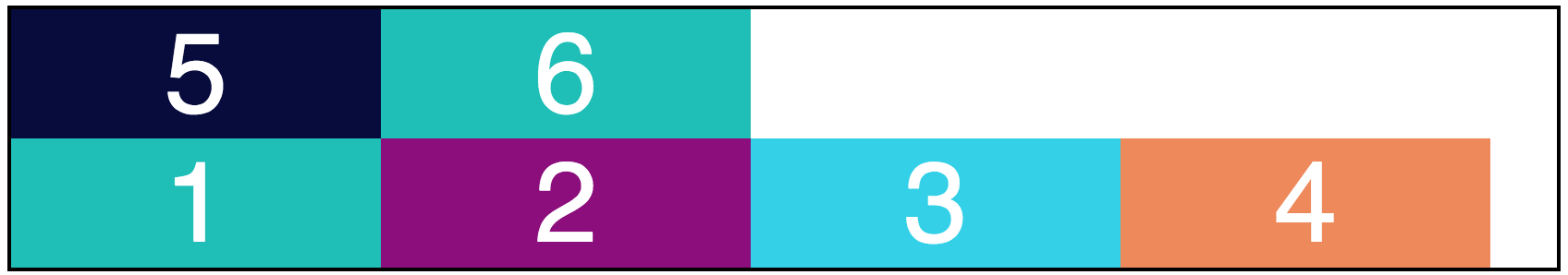
wrap: the flex items can take up multiple lines as needed, whether they're arranged in rows or columns.nowrap: the flex items cannot take up multiple lines. They'll all cram into either one row or column.wrap-reverse: the flex items can take up multiple lines as needed but are displayed in reverse (see the example below to make sense of this).
.container {
    display: flex;
    flex-direction: row;
    flex-wrap: wrap;
}
.container {
    display: flex;
    flex-direction: row;
    flex-wrap: wrap-reverse;
}
Combine direction and wrapping
You can combine both direction and wrapping into one property called flex-flow . The first value should be the direction. The second should be the wrapping. Therefore:
.container {
    display: flex;
    flex-direction: row;
    flex-wrap: wrap;
}

/* becomes */

.container {
    display: flex;
    flex-flow: row wrap;
}
Your Turn
In the following interactive exercise, set up code that uses Flexbox. You'll also set a direction and wrapping preference for your elements. These properties will be the base for everything that comes next!
In
style.css, find thedivwith a class ofcontainer. For now, its only CSS rule involves setting a black border.Set the container's display to flex in order to enable Flexbox (
display: flex;).Set its
flex-directiontorow(flex-direction: row;).Now, set its
flex-directiontorow-reverse.
Check your changes, and feel free to play around with your Flexbox's settings!
Recap
To add Flexbox capability, use the property
displayand set it toflex.Use
flex-directionto add elements in a row or column and set it to one of four values:row,row-reverse,column, orcolumn-reverse.Use
flex-wrapto ensure that elements take up the space they need. It can be set towrap,nowrap, orwrap-reverse.Use
flex-flowto combine direction and wrapping.
