Set columns depending on screen size
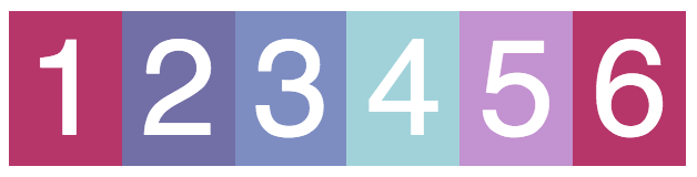
Up until now, we've talked about rigid grid definitions. For example, defining the following code means there will ALWAYS be 6 columns of content, regardless of a device's screen size:
.container {
    display: grid;
    grid-template-columns: repeat(6, 1fr);
}
What's far more likely is that you'll want a result like this on a mobile screen:
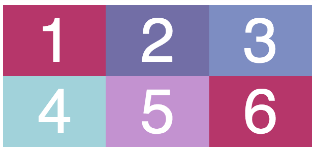
That way, the columns aren't nearly as smushed together just for the sake of getting 6 in a row! You may be thinking back to the first part of this course, when we learned about media queries. With media queries, you can control how content is displayed on different screen sizes.
However, CSS Grid offers flexible solutions for different screen sizes that don't involve media queries at all!
We'll learn two new keywords in this chapter:
auto-fitminmax
The two of them are often combined together, so we'll explore them in tandem.
Auto-fit and minmax
Look at the line of code below. From left to right, it reads:
"Repeat as many columns that will fit on a screen. Each column should be a minimum of 100px wide and a maximum of 1fr wide."
grid-template-columns: repeat(auto-fit, minmax(100px, 1fr));The result of this code is much more apparent when you visualize the code in the browser and resize the window. Play around with it in this CodePen.
Overall, you'll notice that the grid will readjust itself to add another 100px column when there's enough available space for it. As you keep resizing the window, the columns keep growing until the very moment when there'd potentially be space for another 100px column.
When downsizing the window, columns get removed one by one as content gets pushed down onto rows instead. However, the columns will never be less than 100px. This avoids the squished columns you saw at the beginning of the chapter!
It's empowering to be able to create a responsive layout without needing media queries!
Exercise Challenge : create your own layout with CSS Grid
Test out the new concepts you've learned in this part by creating a calendar with CSS Grid. A calendar is a classic way to arrange content using rows and columns.
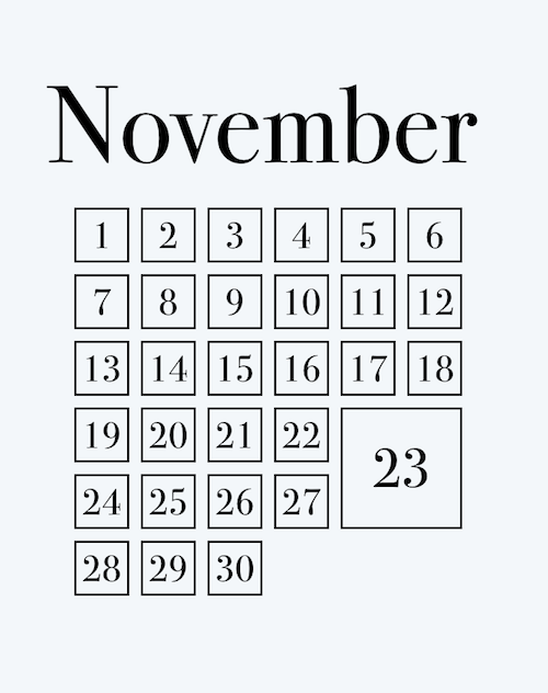
Choose any month you like, as well as the background color, font, and font color. The only rules are as follows:
You must have all date elements within a grid using CSS Grid.
You must have one of the dates bigger than the others (a holiday, for example). This element will have a custom measurement using CSS Grid.
You must have a heading for the month that is not part of the grid.
You must use padding or borders (from the first part of the course).
Take on the challenge, and give those new skills a spin!
