Define grid element height and width
Up until this point, we've only talked about setting measurements for your overall grid (like how wide each column or row should be).
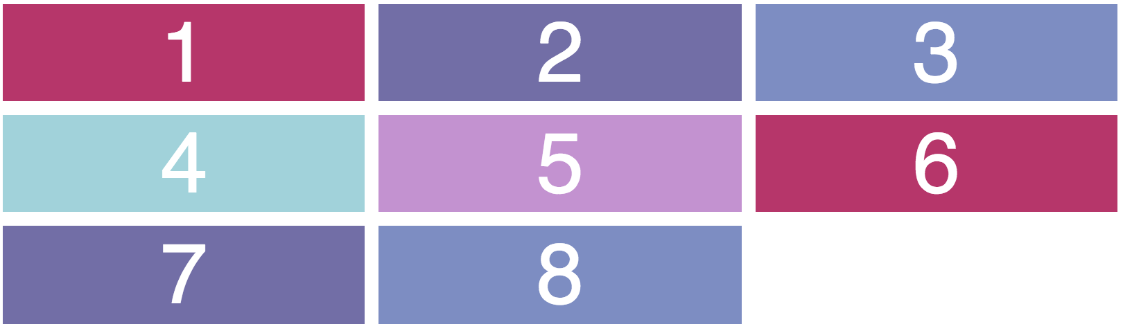
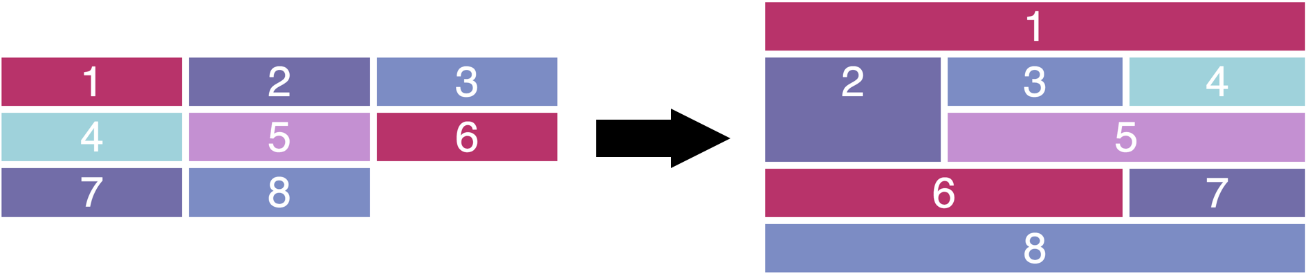
We haven't talked about how to control sizing of individual elements within a grid though. We've only worked with elements of equal sizes:
How could we use CSS Grid to get a result where some elements take up more than one column or row, like this?
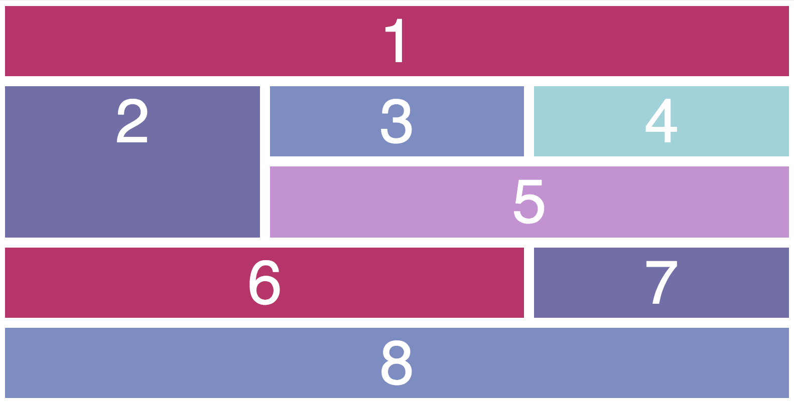
Notice how the grid width is the same, but the "1" block takes up 3 columns, the "2" block takes up 2 rows and 2 columns, etc?
In this chapter, we'll see how, using grid-column and grid-row properties.
Grid columns and rows
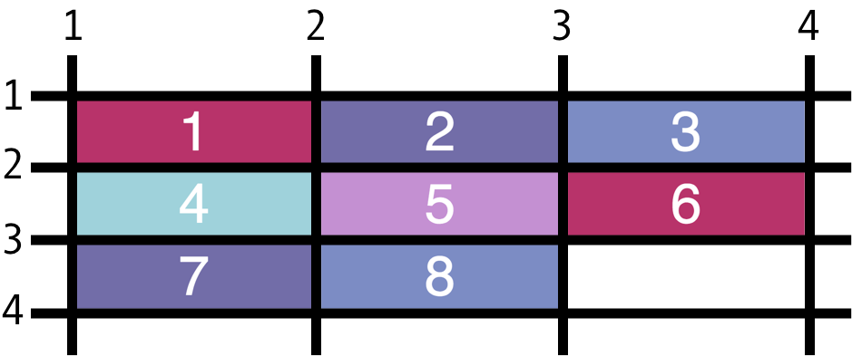
Each grid has elements in it. However, there are also "lines" between each element in the grid. Consider graph paper: there are squares that are marked by vertical and horizontal lines.
In the illustration below, you can see these lines represented (the colored squares are the elements themselves):
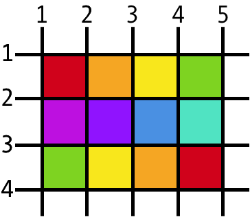
This is the most simple representation of a grid. It's just a bunch of squares between evenly spaced lines, each of which is marked with a number.
You could also have the same overall lines but with some elements that take up more space. In the image below, do you see the red section that spans line 1-5, or the yellow section that spans the vertical lines 3-5?
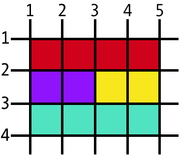
The grid lines remain the same, but elements take up different amounts of space across them.
Set element measurements
To define on which grid lines an element should start and end, use the following properties:
grid-column-startgrid-column-endgrid-row-startgrid-row-end
Inside each property, fill out the line number of your choice. Let's go to the example we've been using in this course to play with these properties. Here's the example and its starter code:
HTML
<div class="container">
    <div id="one">1</div>
    <div id="two">2</div>
    <div id="three">3</div>
    <div id="four">4</div>
    <div id="five">5</div>
    <div id="six">6</div>
    <div id="seven">7</div>
    <div id="eight">8</div>
</div>
CSS
.container {
    display: grid;
    grid-template: 1.6em 1.6em 1.6em / 1fr 1fr 1fr;
    grid-template: repeat(3, 1.6em) / repeat(3, 1fr);
    grid-gap: 10px;
}

#one {
}

#two {
}

#three {
}

#four {
}

#five {
}

#six {
}

#seven {
}

#eight {
}
The color and text properties for each element haven't changed. They are copied from the examples in previous chapters. The difference here in this code is that an id has been assigned to each div. We'll select elements using these ids for the sake of simplicity.
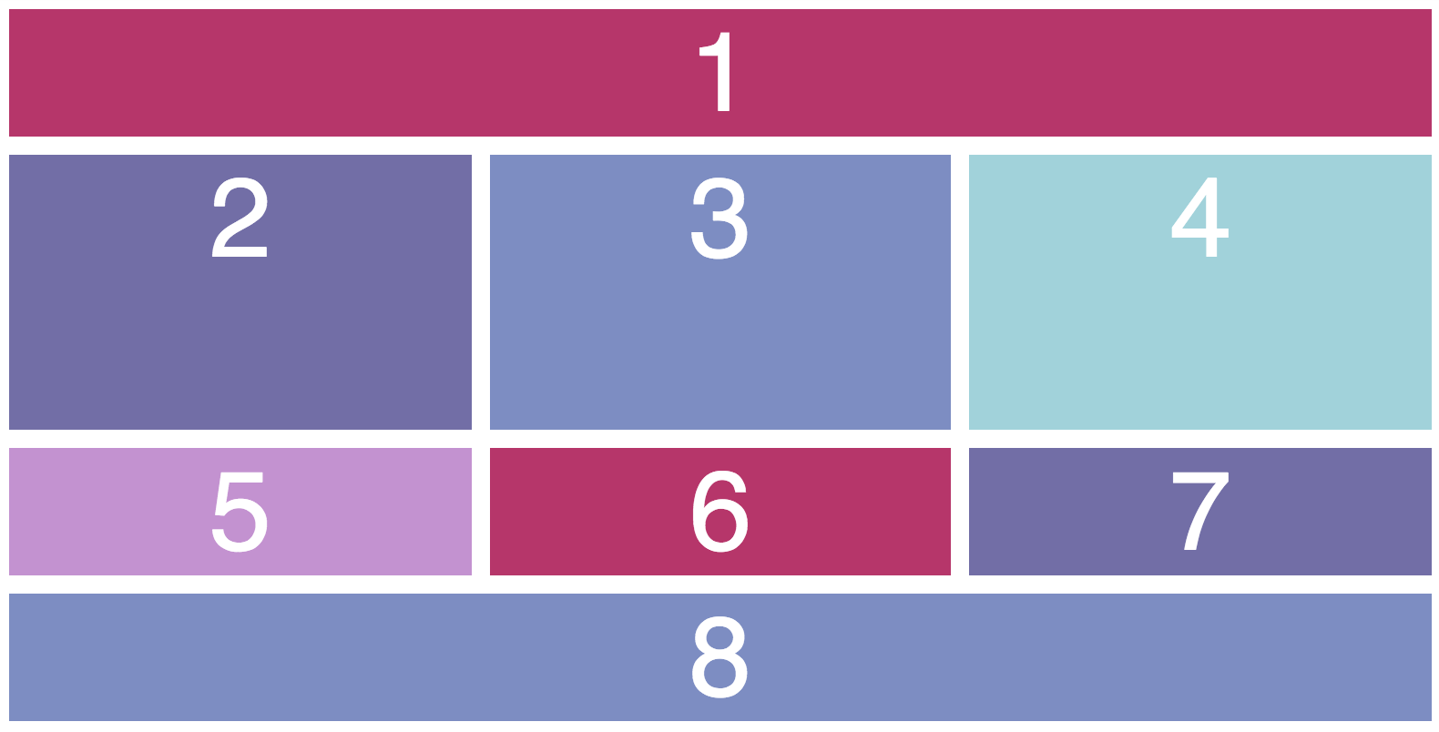
Look at the image below. The code above gives us the left result, and we want the result on the right:
I've marked up the starter result with line numbers like you saw in the images at the beginning of the chapter. They'll help us define where elements should start and end:
Column measurements
To make the first element take up the distance from column line 1 to column line 4 (the full width of the grid), we must specify that it should begin at column 1 and end at column 4:
#one {
    grid-column-start: 1;
    grid-column-end: 4;
}
You can write this as one line of code, separating the lines by a forward slash.
#one {
    grid-column: 1 / 4;
}The result would be the same! The other elements rearrange themselves automatically around these new measurements.
Row measurements
Now, we want the second element to take up two rows' worth of height. Since it now begins on row line 2 (the first element bumped it down), we can specify that it should begin on row line 2 and end on row line 4:
#two {
   grid-row: 2 / 4;
}Here's the final grid and column code that produces the desired result we wanted from above. Take your time to go through the code and draw, by hand, what you think the result will be! It helps a lot to practice this, I promise! Plus, it's totally possible to get a perfect result if you measure carefully:
#one {
    grid-column: 1 / 4;
}

#two {
    grid-row: 2 / 4;
}

#five {
    grid-column: 2 / 4;
}

#six {
    grid-column: 1 / 3;
}

#eight {
    grid-column: 1 / 4;
}
Span and alternative values
So far, we've only used numerical values to define element sizing along column/row lines. To take some math out of the process, though, you can also define a simple span:
#one {
    grid-column: 1 / span 3;
}
This code says, "The element should start at column line 1 and span 3 columns." It's the same result as you saw above ( grid-column: 1 / 4 ).
Lastly, it's sometimes tough to know how many columns or rows you'll have, especially if your content changes all the time. You can also use negative numerical values to ensure that your element always spans the full number of rows, for example. The last row or column line will always be line "-1".
#one {
    grid-column: 1 / -1;
}
This code says, "The element should start at column line 1 and end at the last column line." For our example, it's the same result as you saw above with grid-column: 1 / 4; or grid-column: 1 / span 3;.
Your Turn
This is probably the trickiest concept you've seen so far in the course, so I encourage you to practice it in our interactive exercise. Don't try to go too quickly with it. If you think carefully about your measurements (even counting lines by hand), and you can usually get it right the first time.
In this exercise, you'll code to end up the result below. The step-by-step instructions will get you there!
Find the rules for each paragraph in style.css. It will look like a list of #one, #two, etc
Visually measure elements 2, 3, and 4 in the image above. They start on row line 2 and end on row line 4, right? Code that measurement in the CSS rules for elements #two, #three, and #four.
Visually measure element 1 in the image above. It starts on column line 1 and ends on column line 4, right? Code that measurement in the CSS rules for element #one.
Visually measure elements 2, 3, and 4 in the image above. They start on row line 2 and end on row line 4, right? Code that measurement in the CSS rules for elements #two, #three, and #four.
Visually measure element 8 in the image above. It starts on column line 1 and ends on column line 4, right? Code that measurement in the CSS rules for element #eight.
How is your grid looking? Does it resemble the reference image above? If not, keep adjusting your measurements - you'll get there!
Recap
Use
grid-columnandgrid-rowproperties to create columns that take up more than one standard defined coiumn or standard defined row.
