Create a grid template area
In this chapter, we'll look at another way to set how many columns or rows an element takes up.
This new way will be more visual and take into account an entire layout at once (instead of working element by element).
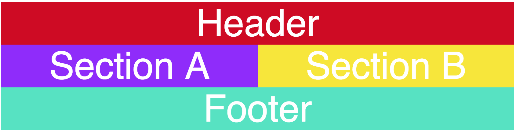
Take this very general layout:

Here's the layout marked up in much more detail, including column lines and white letters that represent which section is which. If this seems like overkill now, you'll see shortly why it's important!
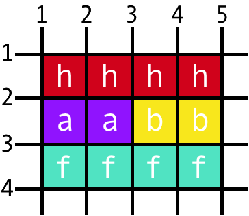
Consider that:
h = header
a = section A
b = section B
f = footer
If the grid (4 columns, 3 rows) were written out in text, with each letter representing the element that takes up a particular position, it'd look like this:
h h h h
a a b b
f f f f
And actually, that's EXACTLY what we'll put in our code!
Grid template areas
Here's the beginning HTML for this chapter's example:
<div class="container">
    <header>Header</header>
    <section id="a">Section A</section>
    <section id="b">Section B</section>
    <footer>Footer</footer>
</div>
Before we get started, here are the general steps we'll follow:
Set the number of columns and rows, and their measurements, in grid-template (or separately in grid-template-columns and grid-template-rows).
Define a template using letters, words, or numbers of your choice in grid-template-areas, putting a space between each and putting each row in a set of quotation marks.
Map elements to these letters, words, or numbers of your choice by defining grid-area on each element.
Firstly, in the accompanying CSS, set a grid-template with how many columns and rows you want and their measurements. You learned this several chapters ago:
.container {
    display: grid;
    grid-template: repeat(3, 1fr) / repeat(4, 1fr);
}
Next, create a layout using grid-template-areas, which will contain a coded representation of where your elements fit into a grid, putting each row in a set of quotation marks:
.container {
    display: grid;
    grid-template: repeat(3, 1fr) / repeat(4, 1fr);
    grid-template-areas:
        "h h h h"
        "a a b b"
        "f f f f"
    ;
}
Next, assign each letter in your grid area template to an element within your grid using the grid-area property. For example, to assign the header element to all instances of the letter "h" in your layout:
header {
    grid-area: h;
}
Here is the full CSS (including colors and background colors) to end up with the final result below the code:
body {
    font-family: Helvetica;
    font-size: 1.4em;
    color: white;
    text-align: center;
}

.container {
    display: grid;
    grid-template: repeat(3, 1fr) / repeat(4, 1fr);
    grid-template-areas:
        "h h h h"
        "a a b b"
        "f f f f"
    ;
}

header {
    grid-area: h;
    background-color: #D0021B;
}

section#a {
    grid-area: a;
    background-color: #9013FE;
}

section#b {
    grid-area: b;
    background-color: #F8E71C;
}

footer {
    grid-area: f;
    background-color: #50E3C2;
}
In summary:
Set the number of columns and rows, and their measurements, in grid-template (or separately in grid-template-columns and grid-template-rows).
Define a template using letters, words, or numbers of your choice in grid-template-areas, putting a space between each and putting each row in a set of quotation marks.
Map elements to these letters, words, or numbers of your choice by defining grid-area on each element.
Comparison with other measurements
In the course's previous chapter, you learned about setting measurements using:
grid-column-startgrid-column-endgrid-row-startgrid-row-end
That way of setting measurements requires some light math.
Using grid-template-areas instead is a more abstracted, visual way of ending up with the same results. In either case, you're setting a grid and then identifying how much space elements should take up within that grid.
Your Turn
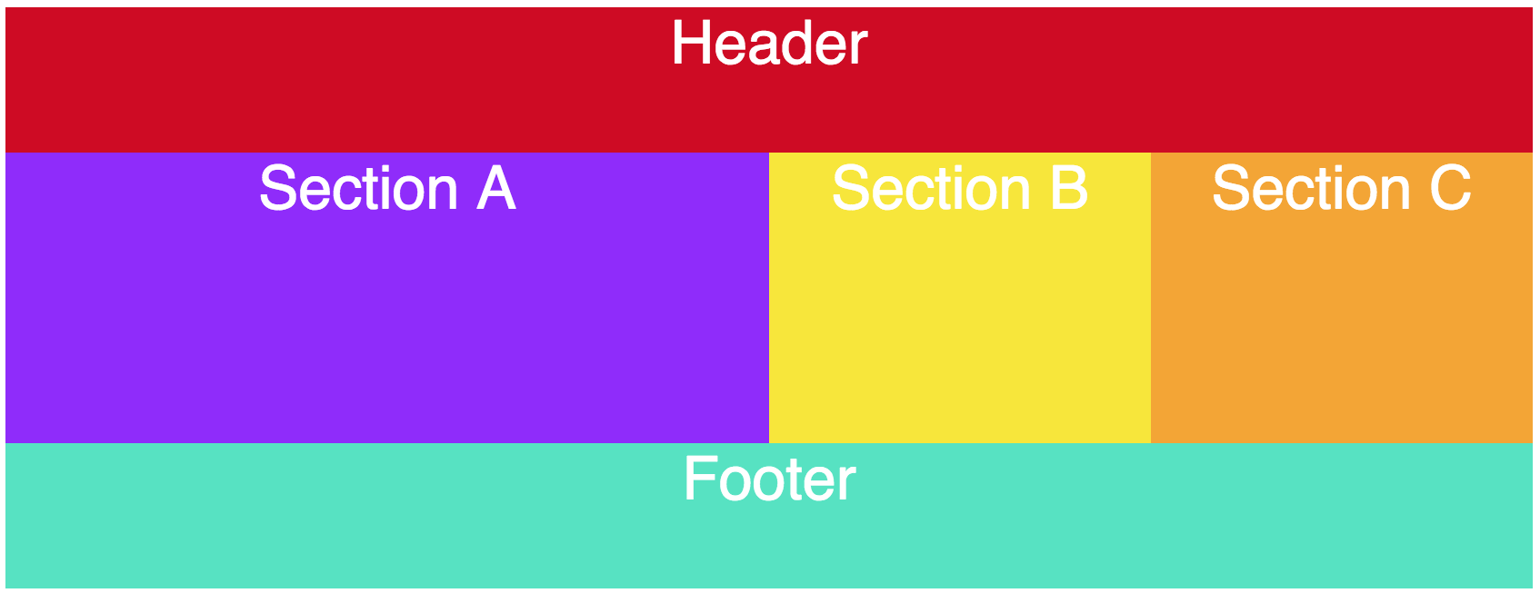
Practice this new way of setting grid measurements in an interactive exercise! Here's the result you'll be working towards in this exercise:
Inside the .container rules, define a grid-template-areas property and set a value for it using letters, words, or numbers of your choice, putting a space between each and putting each row in a set of quotation marks.
For each element inside the grid, set a grid-area property, and set its value equal to whatever its representation is in the grid-template-areas layout you created.
Check out your changes - were you able to recreate the above image?
Recap
Use
grid-template-areaswithgrid-templateto set layouts visually in your code.
