Use pseudo-selectors to trigger CSS transitions
Lighting the fuse: triggering transitions
One of the key ingredients to creating CSS transitions is incorporating a pseudo-class to allow the user to change an element's state and trigger a transition. We've just used a :hover pseudo-selector to trigger the growth of a button. And, while :hover is probably the most common pseudo-class that you'll use, there are others that can trigger transitions as well.
In fact, there are more than 50 pseudo-classes to choose from, but not all of them are well suited to transitions. To understand which will, or won't, work well with transitions, let's take a look at what a pseudo-class is and how it works.
A pseudo-class is a lot like an if-statement for the browser: If the condition of the pseudo-class is true, then apply its styling to the object. In the case of our growing button, if it's being hovered over, use the styling contained within the :hover pseudo-selector, such as transforming it by increasing its scale.
Hovering over the button changes its state from "not-hovered" to "hovered." It is that change that makes it perfect for triggering transitions. The best pseudo-class candidates are those whose states you can anticipate being changed by the user as they interact with the site.
Just like you can anticipate a user hovering over a button, you could also anticipate them making a text-input :active, or entering text that is :invalid and style them as you see fit.
The following are pseudo-classes commonly used in conjunction with transitions. That isn't to say they are the only ones, but rather a list of likely candidates. For a complete list of pseudo-classes, check out the MDN documentation. Even those that don't work well with transitions can make styling elements a lot easier.
:hover
:active
:focus
:valid
:invalid
:not()
:checked
:enabled
:disabled
Constructive criticism: validation
Let's create a form that gives the user feedback as they enter their email address. The HTML for our form could look something like this:
<body>
    <div class="container">
         <div class="form">
            <div class="form__group">
                <label for="">email</label>
                <input type="email" name="" id="">
            </div>
         </div>
    </div>
</body>
We have .form block element, containing a .form__group, which is comprised of an email input and it's label, which renders in the browser as:

Now, let's use the :active pseudo selector to provide the user with a bit of feedback, letting them know that they have made the input field active by highlighting it with a border:
$cd-txt: #6300a0;

.form {
    &__group {
        & input {
            border: 2px solid $cd-box;
            border-radius: 100rem;
            color: $cd-txt;
            font-family: 'Montserrat', sans-serif;
            font-size: 2.5rem;
            outline: none;
            padding: .5rem 1.5rem;
            width: 100%;
            &:focus {
                border: 2px solid $cd-txt;
            }
        }
    }
}
Now, when we change the state of the input to :focus, it should add a purple border to the element:

Perfect! Now, let's use HTML5's built in ability to validate fields, and combine it with the :invalid pseudo-class, so that they receive feedback that they haven't entered a valid email address. Let's start by adding an :invalid pseudo-selector to the input selector and add properties to change its text to white on a red background:
$cd-txt: #6300a0;
$cd-txt--invalid: #fff;
$cd-danger: #b20a37;

.form {
    &__group {
        & input {
            border: 2px solid $cd-box;
            border-radius: 100rem;
            color: $cd-txt;
            font-family: 'Montserrat', sans-serif;
            font-size: 2.5rem;
            outline: none;
            padding: .5rem 1.5rem;
            width: 100%;
            &:focus {
                border: 2px solid $cd-txt;
            }
            &:invalid {
                background: $cd-danger;
                border: 2px solid $cd-danger;
                color: $cd-txt--invalid;
            }
        }
    }
}
Now let's take our form for a spin!

It's validating the email address as it's being entered, but flickering between the :focus and :invalid is a bit obnoxious. Let's make use of the :not() pseudo-selector, combined with the :focus pseudo-selector to allow the user to finish entering their email address before telling them whether it's valid or not:
$cd-txt: #6300a0;
$cd-txt--invalid: #fff;
$cd-danger: #b20a37;

.form {
    &__group {
        & input {
            border: 2px solid $cd-box;
            border-radius: 100rem;
            color: $cd-txt;
            font-family: 'Montserrat', sans-serif;
            font-size: 2.5rem;
            outline: none;
            padding: .5rem 1.5rem;
            width: 100%;
            &:focus {
                border: 2px solid $cd-txt;
            }
            &:not(:focus):invalid {
                background: $cd-danger;
                border: 2px solid $cd-danger;
                color: $cd-txt--invalid;
            }
        }
    }
}
The :not() pseudo-selector registers as true when it's containing selector registers as false. In this case, :not() will return true if the input is not in the :focus state. You can chain pseudo-classes together, just like with standard classes. In this case, we've created a pseudo-selector that will apply its rule set if the element isn't in the :focus state and the email address is :invalid. This way we don't see the red warning signs of an invalid email until they've finished typing their address:

There. That's much nicer, don't you think? But we can make it nicer yet! This is an animation class, after all, so let's add animation to the changes in state by adding a transition for the background-color that takes half of a second to complete:
$cd-txt: #6300a0;
$cd-txt--invalid: #fff;
$cd-danger: #b20a37;

.form {
    &__group {
        & input {
            border: 2px solid $cd-box;
            border-radius: 100rem;
            color: $cd-txt;
            font-family: 'Montserrat', sans-serif;
            font-size: 2.5rem;
            outline: none;
            padding: .5rem 1.5rem;
            width: 100%;
            transition: background-color 500ms;
            &:focus {
                border: 2px solid $cd-txt;
            }
            &:not(:focus):invalid {
                background-color: $cd-danger;
                border: 2px solid $cd-danger;
                color: $cd-txt--invalid;
            }
        }
    }
}
Now we'll get a quick fade between when the user enters their email and when it displays as invalid:

Perfect! 👌 By chaining together pseudo-classes into a more specific pseudo-selector, we've been able to improve the user's experience!
Picking on your little brother: triggering siblings
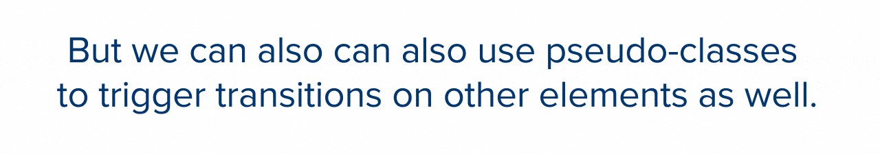
Now, as you've just seen, you can use pseudo-classes to trigger transitions on their assigned element, such as changing the size of a hovered button, or invalid text field. But you can also use pseudo-classes to trigger transitions on other elements as well.
Hey Jim, yeah... can we get an asterisk for that last sentence? Perfect... thanks!
That's better. So, why the asterisk? What's the disclaimer?
For a pseudo-selector to trigger a transition on another element, that element must be the next sibling in the HTML document. In other words, you must use the adjacent sibling combinator: + when setting up the transition.
Say whuuh?
Use a :hover pseudo-selector and add styles to it like so:
.btn {
    background: $cd-primary;
    font-size: 3rem;
    cursor: pointer;
    padding: 1.85rem 3rem;
    border-radius: 10rem;
    &:hover{
        transform: scale(1.15);
    }
}
In the event of a hover, those styles are applied to the element that :hover is attached to:

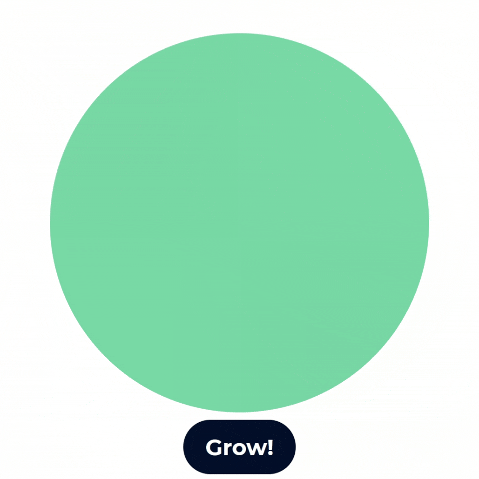
But let's say the button has a sibling with the class .ball assigned that you would like to affect instead.
<body>
    <div class="container">
        <div class="btn">
            Grow!
        </div>
        <div class="ball"></div>
    </div>
</body>
You can use the adjacent sibling combinator to couple .ball with the :hover the pseudo-selector instead:
.btn {
    background: $cd-primary;
    font-size: 3rem;
    cursor: pointer;
    padding: 1.85rem 3rem;
    border-radius: 10rem;
    &:hover + .ball{
        transform: scale(1.15);
    }
}

.ball {
    width: $ball-size;
    height: $ball-size;
    background: $cd-secondary;
    margin-bottom: 1rem;
    border-radius: $ball-size * 0.5;
}
Now when you hover over the button, .ball will scale up instead:
 Let's change things up a bit, and, rather than starting huge and getting huger, let's have it start small by setting the initial
 scale() to .1, and add a transition. But rather than taking a fraction of a second, let's have it take a full four seconds to complete the animation so it creates the perception of continuously growing:
.btn {
    background: $cd-primary;
    font-size: 3rem;
    cursor: pointer;
    padding: 1.85rem 3rem;
    border-radius: 10rem;
    &:hover + .ball{
        transform: scale(1.15);
    }
}

.ball {
    width: $ball-size;
    height: $ball-size;
    background: $cd-secondary;
    margin-bottom: 1rem;
    border-radius: $ball-size * 0.5;
    transform: scale(0.1);
    transition: transform 4000ms;
}
And, finally, let's change the :hover selector to :active, so the scale increases when the button is pressed, rather than simply hovered over. Then, change the scale of the :active state to be 1.0 rather than 1.15 and we should be all set!
.btn {
    background: $cd-primary;
    font-size: 3rem;
    cursor: pointer;
    padding: 1.85rem 3rem;
    border-radius: 10rem;
    &:active + .ball{
        transform: scale(1.0);
    }
}

.ball {
    width: $ball-size;
    height: $ball-size;
    background: $cd-secondary;
    margin-bottom: 1rem;
    border-radius: $ball-size * 0.5;
    transform: scale(0.1);
    transition: transform 4000ms;
}
When we view it in the browser now, we should have a button that, when pressed, triggers a transition to the scale of its sibling, from 10% to 100%, over the course of four seconds. Let's check it out:
Pseudo-classes are extremely helpful in styling elements and triggering transition based on their states, but can also be used to manipulate other elements on the page, allowing you to create more interactive experiences for your visitors.
We've covered the basics of transitions, so, coming up next, you'll learn methods for adding complexity and life to animations from some of the masters!
Let's recap!
Pseudo-classes are used to trigger CSS transitions.
The best pseudo-classes to use with transitions are those that the user will interact with as they browse the site.
You can chain pseudo-classes together to make more specific pseudo-selectors.
Pseudo-selectors can be used to manipulate its element's next sibling as well as itself.
