Add a Progress Bar Component

Understand the Progress Bar Component
In this chapter, you’re going to discover a new Bootstrap 5 component: progress bars.
As always, when integrating a Bootstrap 5 component on your website, look at the Bootstrap documentation on the component first. For this chapter, go to the Progress component in the Components sidebar.
In the Bootstrap documentation, you can see several types of progress bars. Feel free to try them all out! For our portfolio, we’ll use the first option:
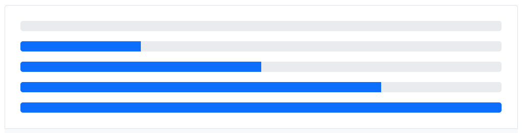
<div class="progress">
    <div class="progress-bar" role="progressbar" aria-valuenow="0" aria-valuemin="0" aria-valuemax="100"></div>
</div>
<div class="progress">
    <div class="progress-bar" role="progressbar" style="width: 25%" aria-valuenow="25" aria-valuemin="0" aria-valuemax="100"></div>
</div>
<div class="progress">
    <div class="progress-bar" role="progressbar" style="width: 50%" aria-valuenow="50" aria-valuemin="0" aria-valuemax="100"></div>
</div>
<div class="progress">
    <div class="progress-bar" role="progressbar" style="width: 75%" aria-valuenow="75" aria-valuemin="0" aria-valuemax="100"></div>
</div>
<div class="progress">
    <div class="progress-bar" role="progressbar" style="width: 100%" aria-valuenow="100" aria-valuemin="0" aria-valuemax="100"></div>
</div>
As you can see, it has the following structure:
A
divwith theprogressclass (the gray bar).A child
divwith theprogress-barclass (the blue bar) and awidthto give the progress value.
Now you’ve seen how to add a progress bar in Bootstrap 5; you can combine it with utility classes to customize it further (for example, you can add a box-shadow, make the corners completely round, etc.).
Over to You!
Your mission is to create at least three progress bars in each part (design and development), which should look like this:

A few hints to set you on the right track:
Use the Bootstrap 5 grid system.
Use utility classes for padding, colors, and alignments (flexbox).
Add the Font Awesome “link” tag to your project to get access to icons from different web languages (HTML, CSS, Sass, JS, etc.):
<link rel="stylesheet"href="https://cdnjs.cloudflare.com/ajax/libs/font-awesome/5.15.4/css/all.min.css" integrity="sha512-1ycn6IcaQQ40/MKBW2W4Rhis/DbILU74C1vSrLJxCq57o941Ym01SwNsOMqvEBFlcgUa6xLiPY/NS5R+E6ztJQ==" crossorigin="anonymous" referrerpolicy="no-referrer" />
Once you’ve made these changes, watch the screencast below to compare your work with ours!
Now all you have to do is copy this progress bar as many times as there are skills you want to show, then adjust the content (change the icon, title, and value of the progress bar).
Let’s Recap!
Before implementing a new component in your design, always read the Bootstrap 5 documentation to see how it works.
The progress bar component in Bootstrap 5 is a visual element you can add to your website.
You can put grids within grids to help you structure the layout of your elements.
To take full advantage of what Bootstrap offers, you can combine components and utility classes.
Now you’ve integrated a component entirely made up of CSS, you’re going to see how to add a component that requires a bit of JS (JavaScript) to customize it: cards.
