Create Appropriate Visualizations for Different Scenarios
Having started to see the power of data, Zara is excited to have you explore other perspectives to discover new patterns in her life. In this chapter, we will explore the different types of charts available and when to use them by helping Zara with some of her new initiatives:
What other factors might be affecting her mood?
How is her spending changing over time?
How do her leisure time pursuits compare to her friends'?
Is work interfering with her fitness goals?
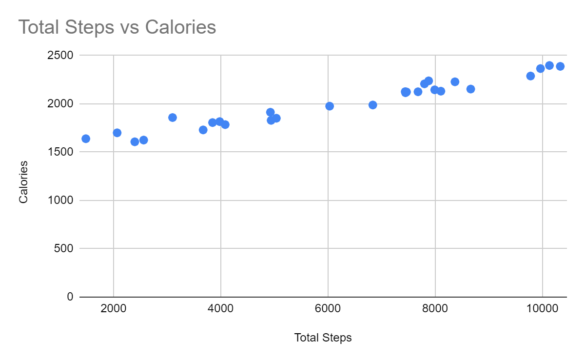
You’ve already seen a few examples of patterns “jumping out” using visualizations of Zara’s data. For example, you saw that Zara’s burned more calories as she exercised more:
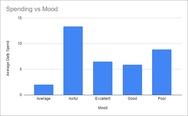
In addition, Zara spent more when her mood was low:
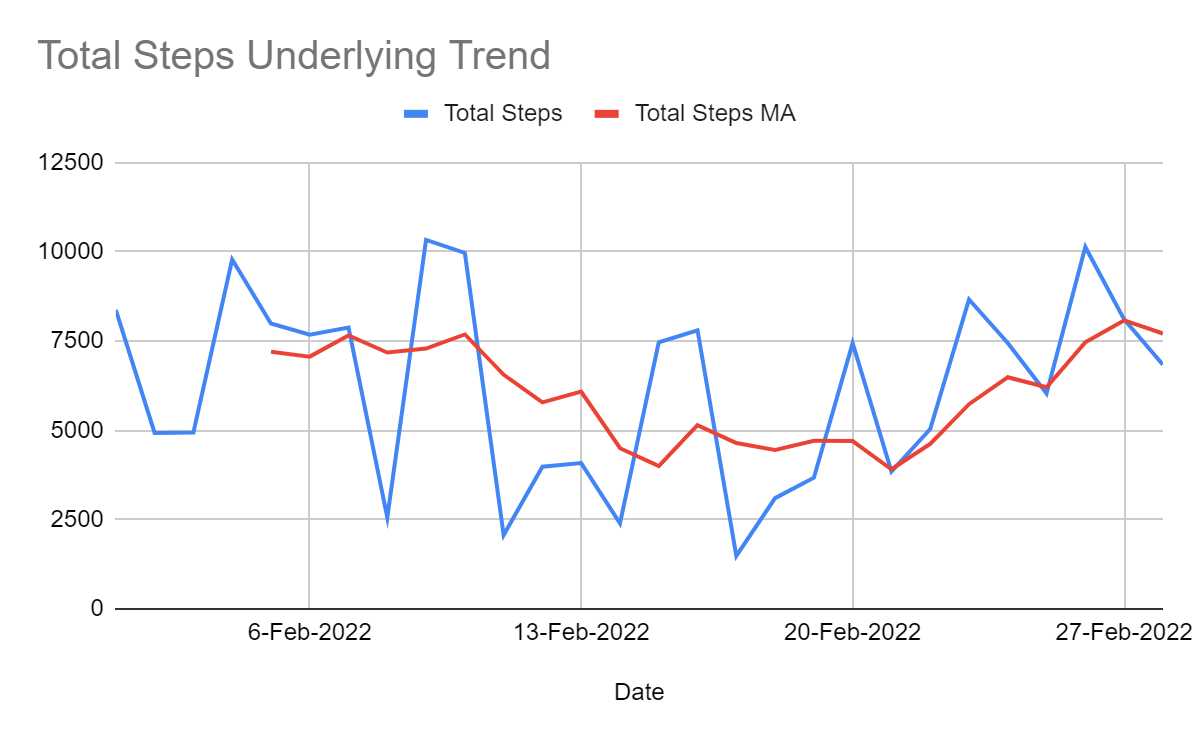
And you saw this chart showing the trend of Zara’s total steps:
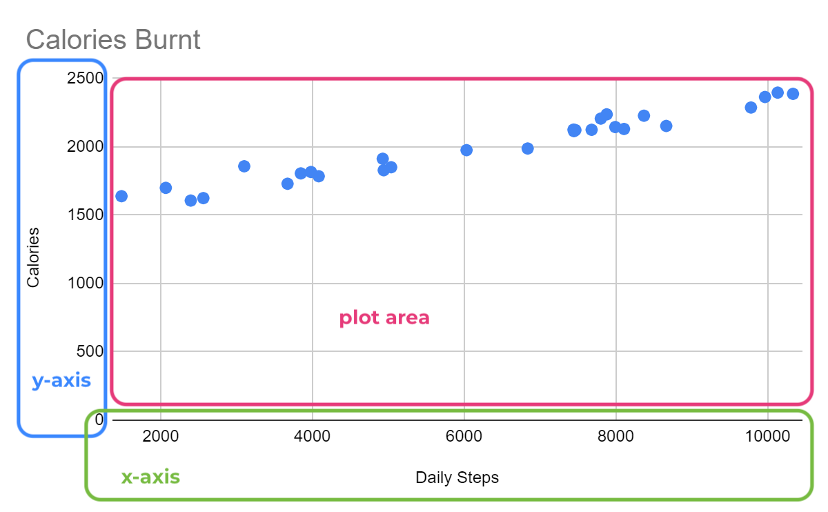
In this chapter, we will examine the art of good data visualization. But first, let’s define some terminology. There are three main areas for most charts, shown in red, blue, and green here:
Fit Your Data to Appropriate Charts
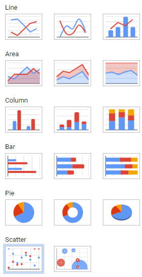
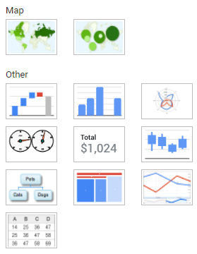
We’ve established that charts are a good thing. What’s even better is the selection you’ll find in your spreadsheet program! For example, here are the charts available in Google Sheets:
When plotting data, choosing an aesthetically pleasing chart is tempting, but you should approach this more logically. If you think about charts as a communication method, then it makes sense to think about the message you want to communicate, which can fall into one of the following categories:
Let’s look at each of these categories with some new data that Zara has gathered, which you can find here.
Comparison
Objective: What other factors might affect Zara’s mood?
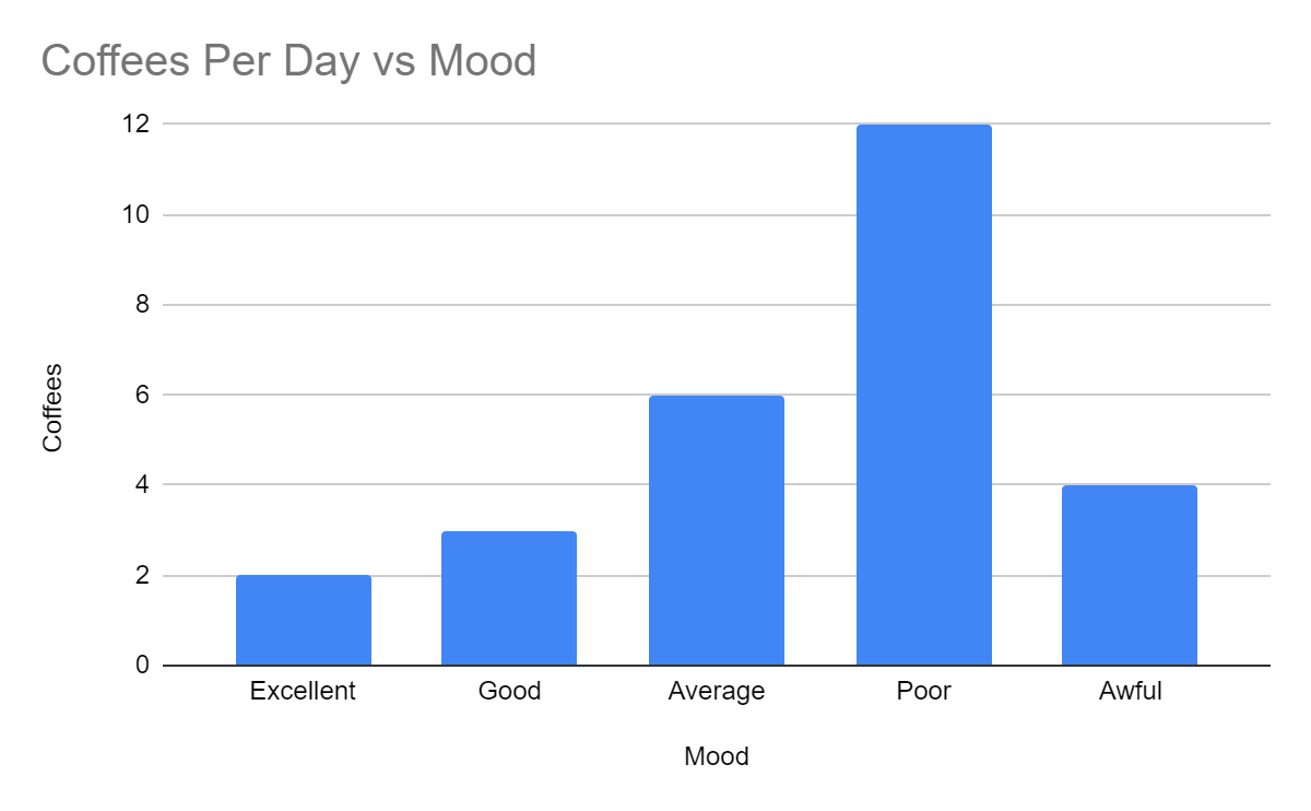
Having discovered that her spending and mood seem related, Zara wants to dig deeper to see if other aspects of her life affect her mood. She’s read a lot about coffee’s positive and negative effects, so she collects some data about her coffee consumption and mood. Here is the data you receive:
Mood | Coffees (cups per day) |
Excellent | 2 |
Good | 3 |
Average | 6 |
Poor | 12 |
Awful | 4 |
A bar chart is an excellent way to plot this. Bar charts are great for comparisons, as it’s easy to compare their relative length. You can plot bars vertically:
Or you can plot them horizontally (this is called a horizontal bar chart):
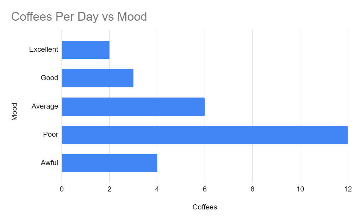
The choice of vertical or horizontal is mainly aesthetic, but sometimes one is more readable than the other.
Zara finds this interesting. It looks like she drinks more coffee as her mood deteriorates, but she drinks less when she’s in an awful mood. She wonders if she replaces coffee with another guilty pleasure on her awful days, so she gives you some more data about her consumption patterns:
Mood | Coffees (cups per day) | Gummy Bears (bags per day) | Reality TV Hours (hours per day) |
Excellent | 2 | 0 | 1 |
Good | 3 | 2 | 1 |
Average | 6 | 3 | 2 |
Poor | 12 | 4 | 3 |
Awful | 4 | 8 | 6 |
In this case, her data has three series, another set of numbers you can plot. Fortunately, most charts will nicely show additional series:
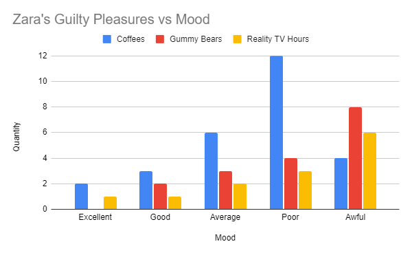
Zara apparently switches to gummy bears and reality TV when her mood is really low!
Again, you could plot these bars horizontally as an alternative approach.
There are other ways to compare, including a radar chart (aka spider chart) showing the same data:
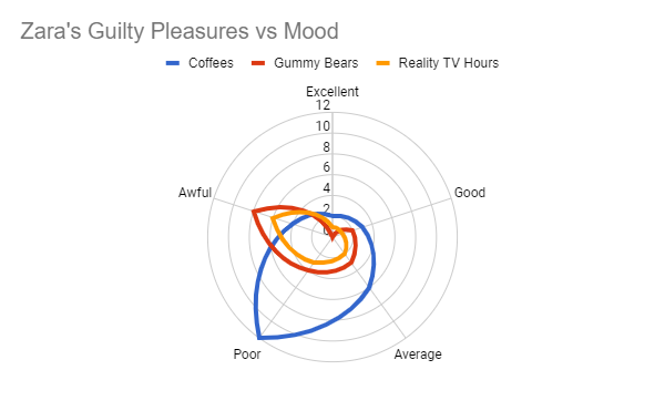
You can see how each spoke represents the numeric data values. The higher the value, the further out from the center of the circle the line goes. Note that there is no x-axis or y-axis. Instead, an angular position around the circle represents a qualitative variable, and the distance from the center represents a quantitative variable.
Watch the screencast below to see how I created the above charts:
Trend
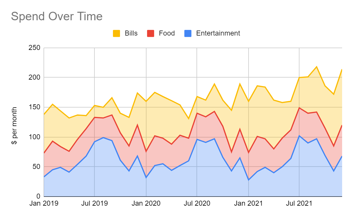
Objective: How is Zara’s spending changing over time?
Zara’s previous research showed that her spending was a little erratic, so she wants to analyze this further. You ask her to send you her bank transactions over the last three years with spending categorized by entertainment, food, and bills. Here are the first six months of that data:
Date | Entertainment $ | Food $ | Bills $ |
Jan 2019 | 33 | 40 | 65 |
Feb 2019 | 45 | 48 | 62 |
Mar 2019 | 49 | 35 | 60 |
Apr 2019 | 41 | 35 | 56 |
May 2019 | 54 | 42 | 41 |
Jun 2019 | 68 | 46 | 22 |
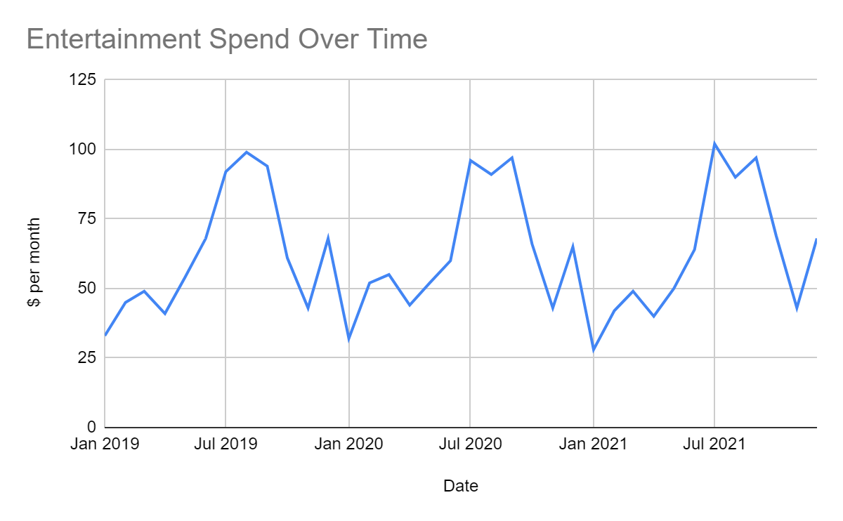
A line chart is a great way to show how her spending changes over time. You can plot just one series:
Or you can plot multiple series:
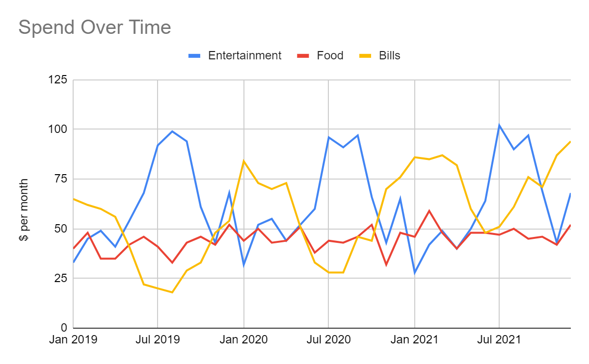
Now it’s easy to see her spending patterns over three years. Her entertainment spending is highest in the summer, with another peak in December followed by a dip in January. Her bills peak in the winter and generally increase over time. Her food spending seems fairly steady, with a slight increase over time.
You could also use a stacked area chart. Here, the spending is stacked with bills on top of food, which is on top of entertainment. So the total height of the colored areas represents the total spending:
Notice that you get a sense of the total spending and the proportions of each spending category, but not how each varies over time. So, for example, you can’t see the seasonality of the bill spend as clearly in the stacked area chart as in the line chart.
Zara wants to inspect the seasonality and general increase of the bills more. You can plot a line chart of the year-to-year comparison:
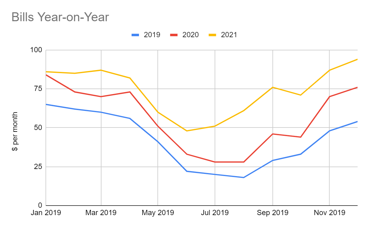
This technique is helpful for seeing data patterns. For example, it clearly shows the increase in the bills during the winter months and over time.
Watch the screencast below to see how I created the above charts:
Proportion
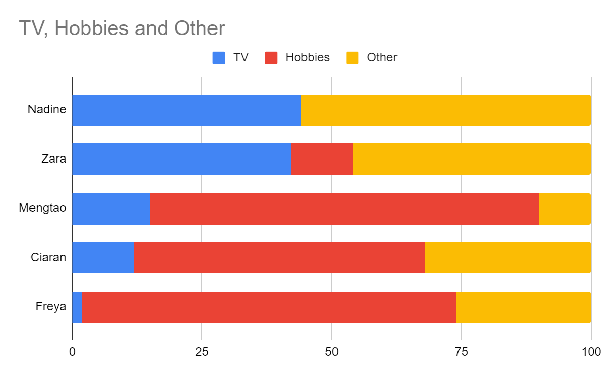
Objective: How does Zara’s leisure time pursuits compare to those of her friends?
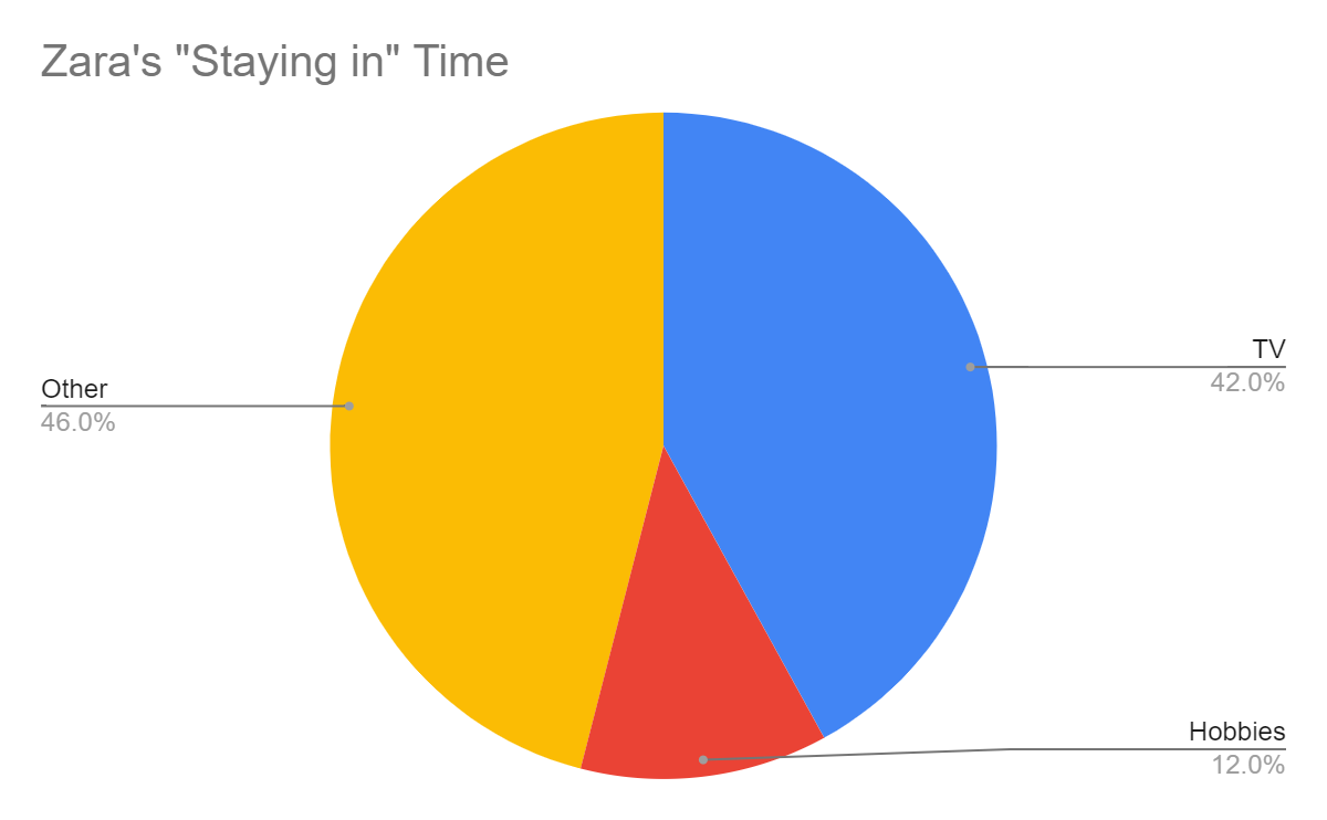
Zara’s friends feel she spends too much time watching TV and needs to spend more time doing anything else! To find out if this a valid concern, they collect some data about how they all spend their “staying in” time, showing the percentage of time spent in each of three categories:
| TV % | Hobbies % | Other % |
Zara | 42 | 12 | 46 |
Ciaran | 12 | 56 | 32 |
Freya | 2 | 72 | 26 |
Nadine | 44 | 0 | 56 |
Mengtao | 15 | 75 | 10 |
Note that the numbers in each row add up to 100, as they are percentages.
You can plot Zara’s time split in a pie chart. Each segment represents a proportion of the whole 100% of her staying in time:
Pie charts don’t present multiple series. For that, you'd need to plot a pie chart for each friend. An alternative is to use a stacked bar chart (which can be vertical or horizontal):
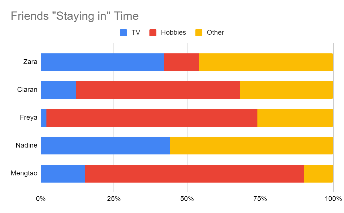
Each total bar adds up to 100, with each color showing how that 100% is broken down.
With these charts, it’s sometimes worth sorting the data by one of the series. For example, you can sort by the TV series and list her friends by the amount of TV they watch. It gives a clearer message here because the objective is to decide if Zara watches too much TV:
Watch the screencast below to see how I created the above charts:
Correlation
Objective: Is work interfering with Zara’s fitness goals?
We looked at correlation in part 2, chapter 3 when we looked at some analytical techniques. Now let’s take a deeper look.
Zara speculates that another factor affecting her exercise levels is her workload. You reason that a rough measure of her workload is the number of emails she receives daily. You ask her to collect these two numerical measures over 10 days, and she gives you the following data:
Number of emails | Number of steps |
15 | 7335 |
20 | 7106 |
10 | 9355 |
29 | 5857 |
34 | 4593 |
36 | 3402 |
48 | 2204 |
12 | 8694 |
42 | 2626 |
33 | 5593 |
You can use a scatter plot to show the correlation between these two values:
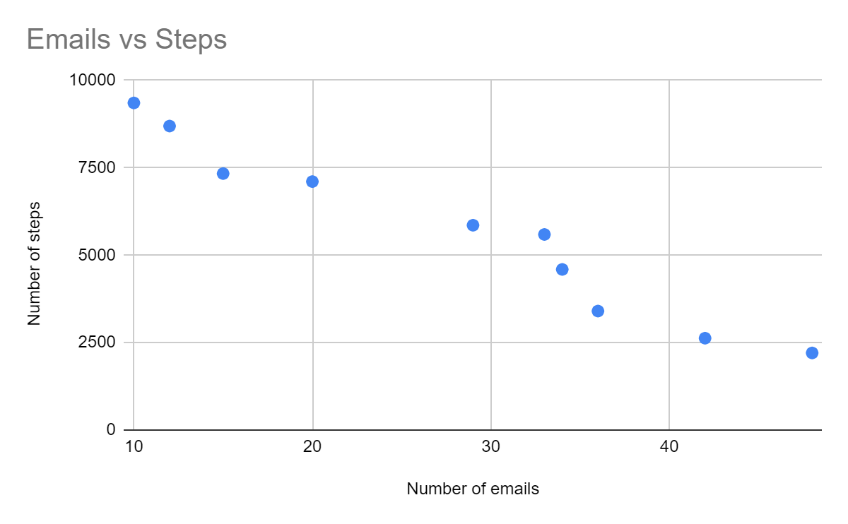
Now you can see that Zara is right. There is a correlation between the two. As the number of emails increases, Zara step count decreases.
You feel you are onto something and want to see if this correlation applies more broadly. So you ask two of Zara’s friends to gather the same data. Here is what you receive:
Zara | Ciaran | Freya | |||
Emails | Steps | Emails | Steps | Emails | Steps |
18 | 9058 | 20 | 3403 | 102 | 13117 |
43 | 3963 | 41 | 1167 | 115 | 11264 |
30 | 6965 | 49 | 1104 | 107 | 12254 |
25 | 8341 | 35 | 1753 | 100 | 14210 |
41 | 5316 | 12 | 4376 | 77 | 17071 |
39 | 5499 | 36 | 1348 | 80 | 16225 |
32 | 6348 | 14 | 3120 | 110 | 11755 |
35 | 5790 | 10 | 4548 | 96 | 14784 |
30 | 6873 | 12 | 3745 | 82 | 15511 |
24 | 8449 | 24 | 2308 | 72 | 17434 |
Now you can plot all three series on a scatter plot:
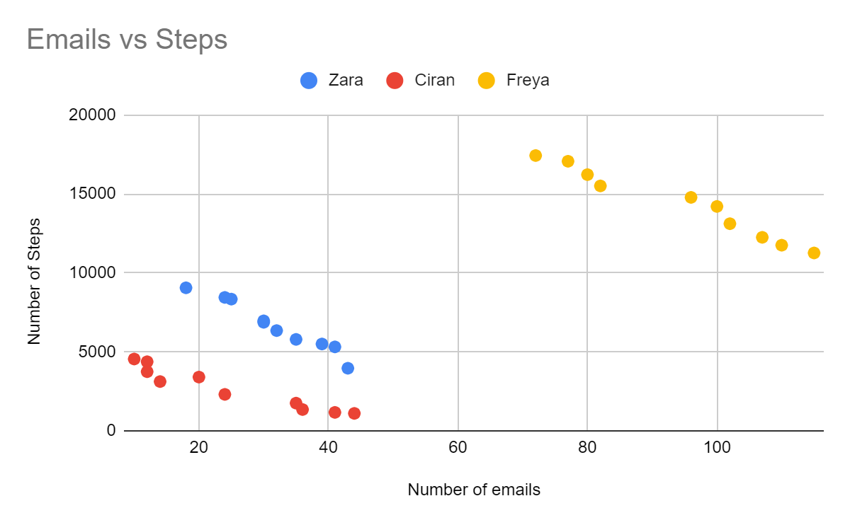
It looks like your theory is correct! Workload does seem to affect physical activity.
You can probably conclude that the number of emails is causing the number of steps to reduce because Zara and her friends are spending more time on their computers and less time walking. However, you can’t conclude that the decrease in steps causes the number of emails to increase. Sometimes there is no causation at all. For example, consider this chart showing the number of hours that Freya rows vs. the number of miles that Zara cycles:
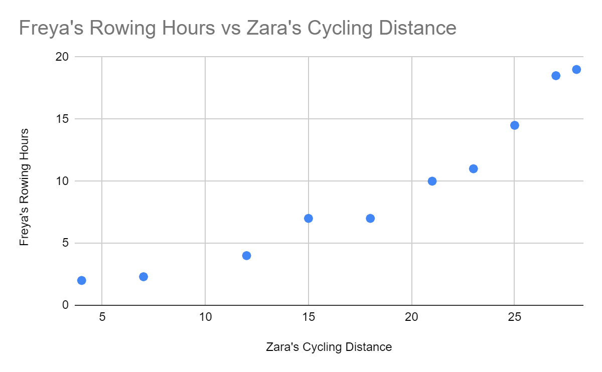
There is a correlation here, but is there causation? Does Freya’s rowing cause Zara to cycle, or vice versa? Probably not! What could be happening here is that they both enjoy their outdoor activities when the weather is good.
Watch the screencast below to see how I created the above charts:
Your Turn: Choose and Create a Chart
Now it’s your turn. Looking at your consolidated spreadsheet, choose and plot one of the following charts:
Zara’s mood vs. her number of steps.
Zara’s calories burned over the month.
Zara’s time asleep vs. her time in bed.
Zara’s number of steps vs. her spending.
✅ Check your work: How did you do? There are a few ways you can create suitable charts. You can check out my suggestions here.
Let’s Recap!
I hope you had fun exploring the different charts! Here’s a recap of what you learned:
Charts are created for different purposes:
To compare numbers
To show a trend over time
To show a whole split into proportions
To show the correlation between two sets of numbers
You can best show a comparison using bar charts, horizontal bar charts, or radar charts.
You can best show trends using line charts or stacked area charts.
You can best show proportions using pie charts or stacked bar charts.
You can best show correlation using scatter plots.
Correlation doesn’t always imply causation.
By now, you have a pretty good idea about choosing the right chart for your objectives. In the next chapter, we will look at ways to ensure your charts come out right by avoiding common mistakes, applying effective enhancements, and choosing the right tools.
